Basic properties of UI widget
It takes about 15 minutes to read this article
This article provides an overview of the UI widget's instructions for transforming, aligning, generic, and rendering these four basic properties. In the specific introduction document for each widget, we description what other property of each widget do and instructions.
What are UI widgets and base properties?
UI widgets are the basic widgets you can use to build an experience interface. In the UI editor, we provide widgets such as Containers, images, buttons, text, Input Box, Progress Bar, Scroll Box, joystick, camera slider, etc.
Basic properties are the four types of properties contained in each UI widget: Transform, Align, Generic, Render.
Transform
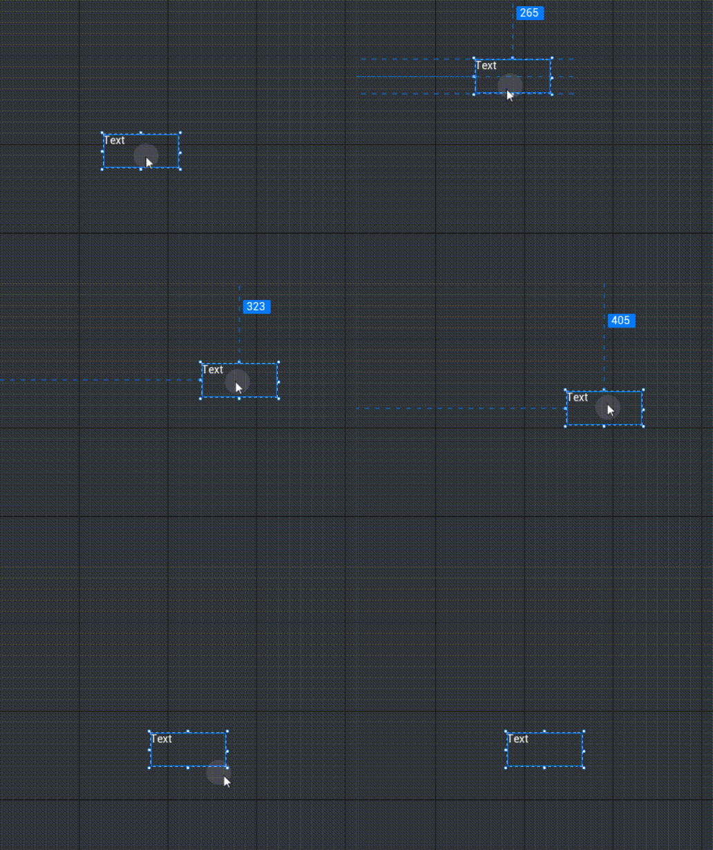
Coordinates - Position
- Modify UI widget display position in main viewport
- Diagram:
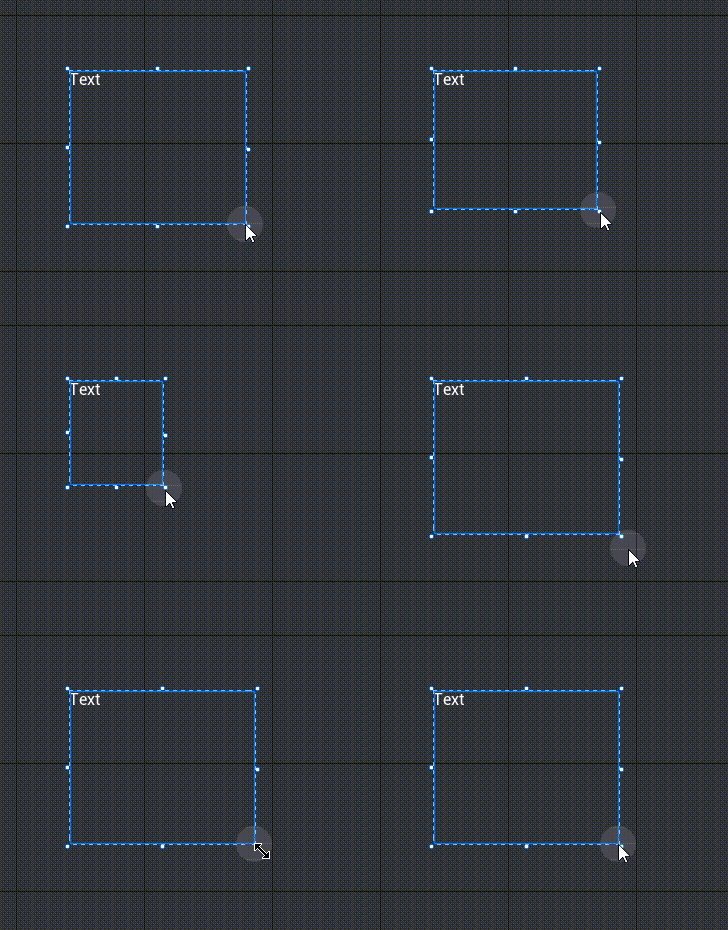
Coordinates - Size
- Modify UI widget display size in main viewport
- Diagram:
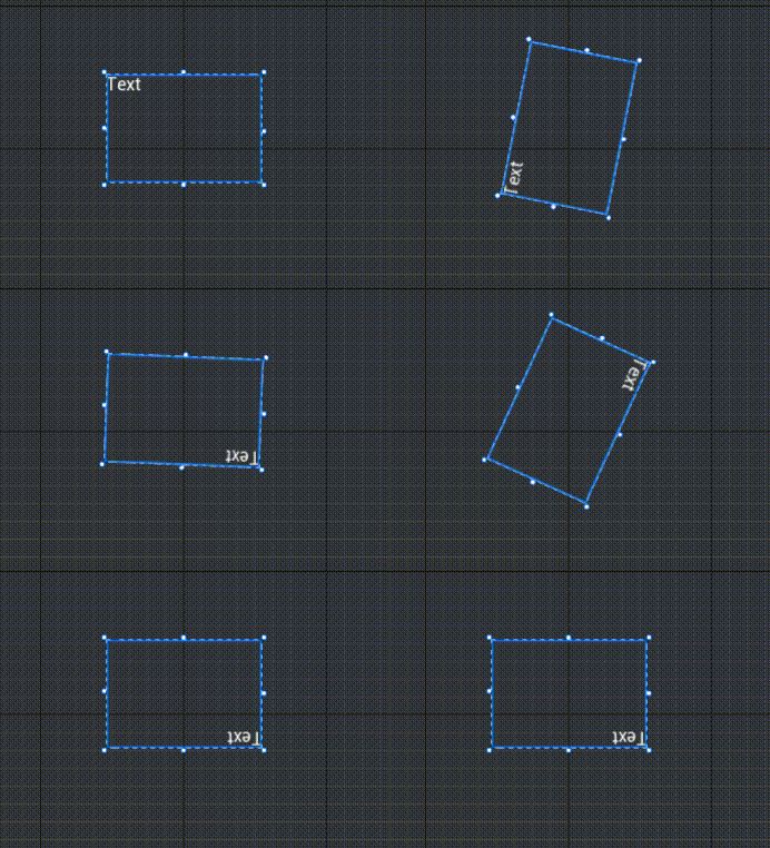
Angle
- Modify the rotation angle of the UI widget in the main viewport, with positive numbers rotating clockwise and negative numbers rotating counterclockwise.
- With the rendering anchor as the center of rotation, see [Rendering]-[Rendering Anchor] below for the setting method of the rendering anchor
- Value range: -180 - 180
- Diagram:
Z Order
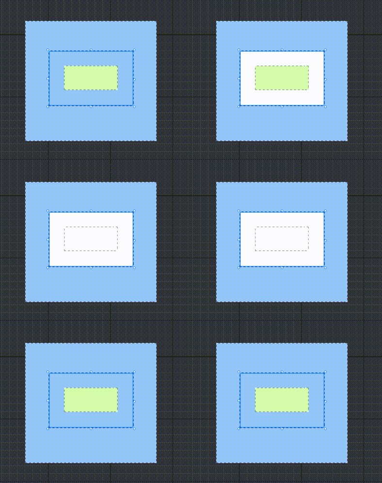
- Modify the UI widget's layer, with larger coefficients and higher layers.
- Layer logic for UI widgets: widget levels under the same parent are determined by the Z Order, determined by the order up and down the object list when the Z Orders are the same, widgets located further down the object list are displayed in the upper layer; any child widgets are displayed in the upper layer of their parent widget
- Diagram:
TIP
Notice here the difference between the UI widget Z Order and the UI object hierarchy: the UI widget Z Order is the layer used to modify a widget or customize a UI widget in a UI object, whereas the UI object hierarchy is the overall layer used to modify the UI object, the UI object hierarchy takes precedence over the UI widget Z Order
- Two UI widgets in different UI objects, UI widgets higher in UI object hierarchy are rendered at the upper level, regardless of UI widget Z Order
- Two UI widgets within the same UI object, with widgets with larger Z Orders rendered at the top
- UI widget Z Order is selected in UI editor object list and then modified in property panel, while UI object hierarchy is selected in main editor object list and modified in property panel, both can also be modified in script
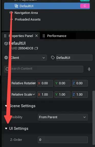
Example script to modify the UI widget Z Order and UI object level:
// Modify a UI widget or customize the UI's Z Order
btn.zOrder=0
// Modify UI object hierarchy
this.uiObject.zOrder=0
// Modify a UI widget or customize the UI's Z Order
btn.zOrder=0
// Modify UI object hierarchy
this.uiObject.zOrder=0Overflow concealment
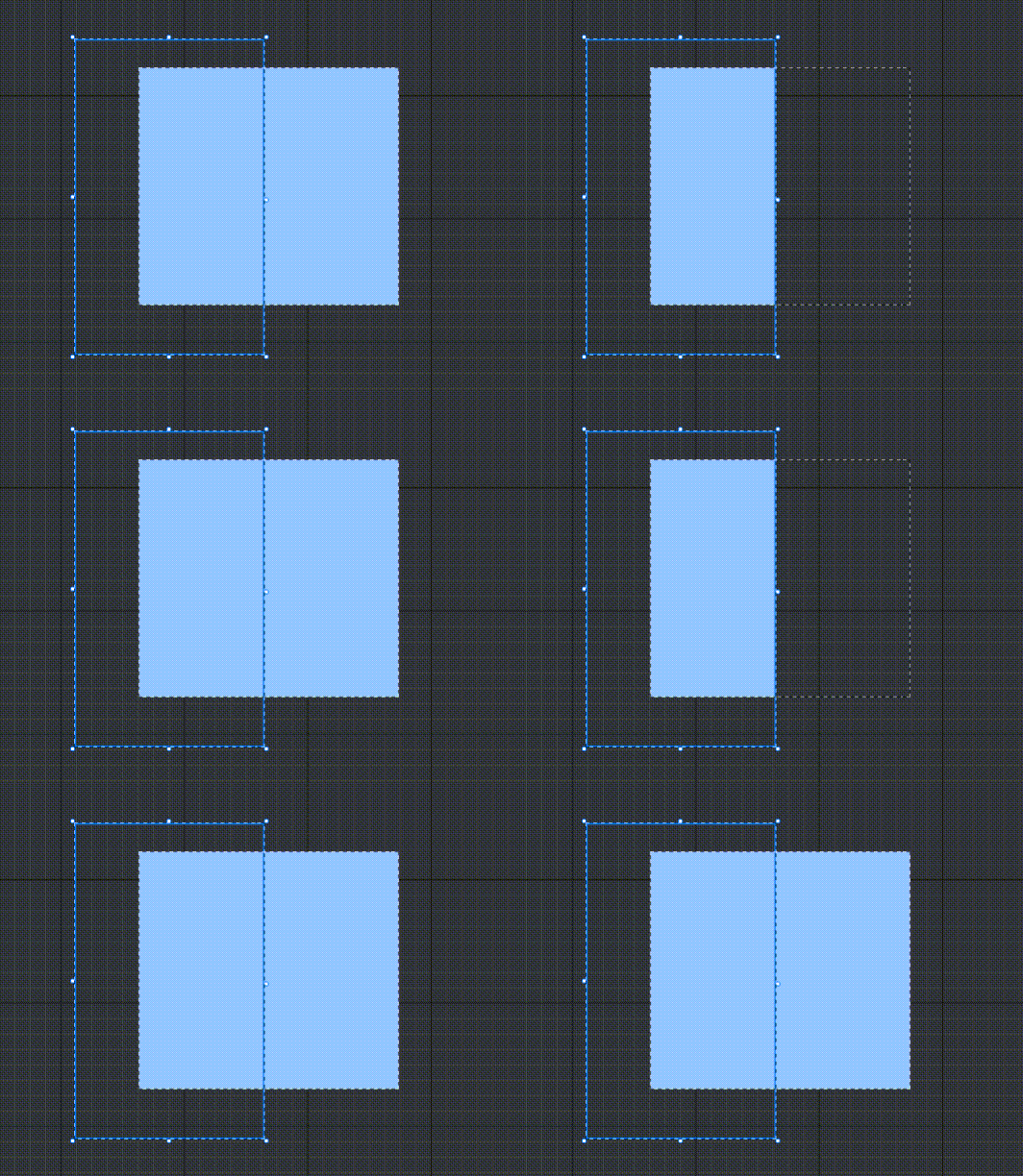
- Whether to hide out-of-range content when the size range of the Container is exceeded
- Diagram:
Horizontal Auto Size/Vertical Auto Size
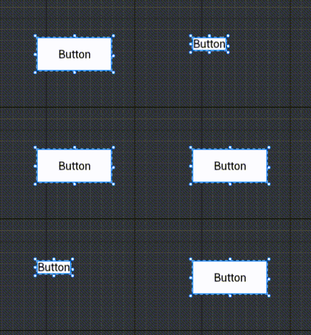
When AutoSize is selected, the UI widget is automatically modified to the desired size
- The resizing logic is modified differently for different widgets with this option turned on, e.g. text controls with AutoSize modified to text content and image controls with AutoSize modified to image-image size
- Auto-size cannot be used in conjunction with align-adaptive/up-down aligned/fully-justified. Auto-size will not be used if aligning such as adaptive is enabled
- To avoid conflicts, for text controls, this option is only allowed to turn on if horizontal display=cull and no adaptive text box is turned on
Align
Align
- Refers to aligning the UI layout based on the parent's stretch/displacement to facilitate UI adaptation for different models.
Horizontal direction
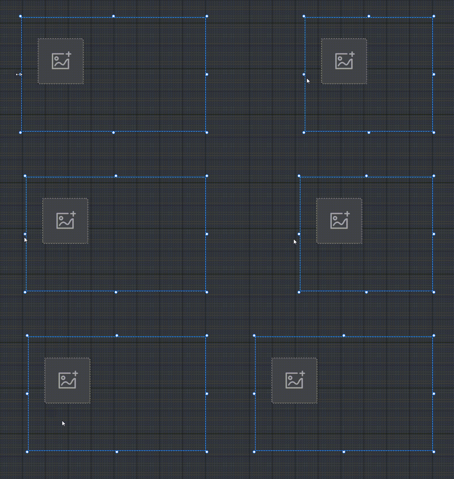
- Align to the left However the parent changes, the UI widget remains the same distance to the left and the size remains the same Diagram:
TIP
Description: In this series of demo animations, the white image does not directly follow the experience screen aspect ratio adaptive change; the parent of the white image is up and down aligned + fully-justified Rootcanvas and Root, Rootcanvas and Root automatically follow the experience screen aspect ratio change to fill the screen, and then change the position and size of the white image
- Align to the right However the parent changes, the UI widget remains the same distance to the right and the size remains the same Diagram:
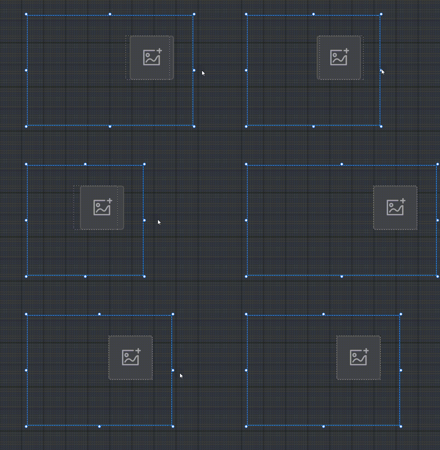
- Fully-justified No matter how the parent changes, the UI widget remains the same distance to the left and right, and the size changes Diagram:
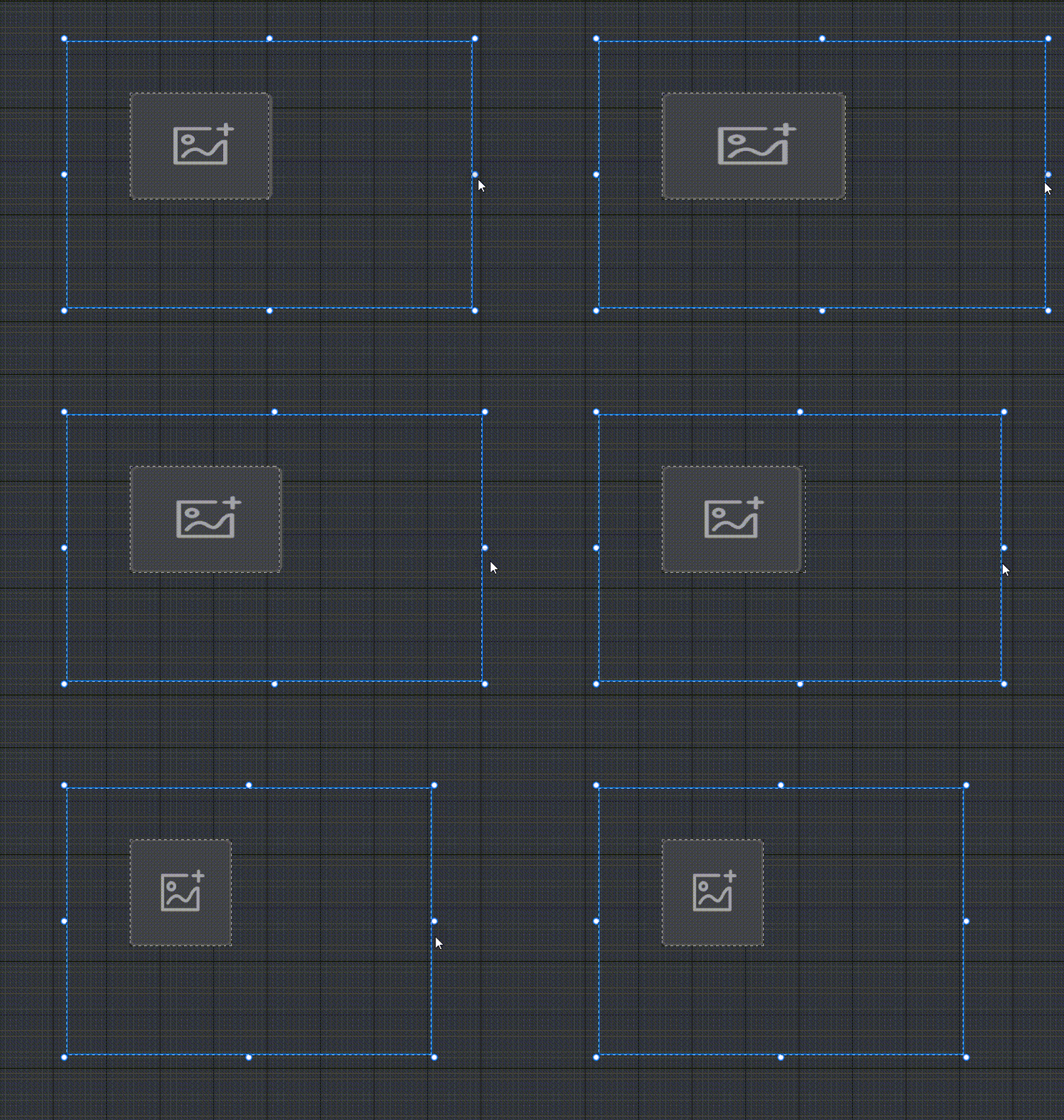
- Center aligned No matter how the parent changes, horizontally the UI widget remains the same relative distance from the parent's center position and the same size Diagram:
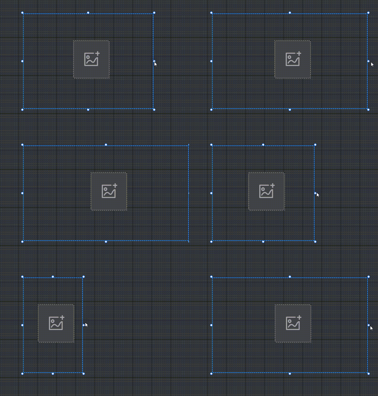
- Adaptive Horizontal, UI widgets are sized according to a ratio of changes that will adapt to changes in the parent Diagram:
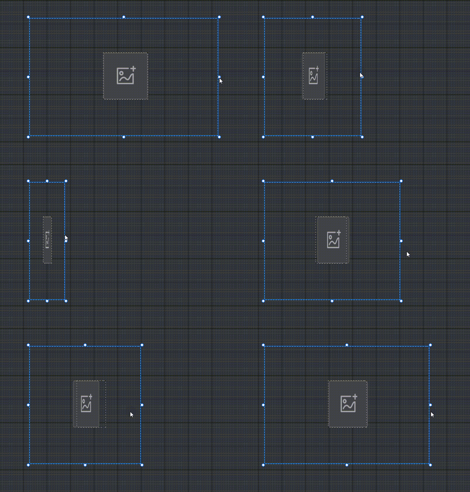
Vertical direction
- Align Top No matter how the parent changes, the UI widget remains the same distance from the top margin and the same size Diagram:
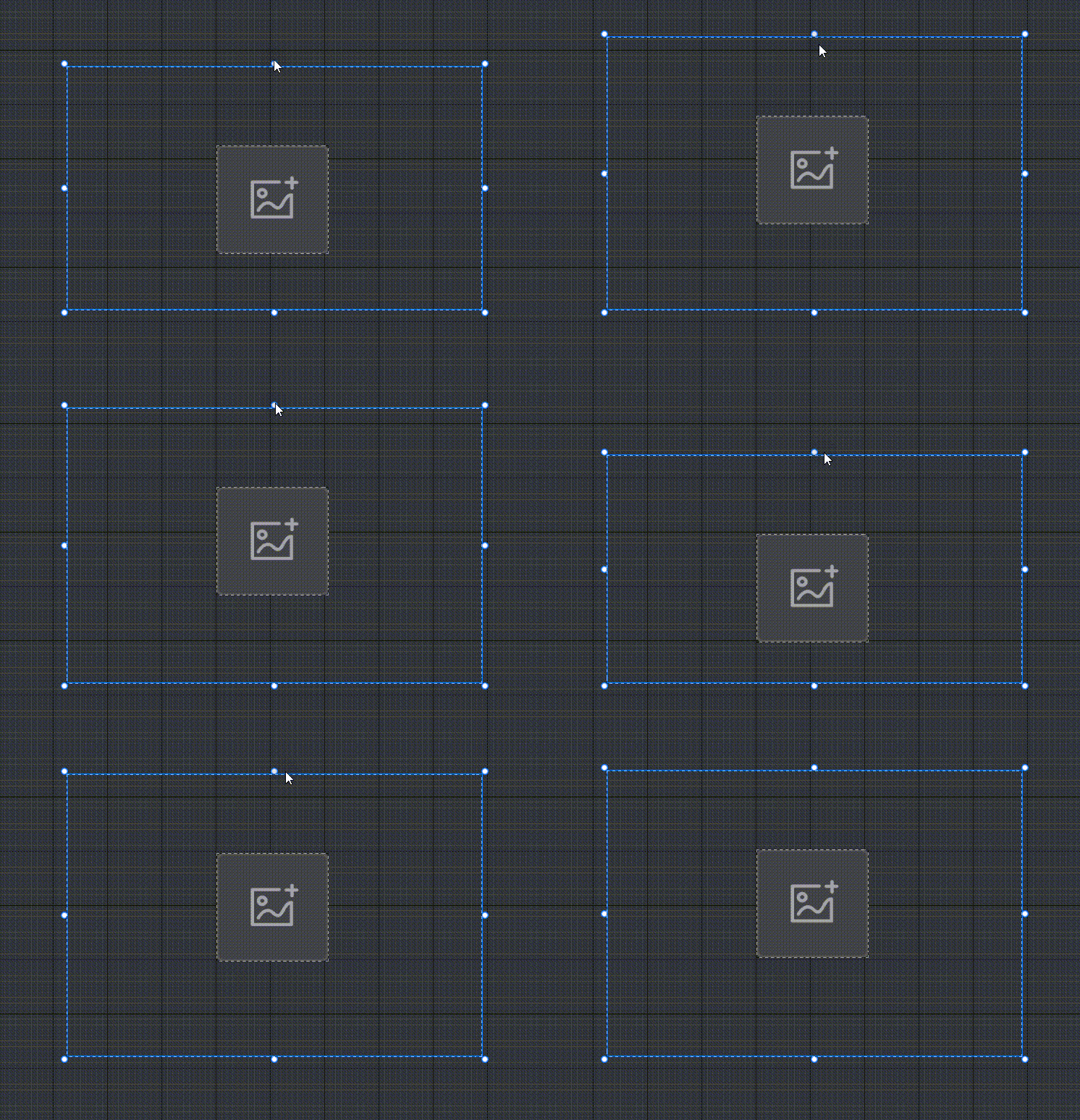
- Align Buttom No matter how the parent changes, the UI widget remains the same distance from the lower margin and the same size Diagram:
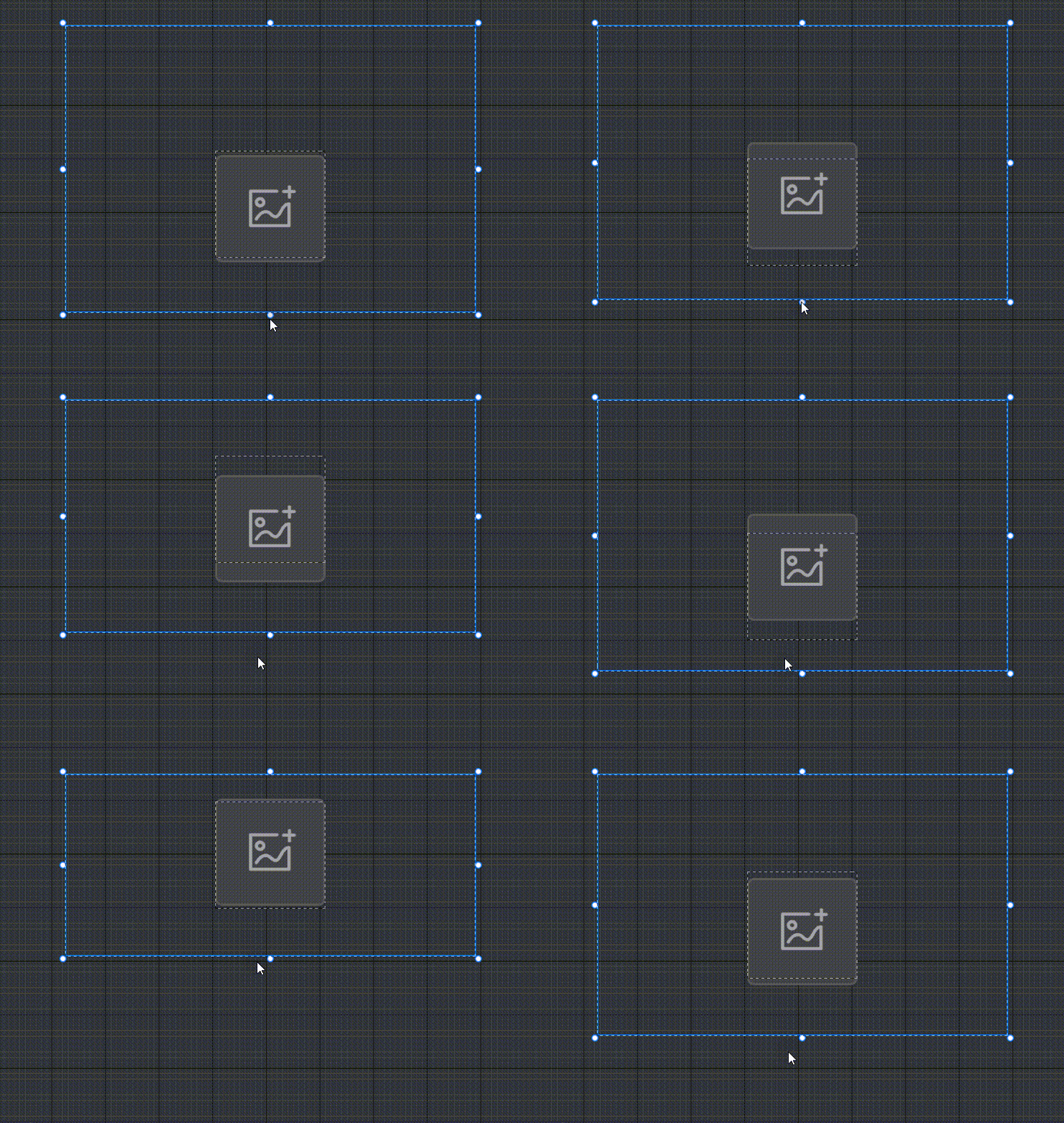
- Align up and down No matter how the parent changes, the UI widget remains the same distance from the top and bottom margins, and the size changes Diagram:
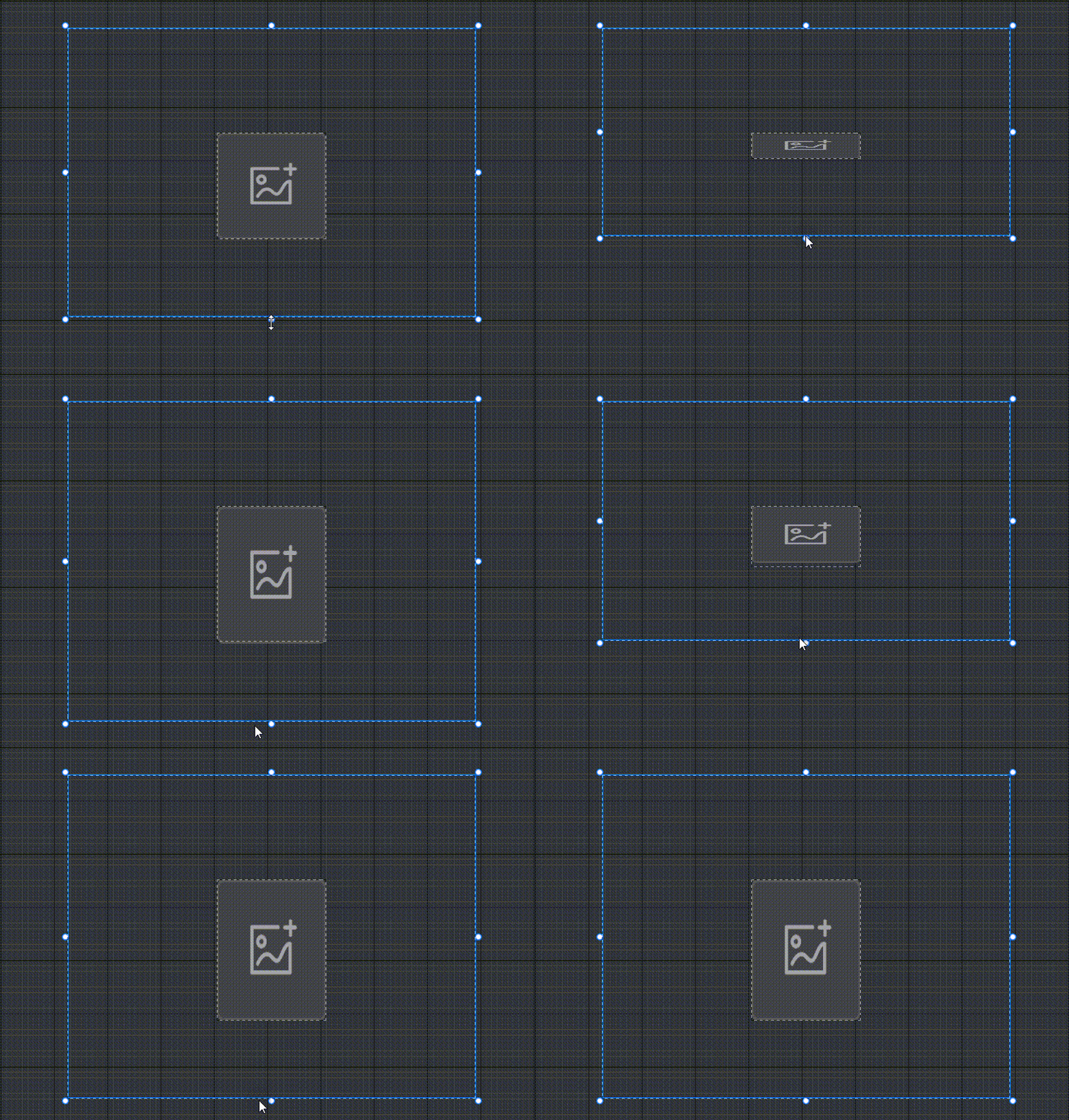
- Center aligned No matter how the parent changes, the UI widget remains the same relative distance from the parent's center position in the vertical direction and the same size Diagram:
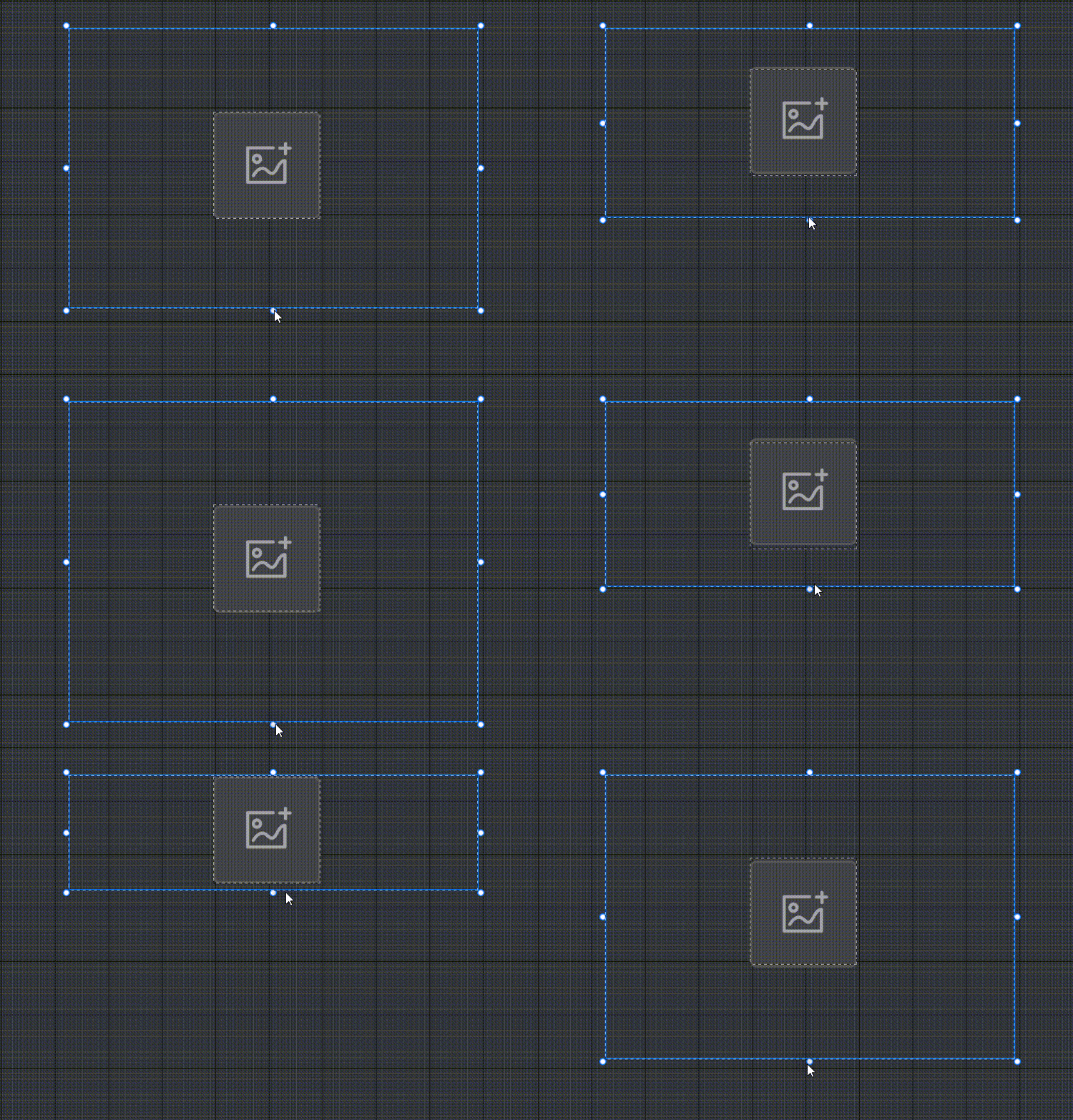
- Adaptive Vertically, UI widgets are sized based on a ratio of changes that will adapt to changes in the parent, Diagram:
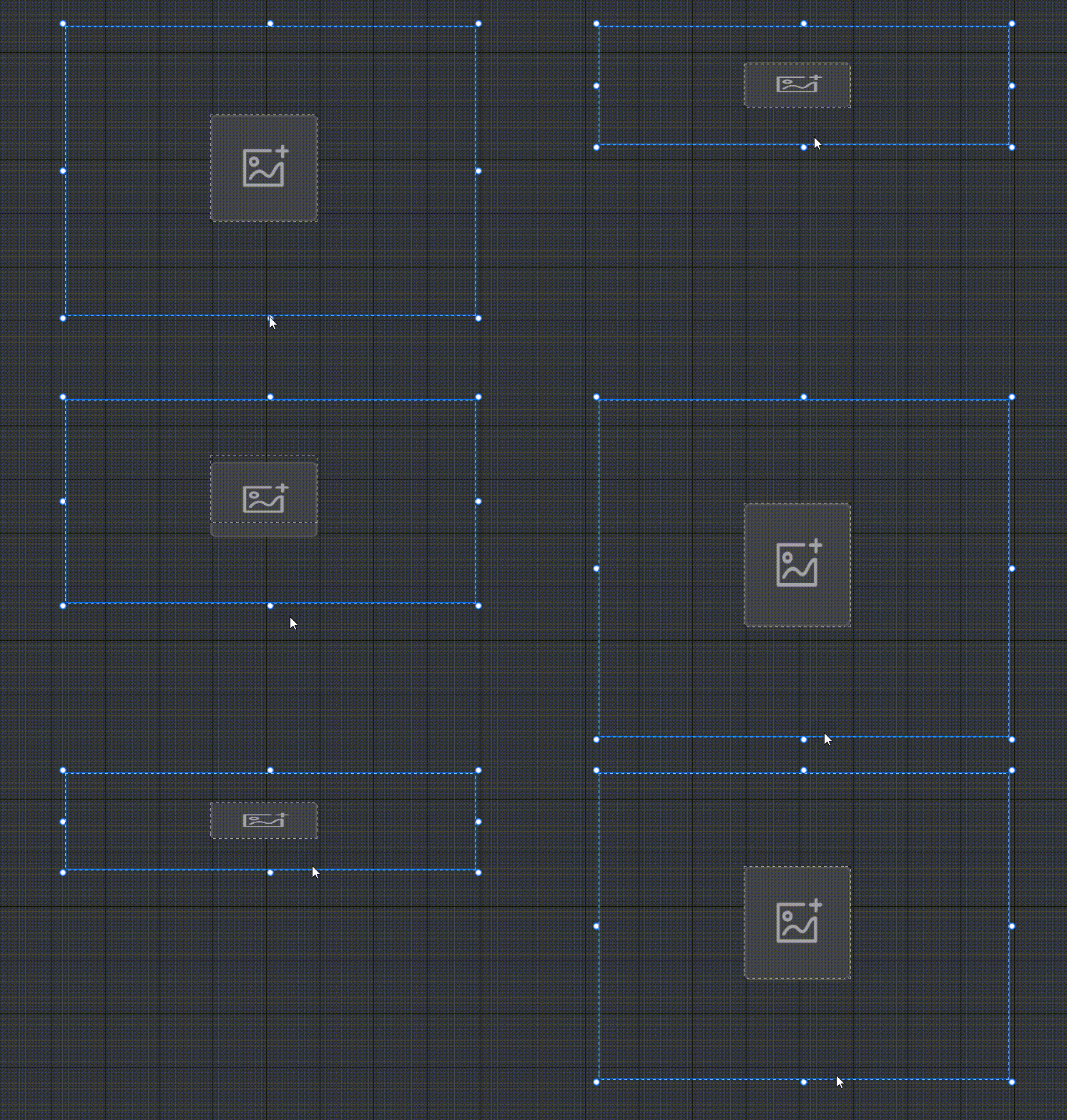
Example: How to align usage:
- If you want the size of the joystick/camera controls to change automatically in ratio to the Player screen, the recommended align of the joystick/camera controls = adaptive
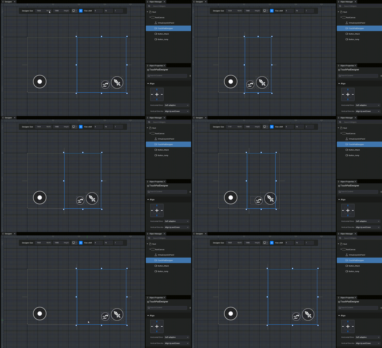
General
Name
- The name of the UI widget that the user can easily call in scripts.
// Find the corresponding button
let btn = this.uiWidgetBase.findChildByPath('Canvas/btn') as Button
// Find the corresponding button
let btn = this.uiWidgetBase.findChildByPath('Canvas/btn') as ButtonInteractable
Whether UI widgets can be modified interactively with the user;
- When set to unavailable, the widget enters disabled mode and the appearance changes according to the relevant settings in disabled mode.
- Whether available or not, all actions cannot penetrate the UI widget when its visibility is visible
Visibility
Visible (Visible)
- visible and allows click interaction
Collapsed
- Invisible, no layout space, no click interaction
Hidden
- Invisible, occupying layout space, no click interaction
Visible Non-Interactive (HitTestInvisible)
- Visible, but no click interaction and no click interaction for child objects in the layer, all actions penetrate this widget and its child objects
Visible Non-Interactive Only (SelfHitTestInvisible)
- Visible, but not click, but does not affect click interaction with child object in the layer, all actions penetrate this widget
Rendering
Rendering property are displacements and deformations made against UI widget when the layout space of the UI widget remains the same.
- UI widgets that modify rendering shear, rendering scale, rendering offset will not be able to use the UI editor's align helpline feature
Render Anchor
- Render anchor is the center point position against which the UI widget deforms and displaces.
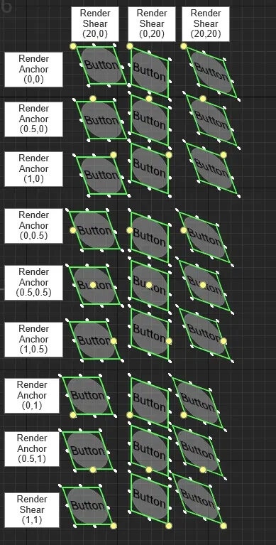
Rendering shear
- Horizontal and vertical tilt centered on the rendering anchor
- Diagram:
Render Scale
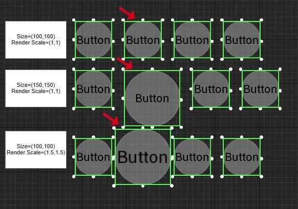
- Scale UI widgets centered around rendering anchors.
- Example Description: After placing a UI widget in a Container and making an automatic layout, if you modify the size of the Transform, the automatic layout will change according to the changes in the drawing, and if you modify the rendering scale, the automatic layout will not change.
- Union example description:
rendering transparent
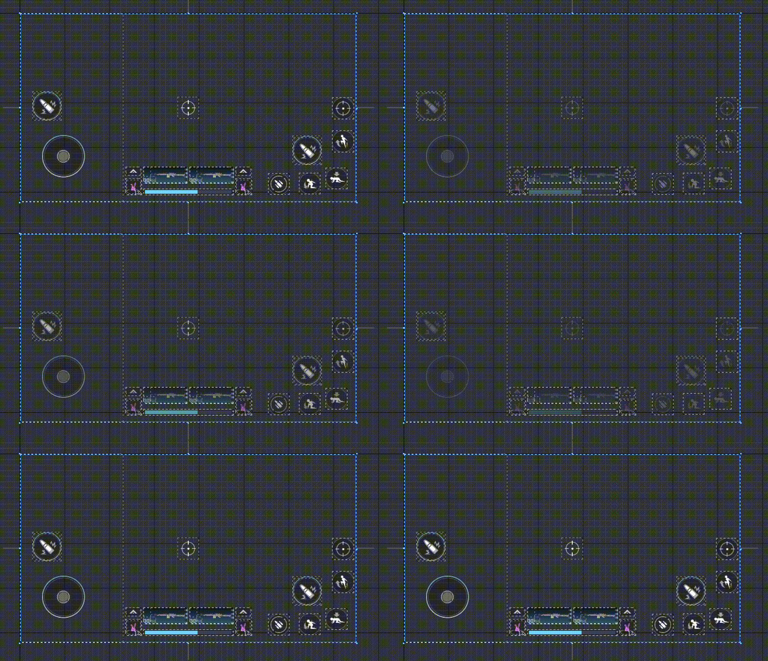
- Render transparency is primarily used to unify the processing of grouped UI widgets for ease of operation and management.
- Example Description: Reduces all UI widget opacity within the Container to fully transparent and still interactive
- Diagram:
Render Offset
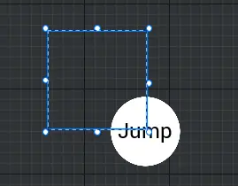
- Render offsets are primarily used to set the relative position of rendered graphics to UI widgets.
Render Blank Size
- Render Blank Size primarily sets the relative size of the rendered graph to the UI widget.
- Union Example Description: Make a button whose clickable range is different in size and position from the actual rendering.
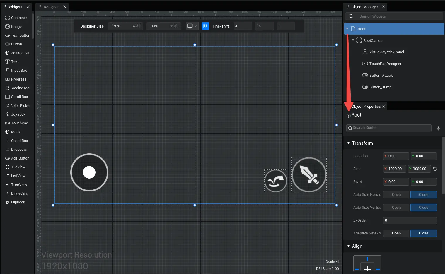
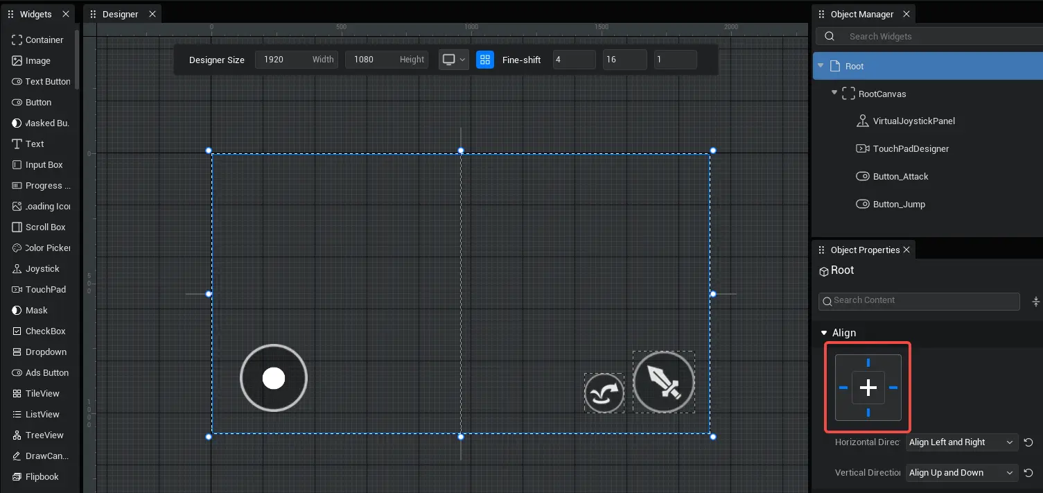
Overall properties of UI file (custom UI) - Root properties
- After opening a UI file, select Root in Object Manager, you can modify the overall properties of this UI file in the Object Properties panel
Transform/Align/Generic/Render
The properties of these four groupings are used in exactly the same way as the properties of the previous four groupings of a single UI widget.
For example, modifying Root's rendering transparency is modifying the overall rendering transparency of this UI file
In addition to the property panel, you can find UIScript.uiWidgetBase or UIObject.uiWidgetBase in the script to find the Root node of the corresponding UI object, and then modify the overall properties of the UI object, uiWidgetBase exactly corresponds to the Root in the property panel
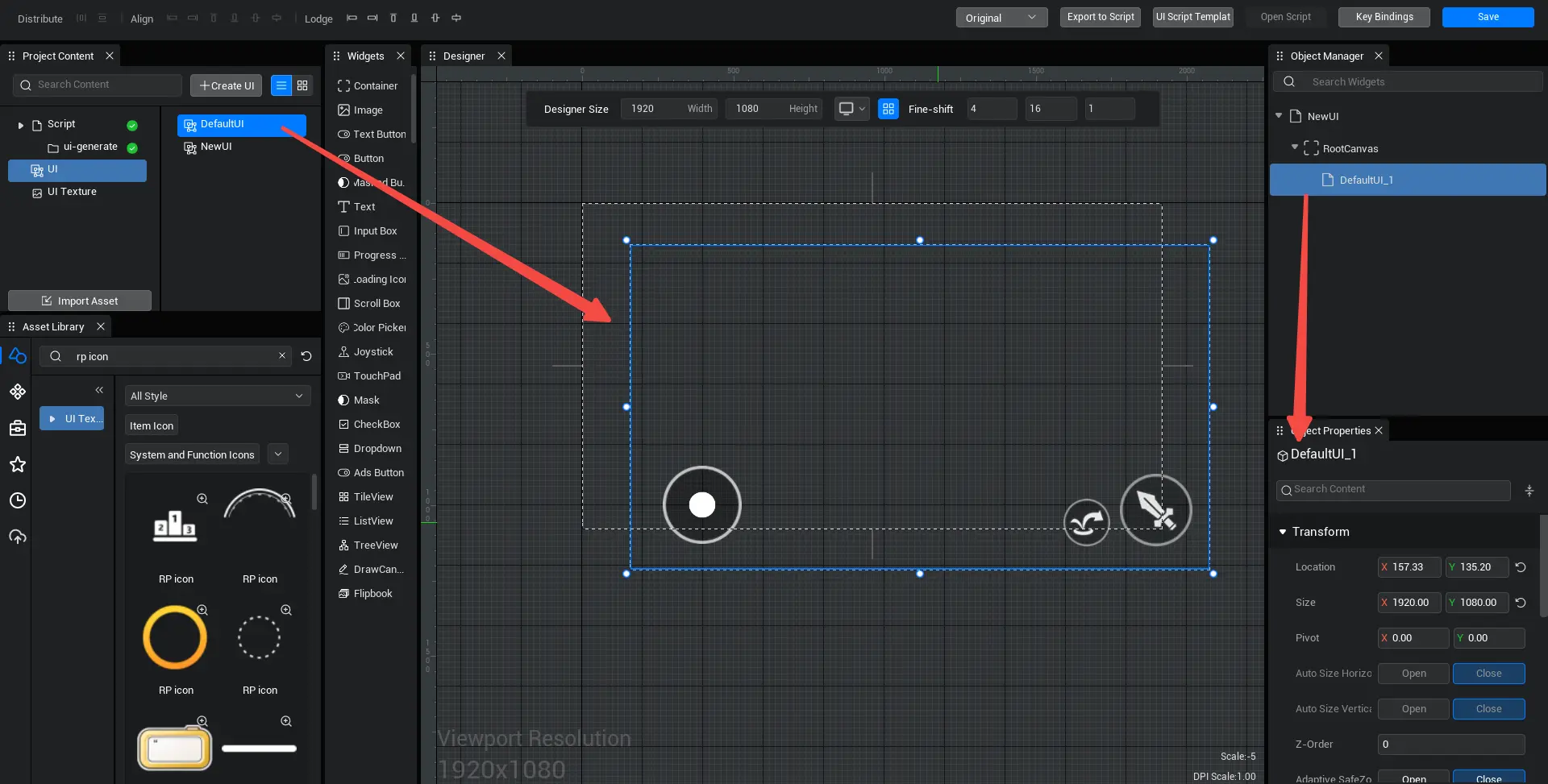
UI files can also be used as customized UI widgets (i.e. UserWidgets), dragged into other UI files in the UI editor or dynamically added to other UI objects in scripts. The four grouped properties of root within the UI file are automatically applied to the newly created customized UI widget; that is, the properties of root of the UI file need to be modified only once, not set every time a custom UI is created
Here is a separate introduction to the use of Root align attributes, which is harder to understand and more prone to problems:
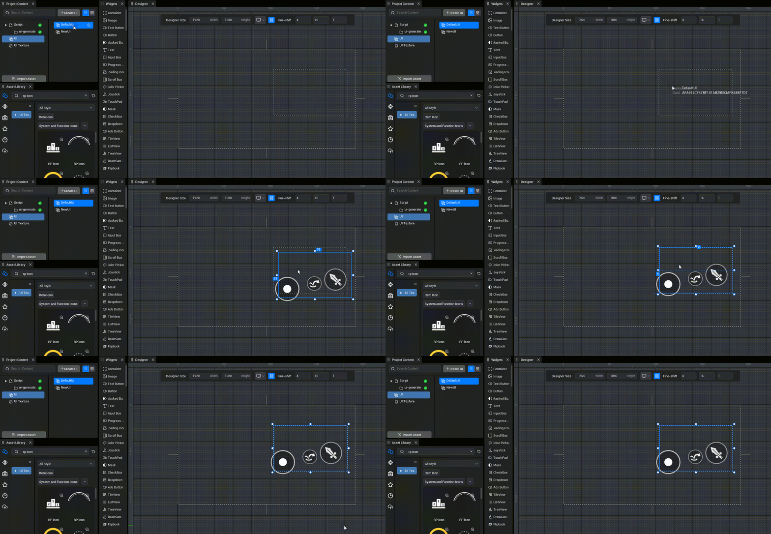
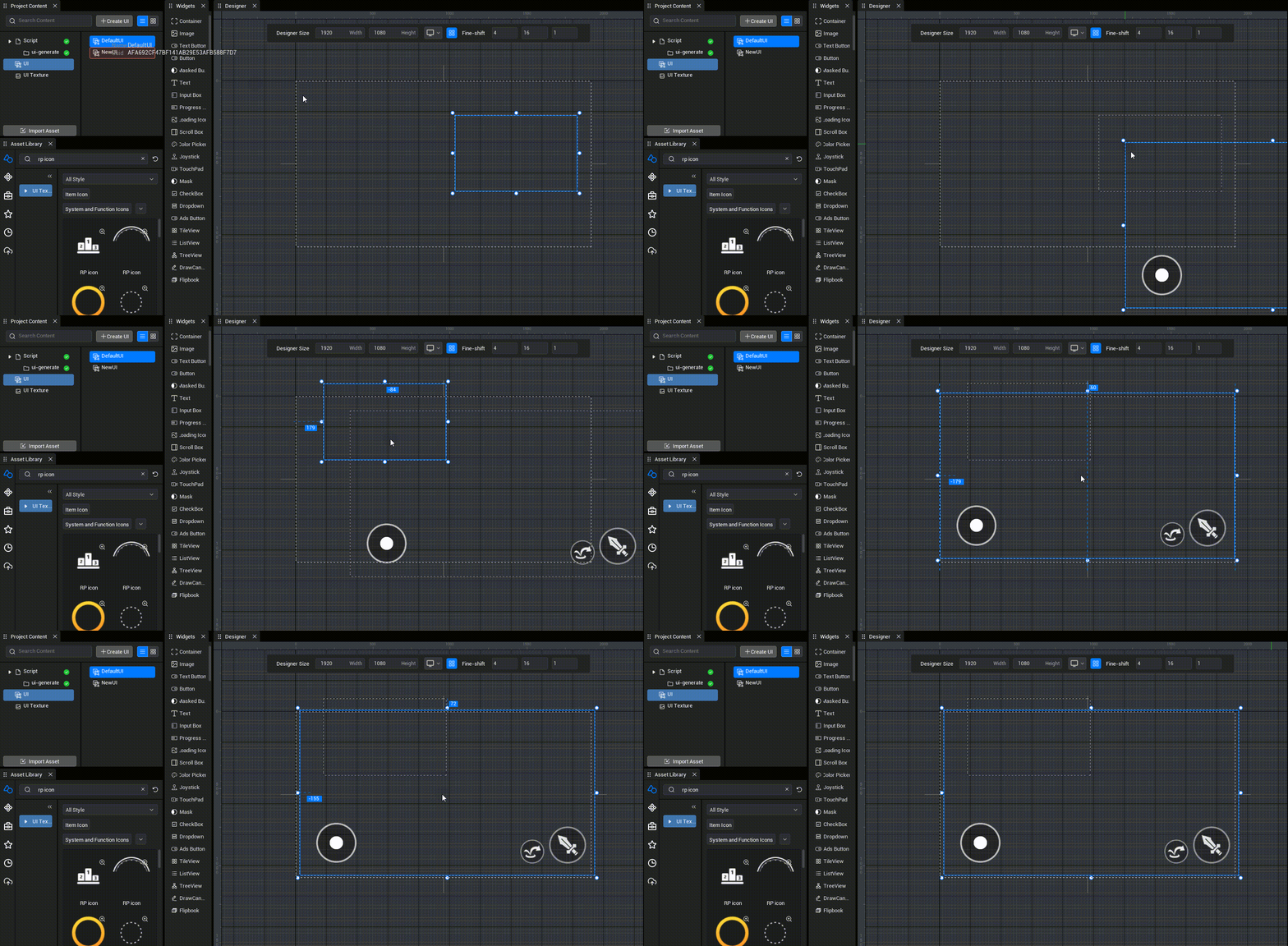
When a custom UI widget is newly created with a UI file, the bottommost design dimension within the original UI file is treated as an old Container, and the position and size of the created customized UI widget is determined based on the size and position of the new parent Container when it was created, and how the customized UI widget aligns (that is, the align property in the UI file Root)

Each widget inside the newly created customized UI widget still determines size and position from the top down based on how the widgets align
TIP
Please pay attention to this. The new UI file root is set to align up and down + fully-justified by default. This is for the UI file to adapt Player device size ratios when used as a full-screen HUD. But if this UI file is used as a customized UI widget and you don't want the size and position of the customized UI widget to adaptively change with the parent (like making a grid in a bag), be sure to set the UI file root to align left + align up!

TS script
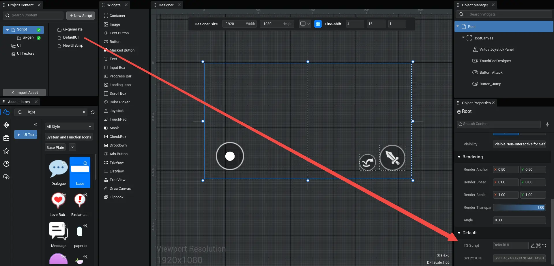
- Used to set the UI script bound by the current UI file, you can drag the UI script you want to bind here to complete the binding
TIP
In this UI file, a UI script is bound; When this UI file is added to the experience screen as a UI object, or to an existing UI object as a customized UI widget, the logic in this UI script is executed.
- In addition to being able to complete bindings by dragging and dropping them in the editor, there are two other uses of binding UI scripts to UI objects in scripts:
- 1. Use UIBind decorator
- First, use the UIBind decorator in the UI script to mark which UI file the UI script belongs to
- Then, run this UI script using UIService.show in another normal script/UI script, this UI file is also added to the experience screen as a UI object
import NewUI_generate from "./ui-generate/NewUI_generate";

@UIBind('NewUI.ui')
 export default class NewUI extends NewUI_generate {
     protected onStart() {
     }
 }
import NewUI_generate from "./ui-generate/NewUI_generate";
@UIBind('NewUI.ui')
export default class NewUI extends NewUI_generate {
protected onStart() {
}
}import NewUI from "./NewUIScript"
@Component
export default class NewScript extends Script {
/** This function is called before the first frame update when the script is instanced */
protected onStart(): void {
UIService.show(NewUI)
}
}import NewUI from "./NewUIScript"
@Component
export default class NewScript extends Script {
/** This function is called before the first frame update when the script is instanced */
protected onStart(): void {
UIService.show(NewUI)
}
}TIP
In this UI script, a UI file is bound; Use the show function to add this UI script to the experience screen, i.e. add the UI file as a UI object to the experience screen
- 2. Create UI with createUI and complete binding simultaneously
In both normal scripts/UI scripts you can use createUI to create UI and bind at the same time and then add to graphics using addToViewport, this method does not require the UIBind decorator
Note: When using createUI, UI scripts and UI file bindings in parameters have the highest priority. If UI scripts in createUI parameters bind other UI files with UIBind decorator, other UI files are overwritten. If UI files in createUI parameters mount other UI scripts, other UI scripts are overwritten.
import NewUI from "./NewUIScript"
@Component
 export default class NewScript extends Script {

     /** This function is called before the first frame update when the script is instanced */
     protected onStart(): void {
         let newui=createUI('NewUI.ui',NewUI) as UIScript
         newui.uiWidgetBase.addToViewport (0)
     }
 }
import NewUI from "./NewUIScript"
@Component
export default class NewScript extends Script {
/** This function is called before the first frame update when the script is instanced */
protected onStart(): void {
let newui=createUI('NewUI.ui',NewUI) as UIScript
newui.uiWidgetBase.addToViewport (0)
}
} Editor Doc