UI widget-Text
It takes about 10 minutes to read this article
This article provides an overview of the various properties and instructions for using the UI widget—text.
What is text?
Text is the most basic UI widget, which is used to display text in 2D plane mode. The text content can be replaced.
- Transform/Align/General/Rendering properties can be found in the basic properties of UI widgets
text attribute-text
text
- Modify text content
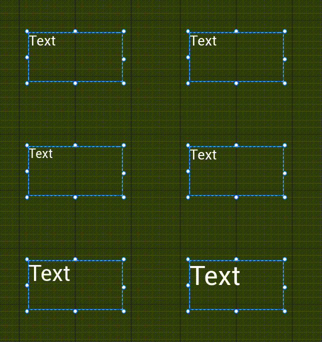
Font size
- Modify the font size of the text
- Diagram:
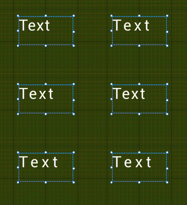
font spacing
- Modify the spacing between the text
- Diagram:
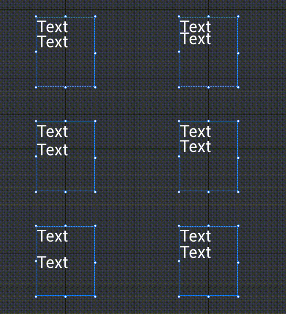
Row spacing coefficient
- Modify the spacing distance between each line
- Diagram:
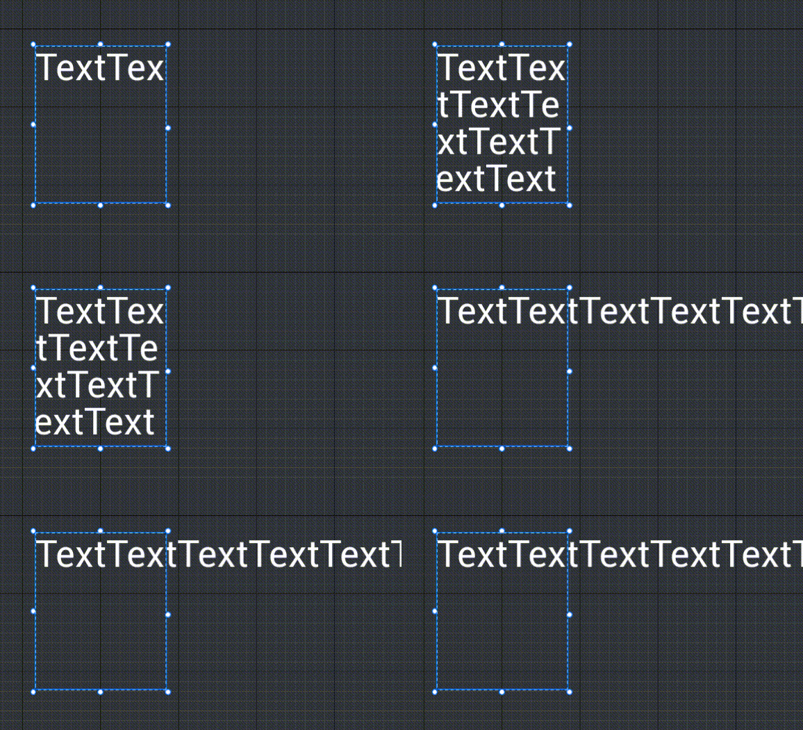
horizontal display
This property is used to modify the line break strategy to be used.
autowrap
- Automatically calculate according to the size of the text box and the content characters, and wrap the content that overflows the control boundary.
Clipping
- Content that does not autowrap and overflows the control boundary will be clipped.
No Clipping
- Will not autowrap, and content that overflows the control boundary will not be clipped.
Auto Adjust
After enabling, the current text content and the size of the text control will be automatically calculated to determine the most suitable "font size" for the current text control, filling the entire text box as much as possible, while the size of the text box will not change.
When the Adaptive Text Box is enabled, the Font Size cannot be adjusted manually, nor can the Transform - Auto Size be used.
The calculation of the {adaptive text box} does not take into account the {font outline width}, {shadow offset}, {font spacing}, and {line spacing coefficient}.
- When non-default values for {font spacing}, {line spacing coefficient}, and {adaptive text box} are used simultaneously, it may cause the text to exceed the text box, so please do not use them at the same time.
- 【Font Outline Width】The outline width is small or the 【Shadow Offset】 offset value is small, it will not exceed the text box, and can be used simultaneously.
After turning off the {adaptive text box} function, it will revert to the {font size} before enabling adaptation.

- [Maximum font size] and [Minimum font size]
- When the {adaptive text box} is enabled, if the calculated adaptive font size is greater than the {maximum font size}, the maximum font size is used; if the calculated adaptive font size is less than the {minimum font size}, the minimum font size is used; if the calculated adaptive font size is between the two, the calculated adaptive font size is used.
- It is recommended that text boxes of the same size in the same batch can be uniformly set to a {maximum} font size.
text attribute-style
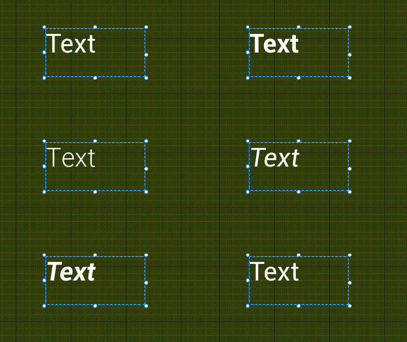
Glyph
- Modify the font of the text. Currently, the default font supports six English font styles (regular/bold/light/italic/bold italic/extra bold) and four Chinese font styles (regular/bold/light/extra bold).
- Diagram:
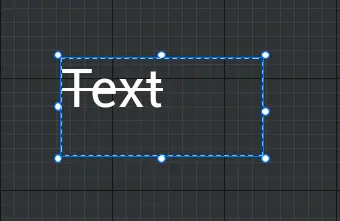
strikethrough
- Modify the text to see if it adds a strikethrough
- Diagram:
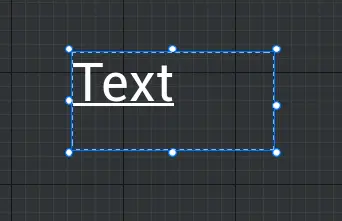
Underline
- Modify whether the text is underlined
- Diagram:
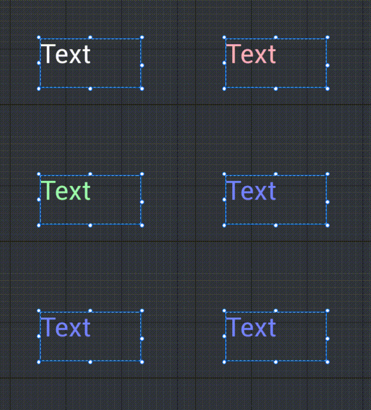
Font color
- Modify the font color of the text
- Diagram:
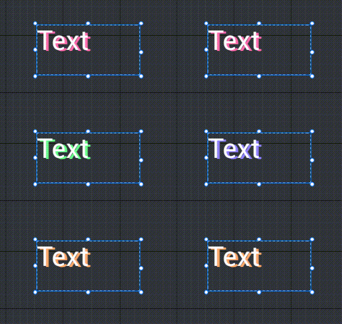
Shadow color
- Modify the shadow color of the text to highlight the three-dimensional effect of the text.
- Diagram:
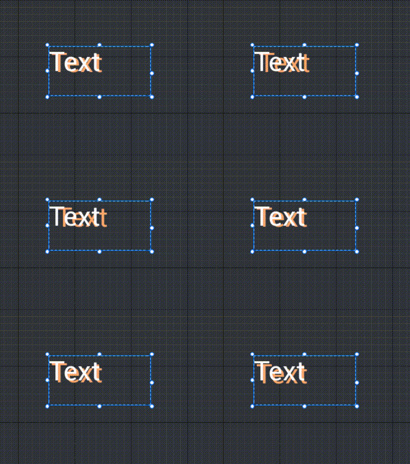
Shadow offset
- Modify the relative position of the text shadow
- Diagram:
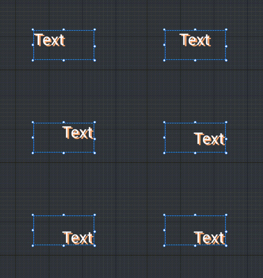
horizontal alignment
Left align
- The text content is aligned to the left side of the text box horizontally.
Center align
- The text content is aligned to the center horizontally in the text box.
Align right
- The text content is aligned to the right side of the text box horizontally.
vertical alignment
Top align
- The content of the text is aligned to the top side of the text box in a vertical direction.
Center align
- Align the text content to the middle of the text box vertically.
align bottom
- The text content is aligned to the bottom side of the text box in the vertical direction.
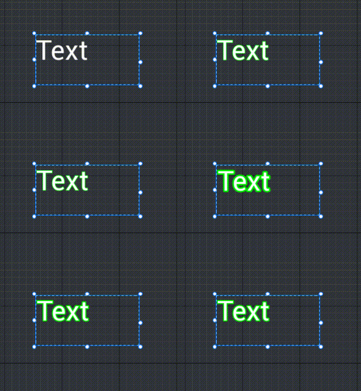
Diagram:
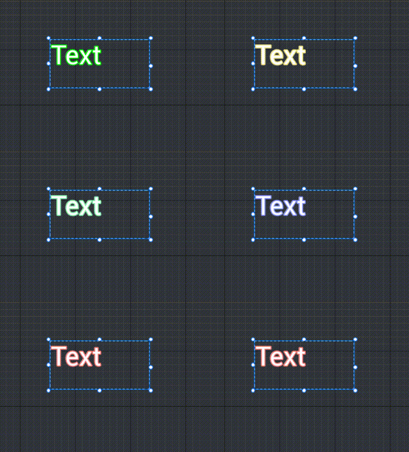
Text outline color
- Modify the color of the font outline.
- Diagram:
Text outline width
- Modify the width of the font outline.
- Diagram:
How to use text?
- The text widget is one of the more basic UI widgets. Unlike buttons, it does not have interactive functions such as click. Text is mainly used for description and introduction.
- Example description: interface title, announcement description, floating blood numbers, etc.
Example 1: Create a display of character speed
- First, we create a UI and drag in a text control. After saving, drag into the object list of the main editor to generate the UI.
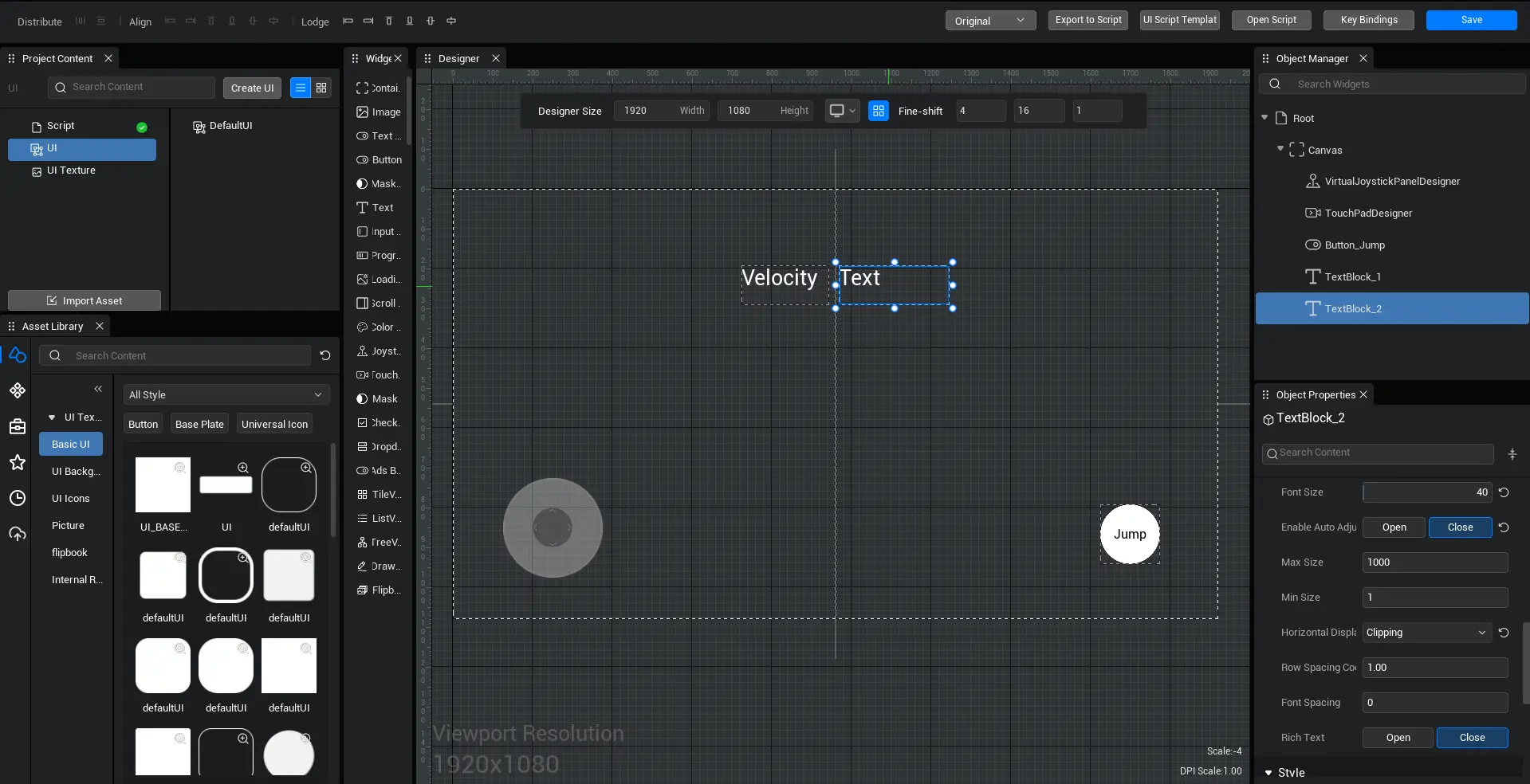
- Then we start writing the logic of the script, find the current character and get the character's speed.
- Let's create another script to find our UI text control, accept the speed event above, and display the obtained character speed on the text control. Finally, drag this script into the Root directory to complete the binding with the UI.
- Example script:
@UIBind('')
export default class DefaultUI extends UIScript {
	private character: Character;
	private anim1 = null;

	/** Only call non-TEMPLATE instances once during experience time */
  protected  onStart() {
		// Set whether onUpdate can be triggered every frame
		this.canUpdate = true;
	}
	/**
	Call every frame
	* You can enable or disable the call through canUpdate
	* dt The time difference between two frame calls, milliseconds
	*/
	protected onUpdate(dt :number) {
		const textBlock = this.uiWidgetBase.findChildByPath('Canvas/TextBlock_2') as TextBlock
	// Find the current player character
	Player.asyncGetLocalPlayer().then((player) => {
		this.character = player.character;
		textBlock.text=	Math.sqrt(Math.pow(this.character.velocity.x,2)+Math.pow(this.character.velocity.y,2))+""
	});
	}
}@UIBind('')
export default class DefaultUI extends UIScript {
private character: Character;
private anim1 = null;
/** Only call non-TEMPLATE instances once during experience time */
protected onStart() {
// Set whether onUpdate can be triggered every frame
this.canUpdate = true;
}
/**
Call every frame
* You can enable or disable the call through canUpdate
* dt The time difference between two frame calls, milliseconds
*/
protected onUpdate(dt :number) {
const textBlock = this.uiWidgetBase.findChildByPath('Canvas/TextBlock_2') as TextBlock
// Find the current player character
Player.asyncGetLocalPlayer().then((player) => {
this.character = player.character;
textBlock.text= Math.sqrt(Math.pow(this.character.velocity.x,2)+Math.pow(this.character.velocity.y,2))+""
});
}
}- Diagram:

 Editor Doc