UI control-Input Box
It takes about 10 minutes to read this article
This article provides an overview of the property of UI controls—Input Box.
What is the Input Box?
The Input Box is a UI widget for entering text or text information. It can obtain the player's input and dynamically modify the text information in the corresponding widget in the experience.
Input box property - text
Input limits
- Limit the number of characters you can enter. If the input limit is exceeded, the excess characters will not be displayed.
- For example description Entering a experience character's name usually does not exceed 8 characters.
default text
- This is placeholder text. When the content of the input box is empty, the text content displayed by default is displayed in the input box widget, and the font color is light gray. As the user enters text, that default text disappears.
text
- Enter the corresponding text content, which is displayed in the input box widget.
Read only
- Whether this text input box can be changed; if checked, it is set to read-only and cannot be changed
Input box property - style
Content color
- Change the color of the input bottom box.
Input box property - content restrictions
Content restrictions
unrestricted
- There are no input restrictions
integer limits
- only integers can be entered
Decimal limit
- only decimals can be entered
support numbers and characters
- support can enter characters and numbers
Password restrictions
- support can enter characters and numbers, but when entered, they are displayed as a “ * ” symbol.
How to use the input box?
- For example description personal signatures, chat input, store input quantity purchases, etc. all require input box widget.
Example 1: Create a redemption code interface
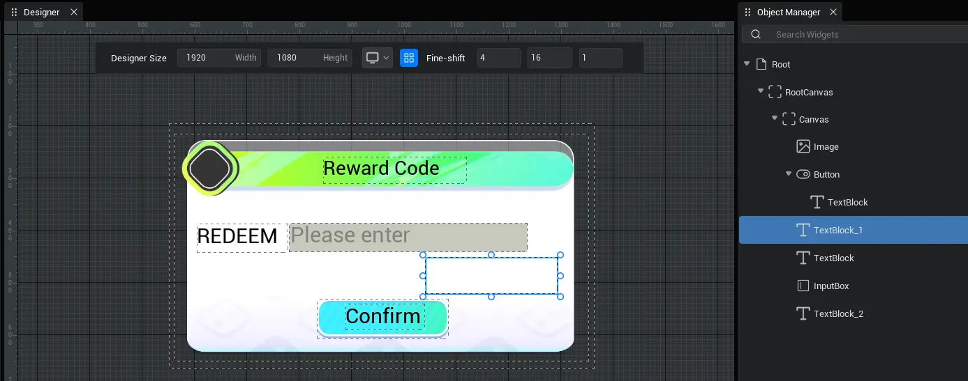
- First, we need to make a panel, and then place UI widget such as Input Box on the panel, as shown in the image.

- The UI is then bound to the script. Then write the script.
- Example script:
ts
export default class NewUIScript extends UIScript {

    isExchange:Boolean;
    //How to create a successful or failed exchange prompt: The criteria for determining whether the exchange was successful?
    Tips (tipsText: TextBlock) {
        //If the exchange is successful, the exchange is successful; if the exchange fails, the exchange code error is displayed
        this.isExchange? tipsText="Redemption successful”: tipsText="Bad redemption code”;
        //If the exchange is successful, the text is displayed in green; if the exchange fails, the text is displayed in red
        this.isExchange? tipsText.setFontColorByHex("00EA3FFF") : tipsText.setFontColorByHex("EA2400FF")
        //The prompt text is displayed for 2 seconds and then disappears
        setTimeout(() => {
            tipsText.visibility=2;
        }, 2000);
        tipsText.visibility=0;
    }

    /**
     * After the UI file is successfully constructed, it is first initialized at the right time
     */
    protected onStart() {
        //Set whether onUpdate can be triggered every frame
        this.canUpdate = false;
         //find the corresponding text component
        let text = this.uiWidgetBase.findChildByPath('RootCanvas/Canvas/InputBox') as InputBox
        let confirmBtn = this.uiWidgetBase.findChildByPath('RootCanvas/Canvas/Button') as Button
        let tipsText = this.uiWidgetBase.findChildByPath('RootCanvas/Canvas/TextBlock_1') as TextBlock

        //After press confirm button, check whether the verification code is correct
        confirmBtn.onPressed.add(() => {
            if (text.text == "111111") {
                //Successful redemption
                this.isExchange = true
            }
            else{
                //Exchange failed
                this.isExchange = false
            }
            //How to execute successful or failed exchange reminders
            this.Tips (tipsText)
        });
    }
}
export default class NewUIScript extends UIScript {
isExchange:Boolean;
//How to create a successful or failed exchange prompt: The criteria for determining whether the exchange was successful?
Tips (tipsText: TextBlock) {
//If the exchange is successful, the exchange is successful; if the exchange fails, the exchange code error is displayed
this.isExchange? tipsText="Redemption successful”: tipsText="Bad redemption code”;
//If the exchange is successful, the text is displayed in green; if the exchange fails, the text is displayed in red
this.isExchange? tipsText.setFontColorByHex("00EA3FFF") : tipsText.setFontColorByHex("EA2400FF")
//The prompt text is displayed for 2 seconds and then disappears
setTimeout(() => {
tipsText.visibility=2;
}, 2000);
tipsText.visibility=0;
}
/**
* After the UI file is successfully constructed, it is first initialized at the right time
*/
protected onStart() {
//Set whether onUpdate can be triggered every frame
this.canUpdate = false;
//find the corresponding text component
let text = this.uiWidgetBase.findChildByPath('RootCanvas/Canvas/InputBox') as InputBox
let confirmBtn = this.uiWidgetBase.findChildByPath('RootCanvas/Canvas/Button') as Button
let tipsText = this.uiWidgetBase.findChildByPath('RootCanvas/Canvas/TextBlock_1') as TextBlock
//After press confirm button, check whether the verification code is correct
confirmBtn.onPressed.add(() => {
if (text.text == "111111") {
//Successful redemption
this.isExchange = true
}
else{
//Exchange failed
this.isExchange = false
}
//How to execute successful or failed exchange reminders
this.Tips (tipsText)
});
}
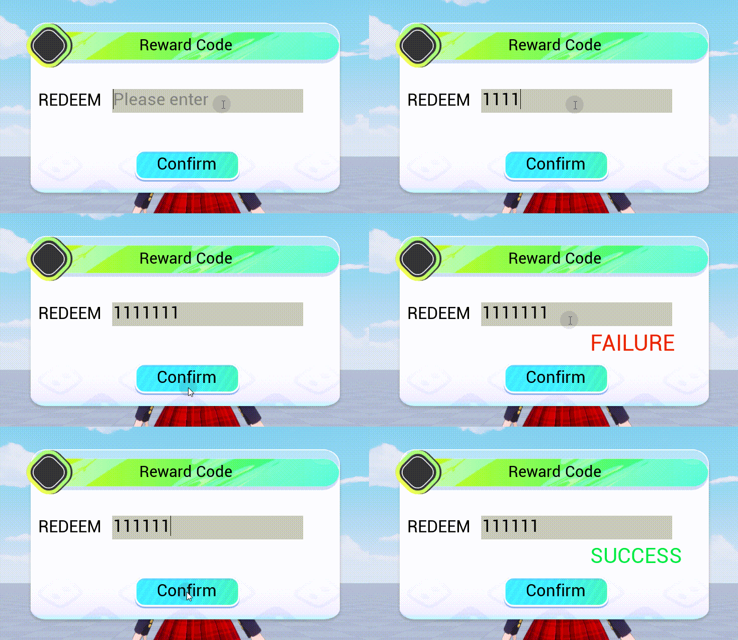
}- Schematic diagram:

 Editor Doc