Main editor window operations
It takes about 30 minutes to read this article.
This article involves a lot of things, it is recommended that users view it in modules. This article outlines the general operations of each window in the editor.
What is the editor window
From the interface perspective, the editor's interface is composed of various windows; From a functional perspective, each window takes on part of the editor's functions. Only by familiarizing oneself with the operations and functions of each window can one create a refined experience.
What does the editor window contain?
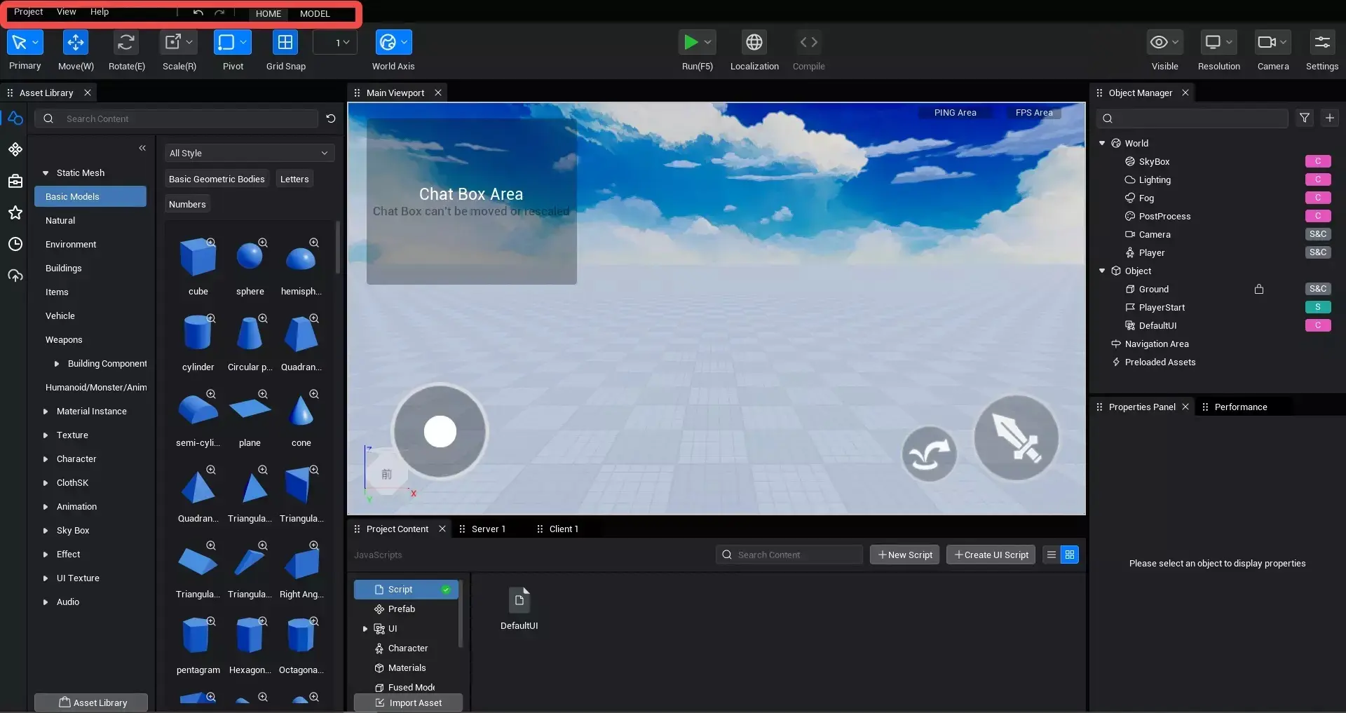
The editor window consists of eight parts: the top tab, menu bar, toolbar, asset library, main viewport, object manager, project content, and property panel.
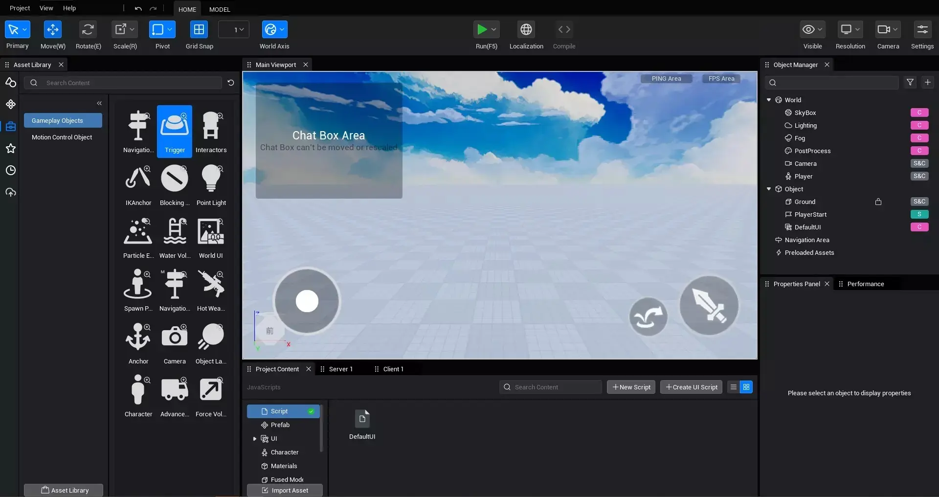
How to use the various windows of the editor
General rules
tabification
except for the menu bar, top tabs, and toolbar, the other five windows support tabbing. Entry: Take the local asset library as an example, click the small yellow corner at the top left of the picture, and the local asset library tab will appear.
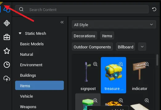
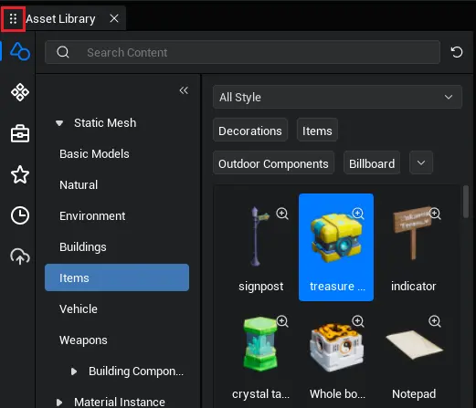
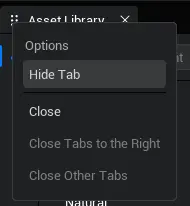
After tabbing, you can drag the window to various positions in the editor, or you can drag it separately to become an independent window. To hide a tab, right-click the tab and click "Hide Tab". Right-click supports closing, closing tabs to the right, and closing other tabs options.
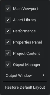
To redo to the initial settings, click the menu bar - View - Redo default settings.
Top Tab

The top tab is different from the tab rules mentioned earlier, and cannot be dragged to the same level as the others. The main editor tab exists and cannot be closed. You can drag the sub-editor to the top tab area to tab the sub-editor.
Menu Bar
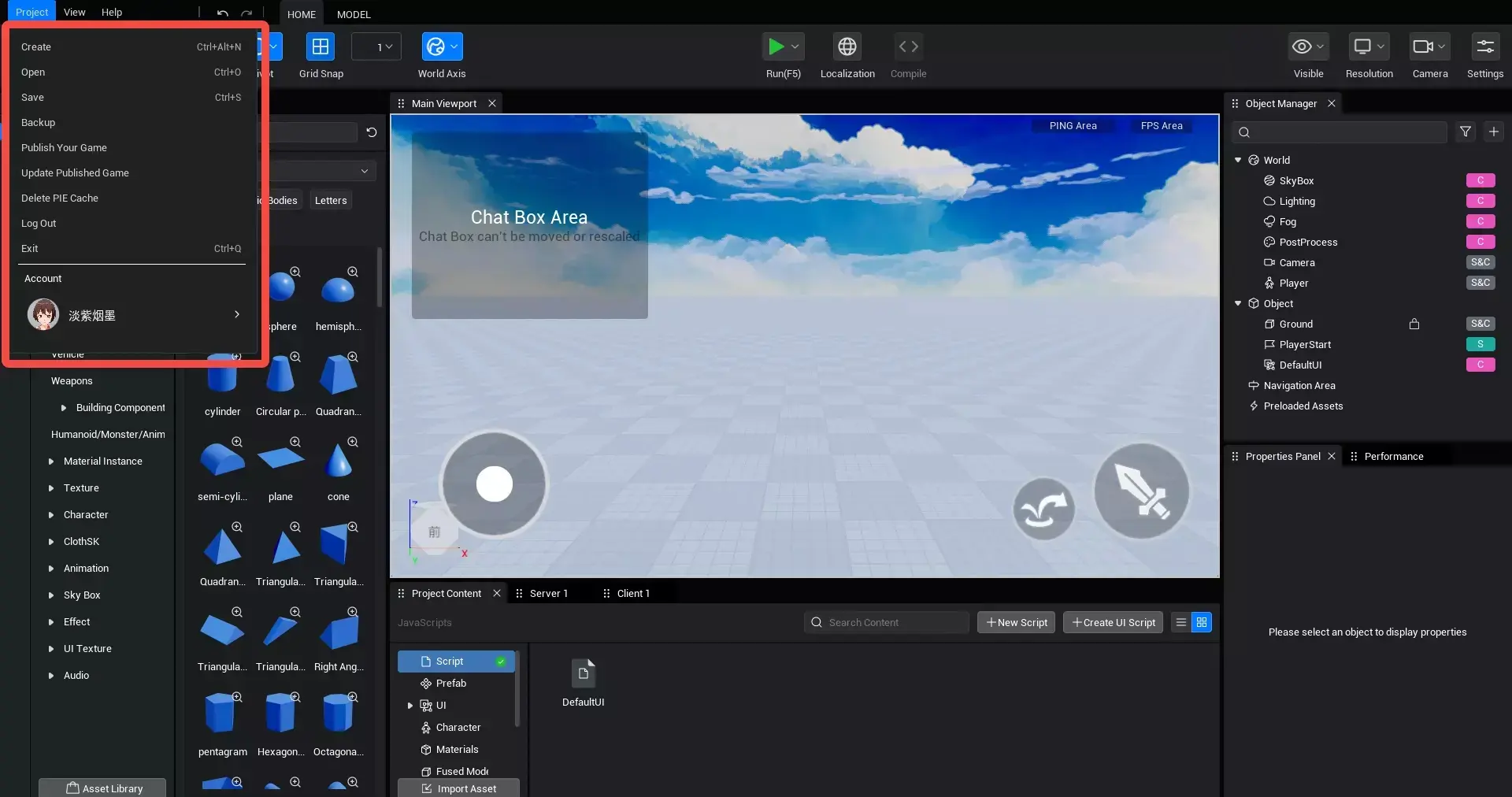
Project
The project menu provides a series of project-related operations; users can create, open, back up, and manage experiences here.
View
Control the display of each window through the use of checkboxes.
Help
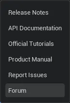
- Update Announcement: Check out the update content of this version
- API document: View the instructions for each API
- Official tutorial: Check out the various tutorials provided by the official source
- Product Manual: View the function and usage of each module and term in the editor
- Forum: View various questions and answers raised by developers
Undo&redo
Regular undo and redo operations, shortcut keys: ctrl+z, ctrl+y

Toolbar
Draw Mode
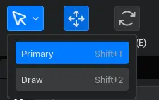
See the Draw Mode document
Transform tool

See the related functions of the Transform tool in the Transform tool document:
Run
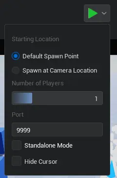
- Click the icon on the left to run the experience locally.
- Click the run dropdown icon on the right to open the run settings interface.
It will run according to the conditions set during execution. Port: The port number during runtime, players on the same port will enter the same space allocated by the server Currently, local operation does not support multi-port operation Single-player mode: After selecting this mode, the number of players can only be 1, and you cannot connect with others. - Player count: Available in non-single-player mode, determines the number of players when running locally. - Starting position: You can choose to run from the default spawn point in the scene (F5) or from the current actual camera position (F6)
Display
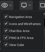
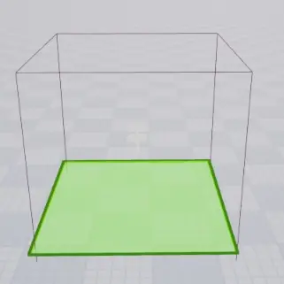
- Navigation Volume Visibility: Whether the specific green area displayed by the "Navigation Volume" logical object is visible in the main viewport.
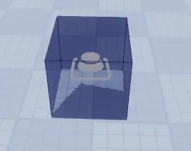
- Hide icons and wireframes: Whether icons and wireframes can be seen in the main viewport; Shortcut key: V
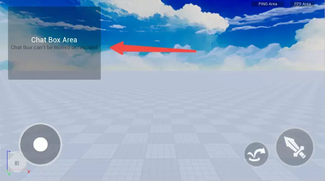
- Chat area visibility: During the editing phase (not after publishing), whether to hide the chat area in the main viewport (the chat area is a general chat function provided by the platform, which is generated by default after the experience is published to the platform)
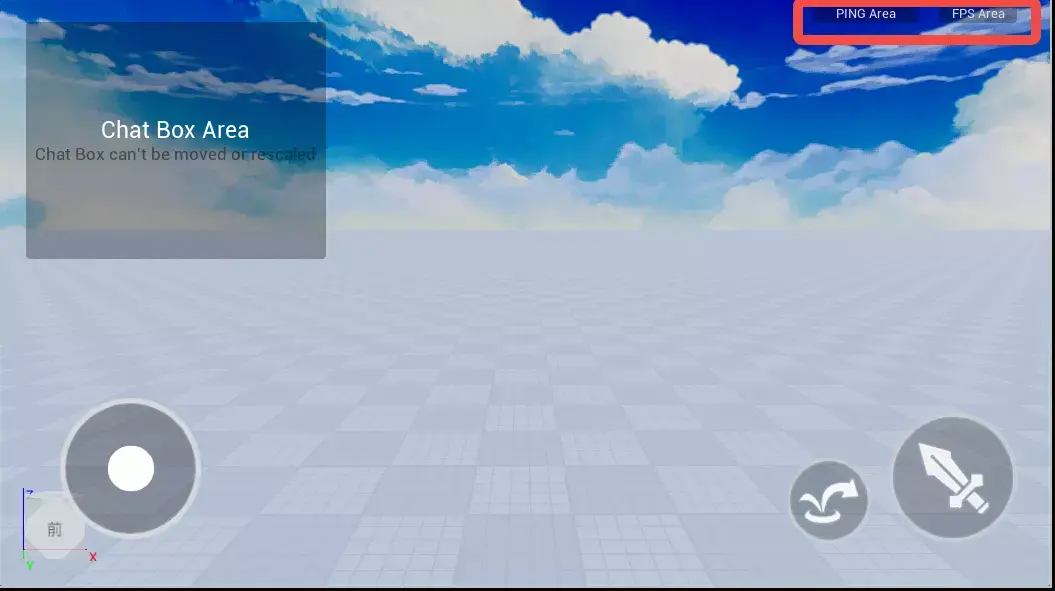
- Ping area and FPS area.
Resolution
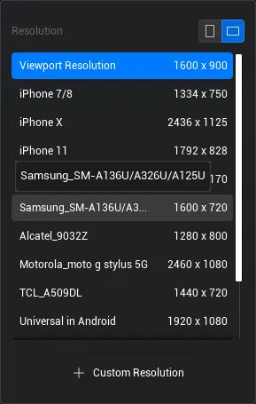
Control the current main viewport/runtime resolution for local test run.
See the Resolution Simulation document
Camera
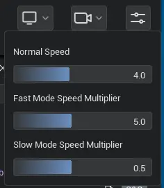
Set the current camera movement speed and acceleration/deceleration ratio using the slider. Normal speed: The speed at which the camera moves when the right mouse button is pressed in the main viewport + WASD. Double Speed Rate: When the right mouse button is pressed in the main viewport +WASD+Shift, the camera accelerates by a multiple; if the value is 2, it is twice the normal speed. Deceleration ratio: When the right mouse button is pressed in the main viewport + WASD + Ctrl, the camera speed is the ratio of the normal speed; for example, if the value is 0.1, it is only 1/10 of the normal speed.
Setting
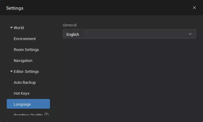
Collision box
Switch: Collision box function in the toolbar

Alignment rules
- bounding box edge align
- When dragging an object, if one side of the bounding box aligns with the bounding box edge of another object, the aligned bounding box edge is displayed in yellow.
- Add a judgment when aligning, the object will unalign from the bounding box edge when the mouse continues to drag a certain distance, allowing further movement.
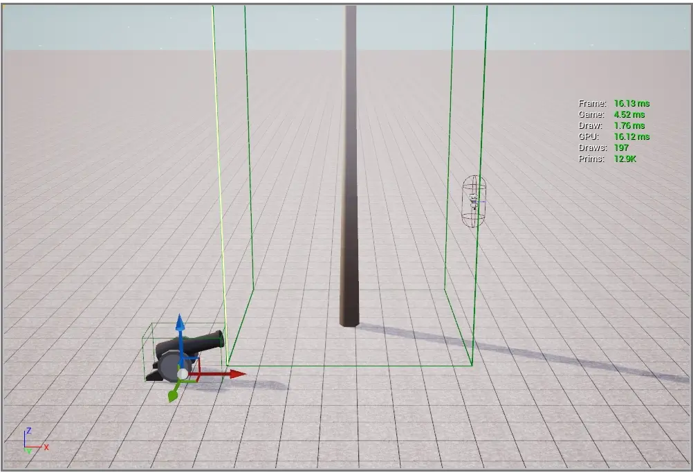
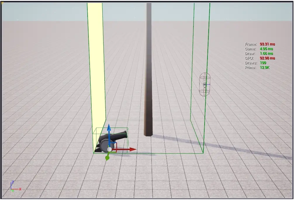
- bounding box surface align
- When dragging an object, if one side of the bounding box aligns with the surface of the bounding box of another object, the aligned bounding box surface will be displayed in yellow.
- Add a judgment when aligning, the object will release the bounding box surface alignment when the mouse continues to drag a certain distance, allowing it to continue moving.
Align Tool
Entry: Toolbar > Model > Align Tool
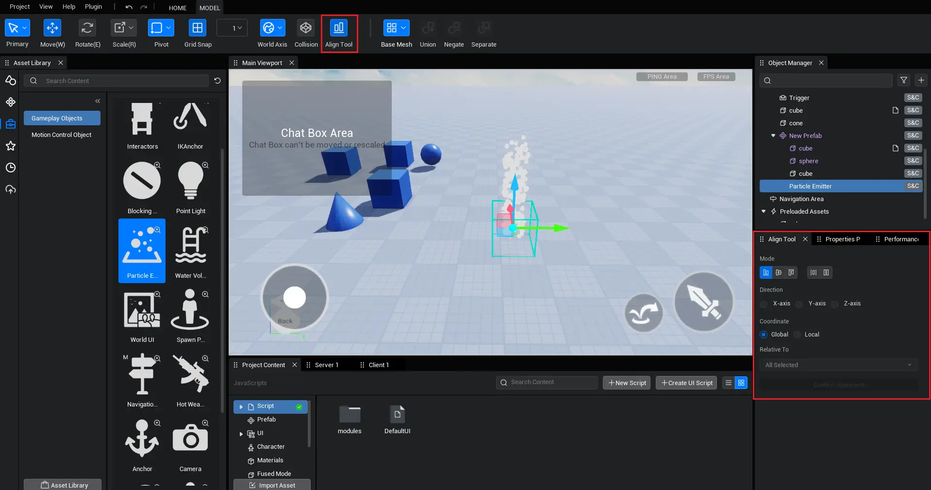
After opening, it is displayed by default in the lower right area of the main interface.
Function mode:
| mode | Illustration | description |
|---|---|---|
| minimum alignment |  | Select the object to align along the set axis to the vertical plane where the vertex of the reference object's minimum value is located. |
| Center align |  | Select the object to align with the reference object's center along the set axis. |
| maximum alignment |  | Select the object to align along the set axis to the vertical plane where the vertex of the reference object's maximum value is located. |
| uniformly distribute |  | In the selected {object}, fix one end of the {object} along the set {axis}, so that the spacing between adjacent vertices of all adjacent {object}s is the same in the selected {axis}. |
| Equidistant distribute |  | In the selected objects, fix the reference object so that other objects are arranged at user-defined intervals along the selected axis relative to the reference object. |
Align axis:

Set which axis to align along the X / Y / Z axis
Coordinate system:

Set the coordinate system used for the axis (world axis/local axis)
Reference object:

Set the align operation relative to which object
Operating method:
- Set the function mode, align the axis, coordinate system, and reference object.
- Move the cursor to the "confirm align" button to preview the position changes of the aligned object.
- Click "Confirm Align" to perform the align operation.
Localization
local asset library
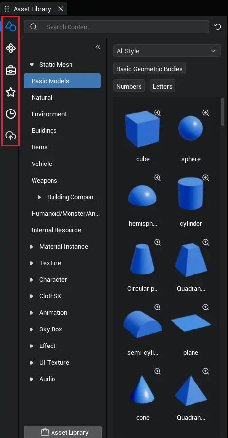
The local asset library provides various assets for building a variety of scenes. The left tab switches are art assets, prefabs, gameplay objects, favorites, history, and my assets.
- Art resources: used to build the game world
- Directory level: art asset - asset type - theme
- Prefab: a combination of objects with complex structures
- Directory level: prefab - theme
- Gameplay Object: An object with certain general capabilities used to achieve game logic.
- Directory Level: Gameplay Object - Asset Type
- Collection: For creators to independently collect and use assets.
- Directory Level: Collection - Asset Type - Theme
- The creator can use the favorite button in the asset preview window to favorite a specified asset.
- History: Record the last 100 assets used
- Directory level: History - Asset type - Theme
- The information is stored locally, and the user's record will be consistent with the previous one the next time they open it.
- My assets: storing assets uploaded by creators
- Directory Level: My Asset - Asset Type
Asset download and preview
Assets in the editor exist in the cloud. Need to click resource to download Click the magnifying glass at the top right corner of the downloaded asset thumbnail to open the preview window and preview the asset. Static models, effects, and animations support viewport preview. If the prefab contains a script, a page icon will be displayed in the upper left corner of the thumbnail.
Among them, sound effect assets support playback and audition in the asset thumbnail.

Preview window related:
- In the preview window, the display rules for tags have changed. The previously used search tag for fuzzy search has been hidden, and a new display tag has been added. By clicking the display tag, you can search for similar tags in the asset library (currently, the display tag has not been configured yet. After configuration, you will be able to see the display tags corresponding to each asset).
- Hidden comment property of unconfigured comments
- support switching preview assets via arrow keys
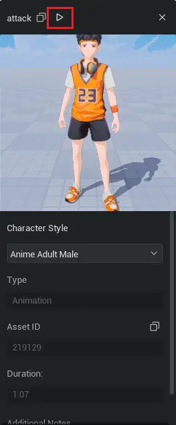
- For playable assets, the play entry is shown in the figure below.
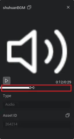
Among them, the sound effect assets support controlling the playback progress in the asset preview window (the playback function optimization for other playable assets will be available in future versions).
Every time you enter the project, it takes a few seconds to pull the relevant information of the asset from the server for asset display, filtering, and search operations.
Asset usage
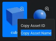
Different assets have different usage methods, please refer to the relevant asset manual for details. Right-click the asset to copy the asset ID and name, making it easy to reference in the script.
Filter related
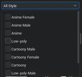
Support filtering of styles and categories for assets The style filtering is done through a dropdown box, supports multiple selections, and the results take the union. Different types of {asset}s have different styles, and when switching {theme}s under the same type, the filter will not be cleared.
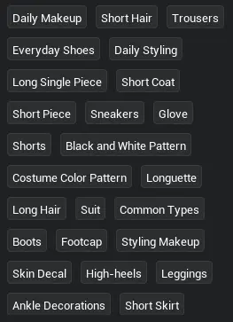
The filtering of categories is done by selecting tags, supporting multiple selections. Tags that are not fully displayed can be expanded through the dropdown button, and the result takes the union.
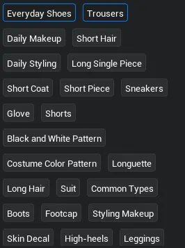
Category filtering will arrange the selected tags. When a category tag filter is canceled, the tag returns to its original position.
Intersection between style and category filter conditions When switching different themes of the same asset, the style filters will be retained, and the category filters will be removed. support filtering after search
Search related

Fuzzy search can be performed using asset name, asset ID, or asset tags. When ending the search state, the navigation directory will be initialized, and the current category filter will be cleared, but the style filter will be retained the next time you enter the directory before searching.
Others
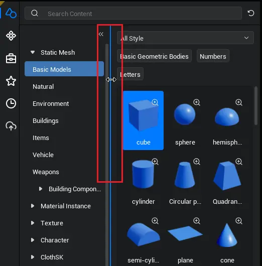
Asset navigation on the right supports dragging to modify the area size.
- Dragging has a minimum and maximum width, with the minimum displaying four assets in a row and the maximum displaying two assets.
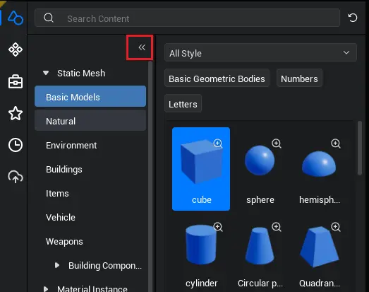
Asset navigation supports quick collapse/expand
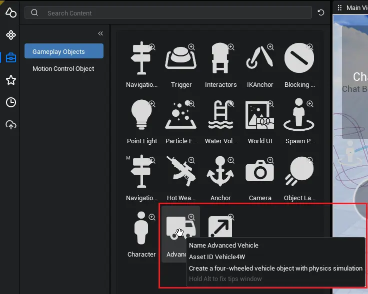
Gameplay Object supports jumping to the corresponding product manual via tips.
- When the mouse hovers over the function object, hold down alt and click the blue text to jump to the corresponding manual.
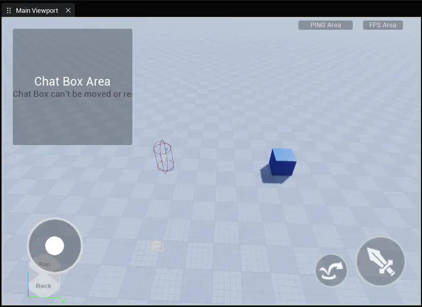
Main Viewport
The main viewport is used to build a rich and colorful experience world.
Select Object
There are three ways to select an object: clicking in the main viewport, box selection in the main viewport, and clicking in the object manager. - Main viewport selection: Click on an object in the main viewport with the left mouse button to select it. Use the left mouse button + ctrl to select multiple objects. - Main viewport selection: Hold down the left mouse button and drag to achieve selection in the interface, allowing multiple objects to be selected. Object Manager Selection: Click on an object in the Object Manager with the left mouse button to select it. Use the left mouse button + ctrl to select multiple objects.
Camera Operation
Drag the right mouse button to rotate the camera (the camera position remains unchanged) Scroll the mouse wheel to move the camera (the camera orientation remains unchanged) WASD+ right mouse button, can move the camera and modify the camera orientation (both camera position and orientation change)
Transform Tool
For related operations using the Transform tool in the main viewport, see the Transform tool document.
Main viewport right-click menu

Only when an object is selected, the right-click function in the main viewport can be used (except paste). Copy, paste, and other basic operations will not be described here. Observe from a certain aspect of the object Move the camera to a certain position of the object to facilitate observing the object from that position.
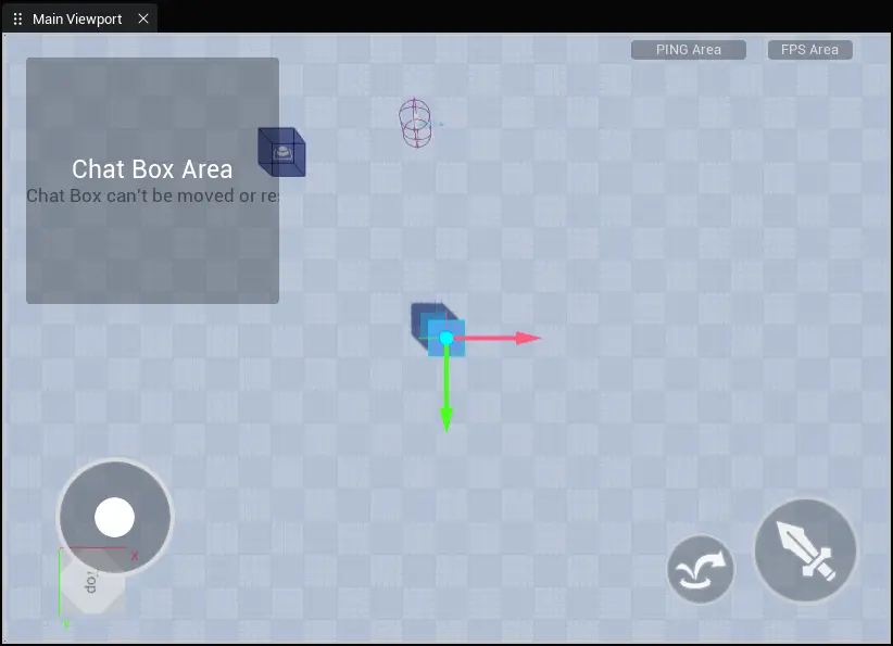
object focus After entering the object focus state, when you right-click to rotate the camera angle, the camera will rotate around the object, making it convenient to observe the details of the object from different orientations. You can enter the object focus state by using the shortcut key F, or "Object Focus" in the right-click menu of the main {viewport}, or by {double-click}ing on an {object} in the {object} manager. Move the object to the camera's position Move this object to the current camera's position, so that the camera and the current object's anchor point coincide, modifying the object's position. Rotate the object to face the direction of the camera. Rotate this object to the current camera's orientation, modifying the object's rotation angle. snap downwards Snap this object to the ground, with the rule being the bounding box touching the ground. If the object's bounding box has already contacted the ground or is below the ground, then the operation is invalid.
View Cube
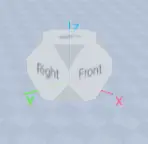
Base (6 sides): including front, back, left, right, top, bottom Corner faces (8): The corner faces formed by three adjacent faces, including front-top-left, front-top-right, front-bottom-left, front-bottom-right, back-top-left, back-top-right, back-bottom-left, back-bottom-right Click on a base face/corner face of the View Cube to rotate the camera's position and direction, switching the view to that face. Hold down the left mouse button to drag the View Cube to the position in the main viewport.
Scene/prefab mode
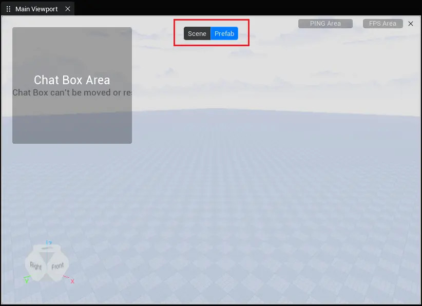
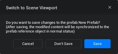
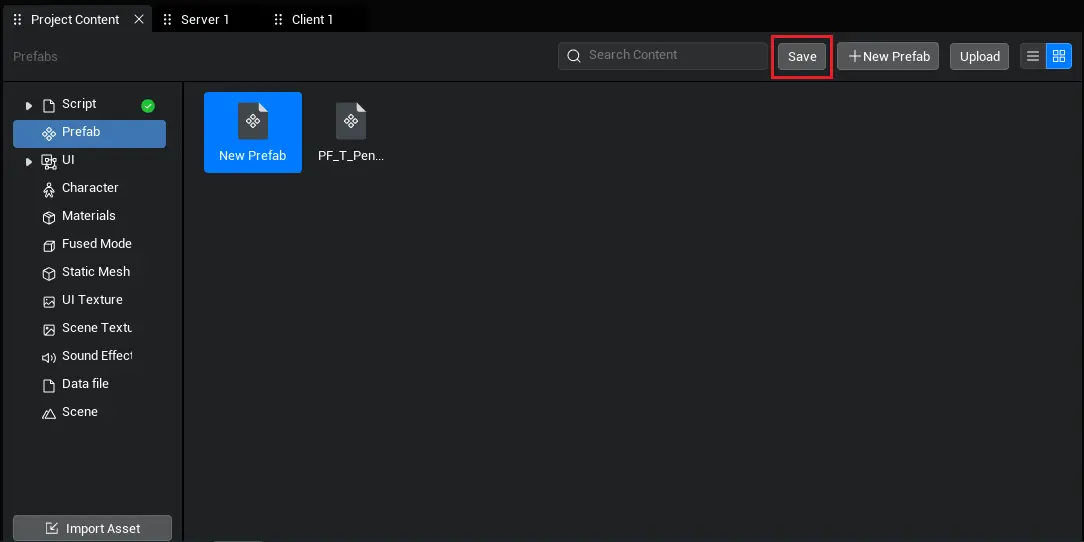
The main viewport is divided into two editing modes: scene mode and prefab mode. In scene mode, you are editing the experience scene In prefab mode, you are editing a specific prefab After editing the prefab in prefab mode, you can click the save button in the project content or switch to scene mode to save the prefab.
When you double-click a prefab file or create a new prefab, the toggle {button} shown above will appear, and you can {click} it to switch {modes}; you can also close the prefab editing {interface} by {clicking} the close {button} in the upper right corner of the main {viewport}.

Project content
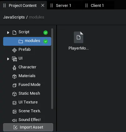
The purpose of the project content is to manage and edit the files used by this project. The directory on the left is categorized by file type, with different functions for each category. The left side also serves as a navigation area, allowing quick access to folder paths through the left navigation.
The directory on the left supports right-click menu operations for folders, and the functions of folders under each type will be described below.
Tile/List mode
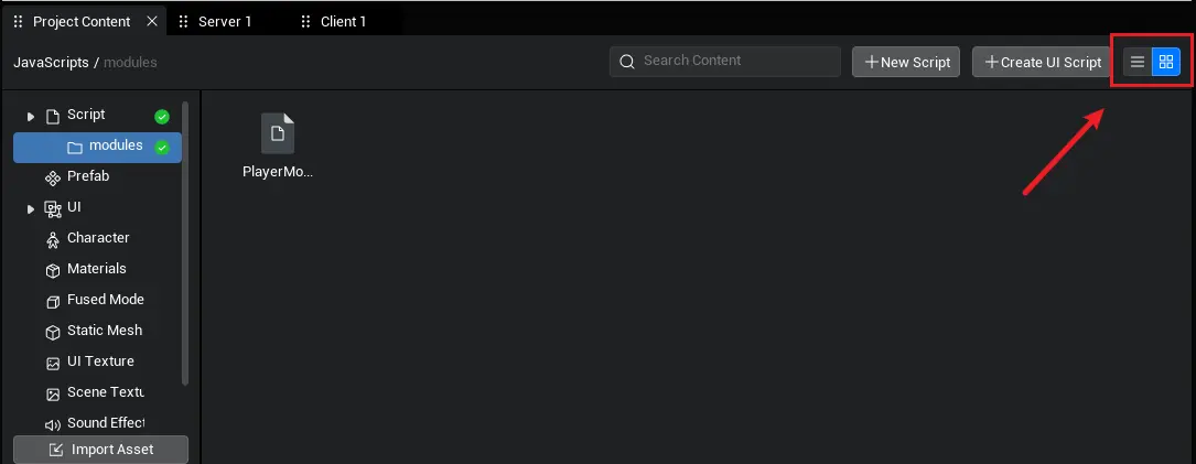
Add a new sorting option The function entry is the icon at the top right corner of the project content page, with the left side displaying in list format and the right side displaying in tile format. Arrangement information is stored locally
Quick path access
The upper left corner provides quick path access. Click the corresponding folder to jump to that folder.
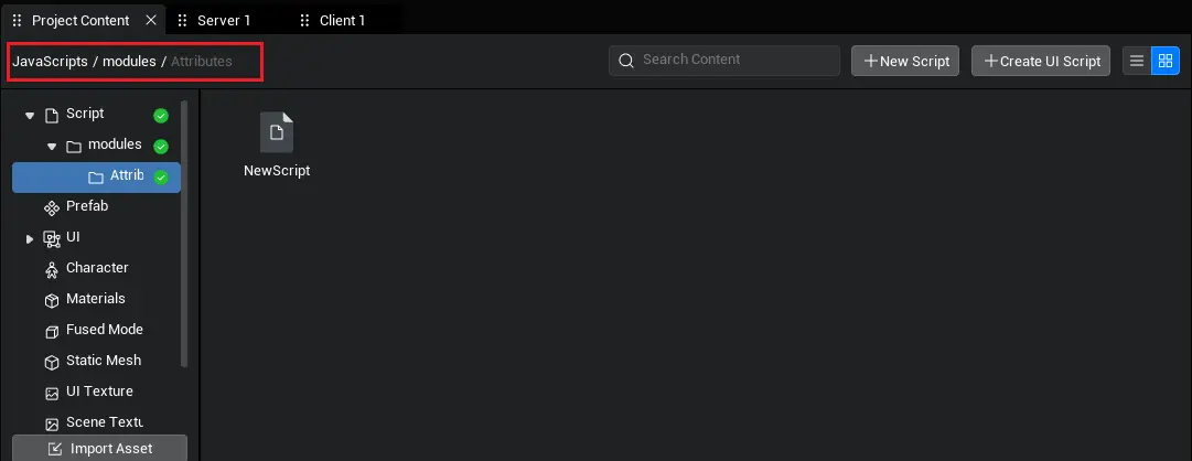
Search function
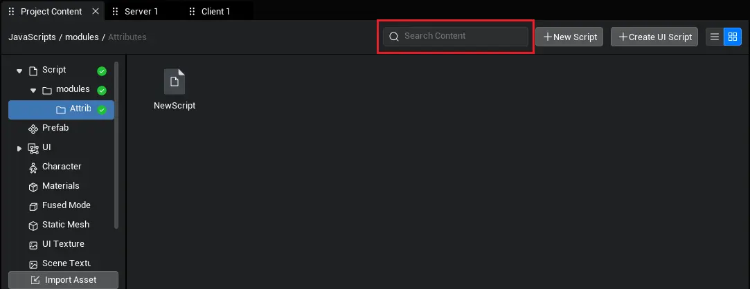
Based on the currently selected directory including downward search at the same level Search rules are for fuzzy search by name. When switching the file category on the left, the search keywords will not be cleared.
Preview function
- Tile mode: When hovering over a file, a preview entry appears at the top right corner of the icon.
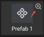
- List mode: When hovering over a file, a preview entry appears at the far right of the line.

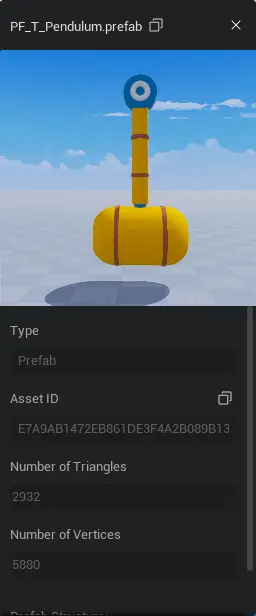
- Click this button to open the preview window. The preview window exists as a separate window and can be dragged to any position on the screen.
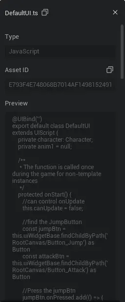
- Script Preview: Provides a copy button for GUID and name, and displays script information.
Prefab preview: Provides copy buttons for GUID and name, displays prefab structure, and supports viewport preview.
- The prefab structure tree supports expanding and collapsing nodes.
- Viewport preview: Similar to the main viewport camera operation, it allows for better observation of this asset.

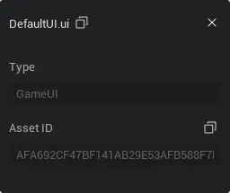
- UI file preview: provide GUID, name copy button
- Character file preview: provides copy buttons for GUID and name, as well as a preview viewport.
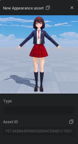
Script
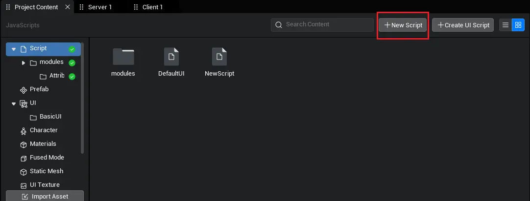
When the left navigation bar switches to the script, the right side provides buttons for creating a new script, creating a new UI script, and importing a script.
Create script: Click this button to create a new script in the current directory
Create a new UI script: Click this button to create a new UI script in the current directory.
Import script: Click to open Windows Explorer, and import the script file in the current directory.
- Only ts format files are allowed to be imported
- Support multiple selections during import
The use of script files
- Drag the script file into the main viewport or object manager to take effect.
- The specific mounting layer is related to the code logic in the script.
Right-click menu - right-click script file
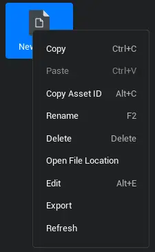
Copy, paste, and other basic operations will not be described here.
Select the nearest referenced object
- The file in the project content and the same object in the object manager have a reference relationship (for example, dragging a script into the object manager, the script object in the object manager is actually referencing the script file in the project content).
- The same script file may be referenced multiple times, so this function is to select the most recently referenced object in the object manager.
Edit
- Click edit (or double-click the script file) to automatically open VScode and edit the script.
- If there is no VScode, please go to the VS official website to download it yourself.
Export
- Click export, then open Windows Explorer to save the script file. The main purpose is to reuse the script in different projects.
Refresh
- update script information to the latest (after editing in VScode, you need to click save)
Right-click menu - Right-click on the blank area
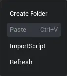
Refresh and paste functions are not described here.
create folder
- create a folder in the current directory
- You can drag different scripts into different folders for easy management.
Right-click menu - right-click folder
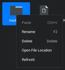
- Some basic operations, no description here.
Prefab
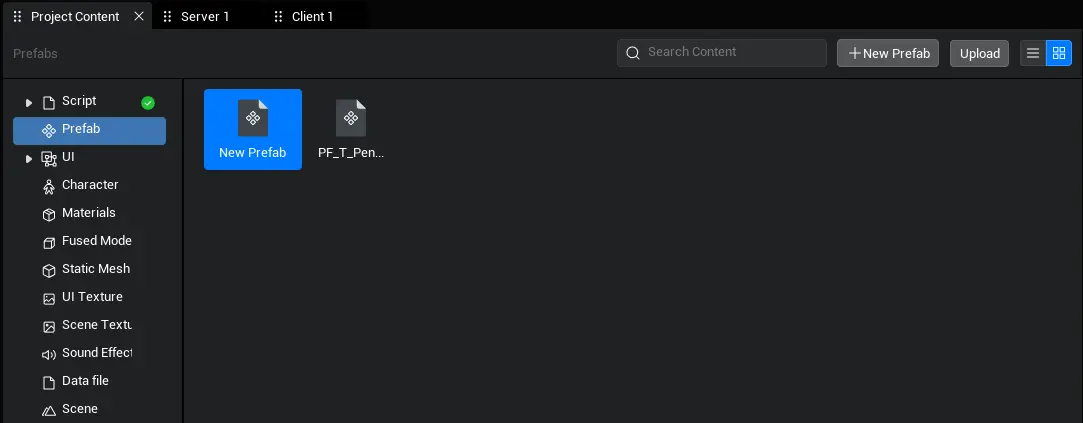
The prefab exists in the project content in the form of prefab file.
Double-click the prefab file, and the main viewport enters the prefab editing state.
- After modification, a save button appears on the prefab interface of the project content.
The right-click functionality of the prefab is generally consistent with the script.
The use of prefabs
- Drag the prefab file into the main viewport or object manager to take effect.
For detailed functions of the prefab, please refer to Prefab
UI file
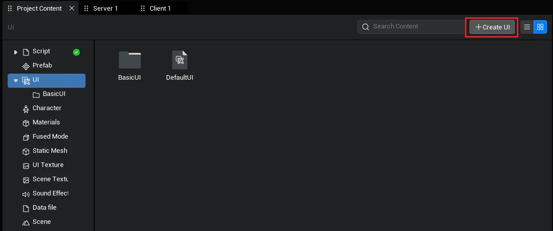
The UI file interface provides a new UI button, and after clicking, a new UI file is created in the current directory.
Folder operations are consistent with scripts.
Right-click the UI file, the function is basically the same as the script, the only difference is that when editing (double-clicking) the UI file, it will automatically launch the UI editor.
Use of UI files
- Drag the UI file into the main viewport or object manager to take effect.
For usage related to the UI editor, please refer to the UI editor manual.
Character
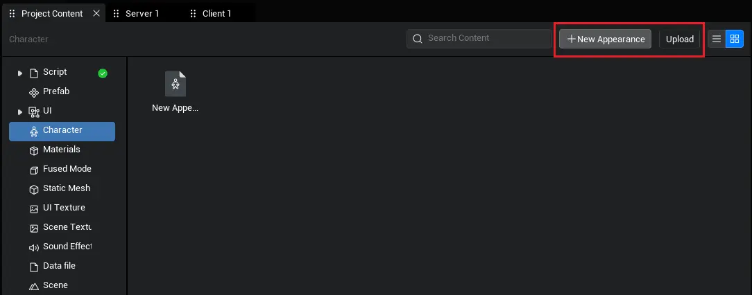
The character interface provides buttons for creating a new appearance and importing Character Avatar data.
Click to create a new appearance (or double-click the character data file) to open the character editor
Click to import character avatar data, open the Windows asset manager, you can select the previously exported character data, the main purpose is also for different project data reuse
Folder operations are consistent with scripts.
The right-click character data file function is consistent with the script, the only difference is that when editing (double-clicking) the character data, it will automatically launch the character editor.
Use of character data
- Can be dragged into the main viewport or object manager as separate character data
- The purpose of character data is to modify the Character Avatar. If you want to use it on a character (such as putting a piece of clothing on a person), you need to use it in the character editor or call the corresponding API in the script. Please refer to the character editor manual for details.
Material
- Material files are different from other files and require specific material resource support. The material file is a description file (prefab is also a description file), which describes the parameter configuration of the material resource.
- To customize the material, first go to the property panel to find the material property, and click the edit material button.
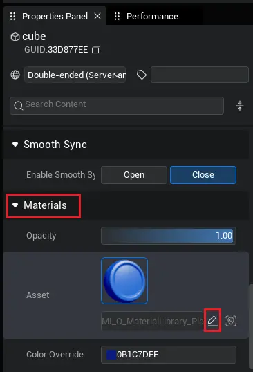
- After clicking the button, a new material file will be created in the project content based on the material resource.
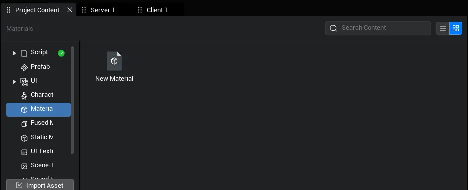
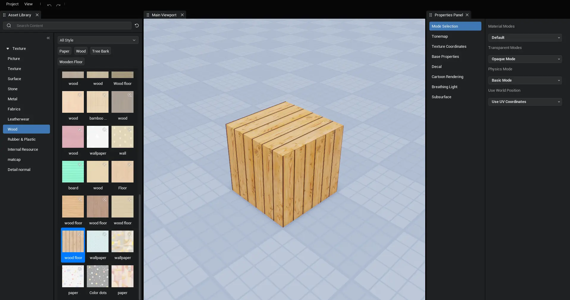
- Double-click the material file to edit the properties of the material and the texture resources used by the material.
- After modification, click Project-Save to save the parameter settings of the material.
Output window
- The output window is used to view the log.
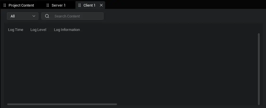
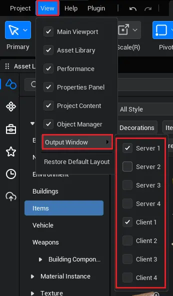
- The output window is divided into server, client 1/2/3/4, and it is determined whether to display them through the menu bar - view.
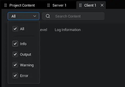
- Log levels are divided into information, warning, error, output, selected through a dropdown.
- Right-click operation
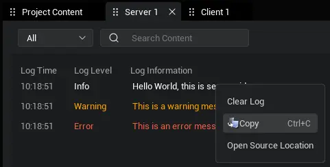
- Provide operations to clear logs, copy, and open log directory
Object manager
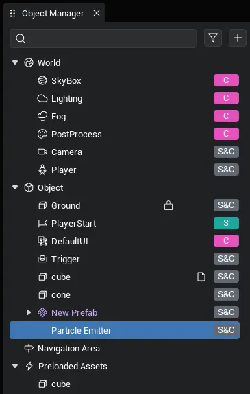
The object manager is used to manage various objects used in the scene.
The root directories are world, object, Navigation Volume, and priority loading, each with different meanings for each area.
- Objects under the world: undeletable, objects that must exist in the scene, such as cameras, skyboxes, etc.
- Object under object: a general object, also a main part of building the experience world
- Navigation Volume under object: Only allows mounting "Navigation Volume" "Navigation Volume Modifier" logical object and script
- Priority loading object: The object placed in this area will be loaded when the experience starts, and the experience will only begin after loading is complete.
Mount operation
- Place the object as a child of another object: drag the object onto another object


- Place the object at the same level as another object: Drag the object to the line between the two objects, which can also be used for lateral movement.


Expand All/Collapse All function
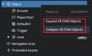
- Only the root directory "object" has this function. Right click the object to show the panel.
- Click the option button, and all tree structure branches under "object" will be fully expanded/collapsed.
Search function

- Support fuzzy search for name and GUID of each object.
- After selecting the object in search mode, you can still locate the object when exiting search mode (if multiple objects are selected, it will locate the last selected object).
Filter function
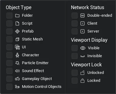
- Support filtering of static state, network state, viewport display, viewport lock, and file attributes of objects.
- The filtered options are displayed in the form of tags. Click the tag clear button to delete the tag.
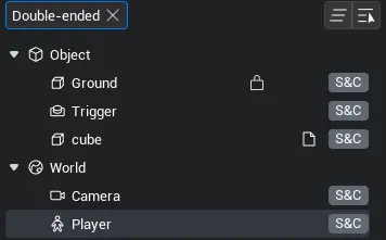
- Filter results take the union between the same conditions and different conditions
Network on the right side of the object, lock, display properties
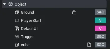
- Lock/Hide Button Display Logic

- When the lock/hide button is in the "locked" or "hidden" state, the button is normally displayed in the object manager.
- When the lock/hide {button} is in the "unlocked" or "unhidden" state, the corresponding {button} is only displayed when the {mouse} hovers over the {object}.
- Network status: Click the "S&C" button in the picture to expand the network status options.
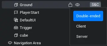
this property can also be set in the property panel.
Locked state: click the lock button to toggle between locked/unlocked state
- The locked object cannot be selected in the main viewport; it can only be selected in the object manager and is displayed with a red frame in the main viewport.
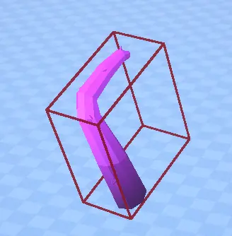
Visibility status: click the visibility status button to toggle the show/hide button
- The hidden object is not visible in the main viewport.
Scene/prefab mode
- Like the main viewport, the object manager is also divided into scene/prefab mode.
- After entering the prefab editing state, the object manager will display the structure of the prefab instead of the world scene; synchronized with the main viewport.
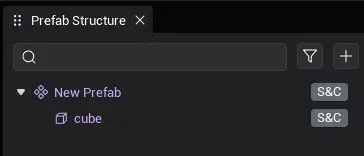
Right-click menu
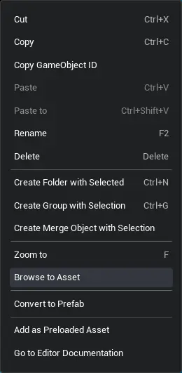
The right-click menu functions of different root directories and file types offer different ranges of functions, but the types of functions are basically the same; below is a description of some commonly used functions.
Basic operations will not be described here.
Add to priority loading object
- Add the selected object to the priority loading area.
paste and paste to
- Paste: Paste to the same level of the selected object (if no object is selected, paste to the "object" sub-level of the root directory)
- Paste to: paste to selected object subordinate
create folder && include selected create folder
- Create a folder: Create a folder in the sub-level of the selected object.
- Include selected create folder: The folder is created at the same level as the selected object, and the selected object becomes a subordinate of the folder.
create merge object && include selected create merge object
- Only static models can be merged, and the merged object can optimize runtime performance (multiple meshes become one mesh).
- When an object or the "object" root directory is selected, an empty merged object can be created in the child level of that object. Users can drag static models into the empty merged object.
- When one or more objects are selected, you can create a merged object that includes these selected objects, which is equivalent to merging these objects.
- Right-click to merge objects, you can cancel merge.
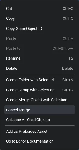
Object Focus: Same functionality as the main viewport
Locate source
- Background: Objects in the object manager are actually referenced objects, which are merely reference relationships rather than the data itself
- Set the data source of the object to the selected state (the source is generally the asset library and project content).
- If an asset is dragged from the asset library to the main viewport, the position source button can directly locate the position of the asset in the asset library and set it to the selected state.
- If the data source disappears, the object in the object manager will turn red, indicating that this object is no longer meaningful.
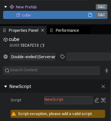
generate as prefab
- Generate the selected object as a prefab and create this prefab in the project content.
Prefab object related
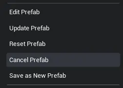
Prefab objects differ from regular objects in functionality, mainly adding the three features shown in the figure.
Edit prefab
- Both the main viewport and the object manager enter prefab editing mode to edit the prefab.
Update the prefab with the object referenced by the prefab.
- Edit the prefab without entering the edit state, such as directly modifying the tree structure of the prefab in the object manager, use this function to save the modifications of the prefab.
Reset prefab
- Make the prefab change from instance state to normal state, which means to undo the modifications made to the structure of this prefab in the object manager under the instance state.
Save as new prefab
- Save this modified prefab in the object manager as a new prefab. The project content will add this prefab, and the original prefab in the object manager will also be synced to this new prefab.
Property panel
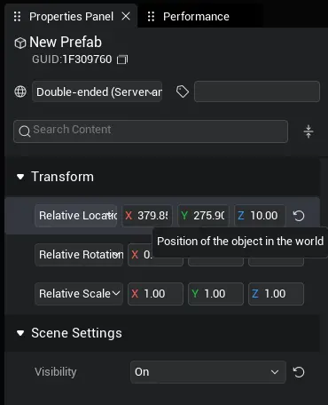
- The property panel is used to preview asset information and modify object properties
- The preview feature has been previously discussed separately in the local asset library and project content, so the following mainly describes operations related to modifying object properties.
Search function

- Support fuzzy search for property name.
Basic property
- Name, tag, network status and GUID properties are uniformly classified as "basic properties".

Numerical modification

- The values are mostly modified through the widget shown in the figure.
- Press and hold the {Input Box} and slide left or right to modify the value, or click to enter directly.
- For material properties, when editing material properties, you need to customize the material before making modifications (generate a material description file into the project content).
Eeset button
- Almost all properties support reset, and the reset button will appear after modifying the properties.
- Resetting will restore this property to the system default initial value

Color picker
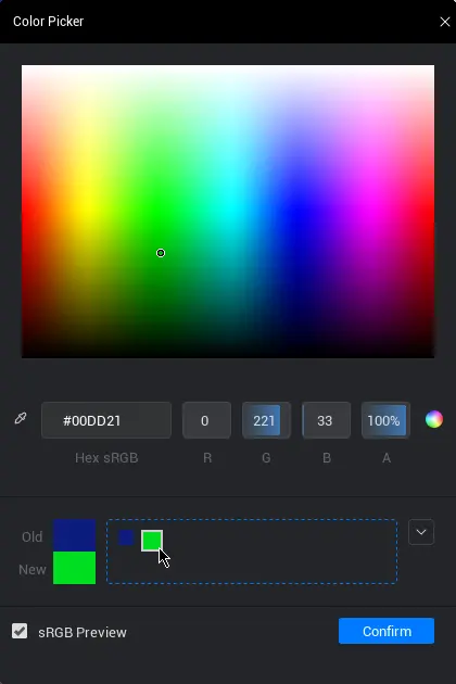
- Click on the color area in the image to open the color picker.

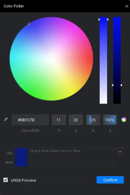
- Color modification operation
- The color picker provides RGBA and HSV ** two color models, ** generally speaking, users only need to modify one of these two color models, RGBA or HSV.
- Method 1: Modify RGBA and HSV values, you can hold and drag or double-click to input
- Method 2: Directly enter the hexadecimal color code
- Method 3: Click or hold and drag to pick the color palette
- In addition to the circle color picker in the image, click the button below to switch to the square color picker, allowing users to choose according to their preferences.

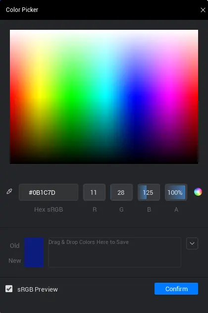
- In addition to the circle color picker in the image, click the button below to switch to the square color picker, allowing users to choose according to their preferences.
- Comparison of new and old colors
- The old color refers to the color currently used by this color property, while the new color is the color currently in the color palette, with the aim of facilitating comparison.

- The old color refers to the color currently used by this color property, while the new color is the color currently in the color palette, with the aim of facilitating comparison.
- Theme-related operations
- The theme is used to store commonly used colors, equivalent to a color favorites folder. Users can add or delete colors in the theme, and can also create multiple themes.
- Click the dropdown button on the right to open the theme action panel.
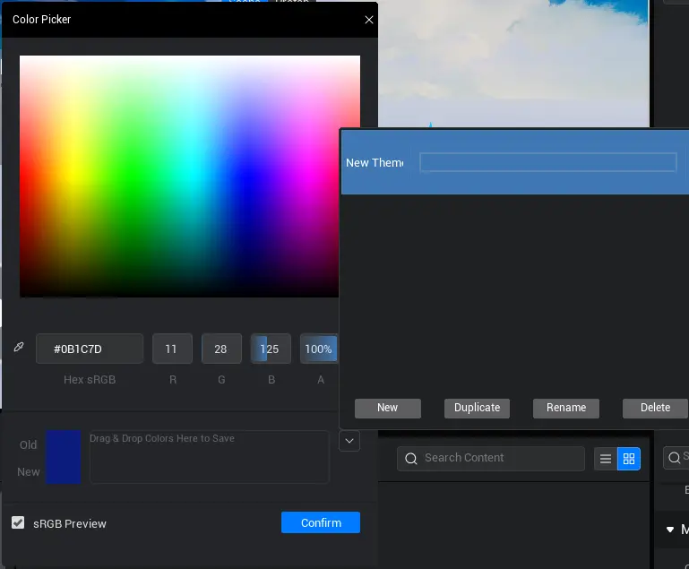
- Adding theme colors: Users can drag colors from the left "New and Old Colors" drag to the color storage area below the color picker. The dragged colors will be stored in a theme.
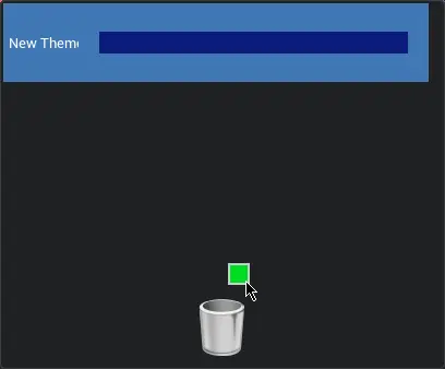
- Delete theme color: Open the theme display interface, when dragging the color block, a recycle bin icon will appear below, drag the block into the icon to delete.
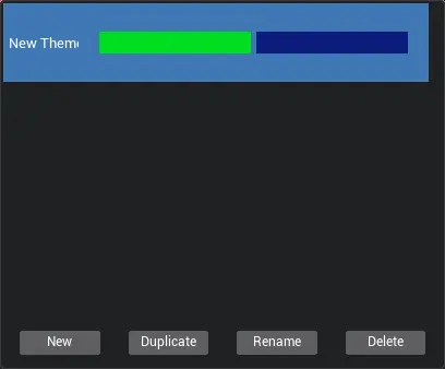
- Addition, deletion, renaming, and copying of themes: After selecting a theme, you can perform a series of operations on it. The operations are simple and will not be elaborated here.
Eyedropper

- Some objects have an eyedropper widget, commonly seen in physical constraints, and can also be defined in scripts.

- Operation method: After clicking the eyedropper icon in the picture, you can click the object in the main viewport; you can also directly drag the object from the object manager into the box.
- Support positioning function for absorbed objects, making it easy to find the position of the absorbed object in the object manager.
- The box under the pipette is prohibited from input. If you want to clear the pipette object, just click the reset button next to the pipette button.
Asset Selection Widget

- The purpose of the widget is to replace the currently used asset with an asset from the asset library/project content
- Operation method: Drag and drop assets of the same type from the local asset library/project content to achieve the use of assets; for specific details, please refer to the asset-related manual.
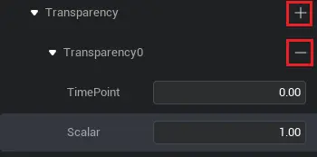
Addition and subtraction component
- Click the add button on the right to add the structure corresponding to the property.
- Click the delete button on the right side of a structure to delete the structure.
Other widgets
- In addition to the above widgets, the property panel also contains some common widgets, such as radio buttons, drop-down boxes, and text input boxes, which are easy to operate and will not be described here.
 Editor Doc