UI Widget- Container
It takes about 15 minutes to read this article
This article provides an overview of the various property and instructions of the UI widget- Container .
What is Container?
The Container is the background board that carries other UI widget. UI widget must also rely on the Container to be displayed and function.
- For transformation/ align/general/rendering property , please see the basic property of UI widget.
Container property- layout
- layout is a unique property of a Container . Its main function is to sort all child object in the Container in a regular manner to facilitate user use.
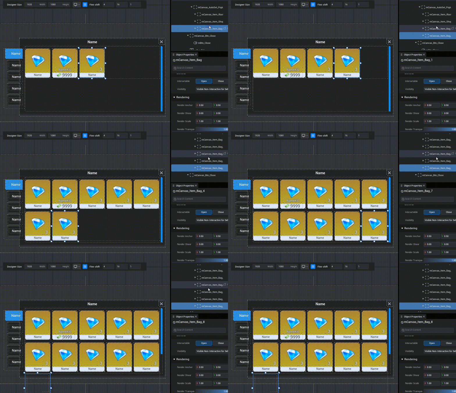
- For description: The bag function is a typical UI effect created using Container layout.
- Schematic diagram:
Automatic layout
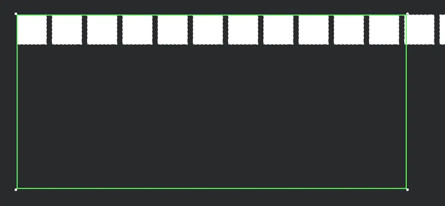
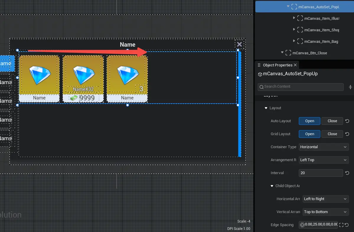
- Turn on the automatic layout function to arrange the UI widget of all child object in the Container in an orderly row.
- Schematic diagram:
mesh layout
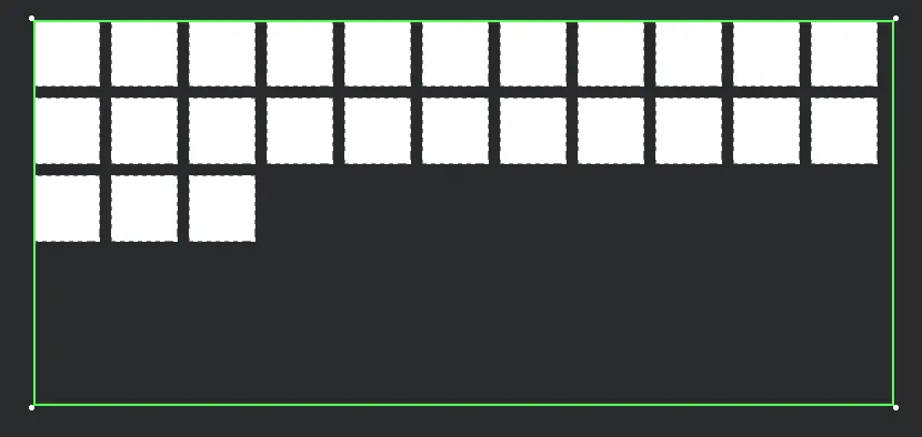
- autowrap the UI widget of its child object according to the size of the Container .
- Schematic diagram:
Container Type
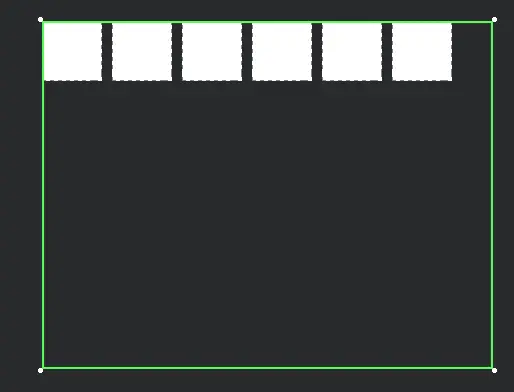
horizontal layout
- Arrange in order horizontal
- Schematic diagram:
vertical layout
- Arrange in order vertical
- Schematic diagram:
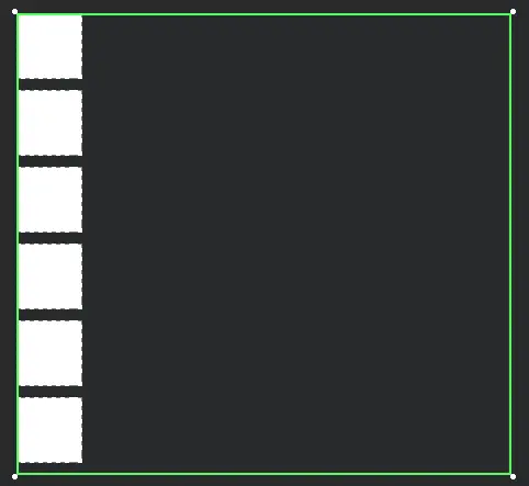
Arrangement rules
- The position of the Container's child in the Container can be set to align left, left align, bottom align , top align , right align , bottom right, top align , align , bottom align
interval
- The spacing between UI widget in a Container
- Schematic diagram:
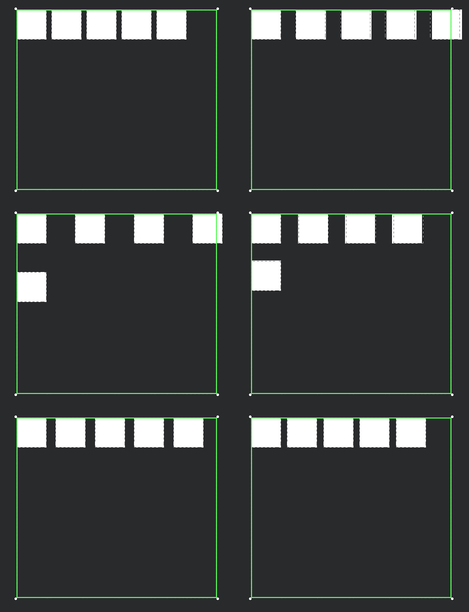
child object arrangement rules
After enable automatic layout , all sub- object in the Container will be sort from top to bottom and from left to right by default ; if you want to modify the sort rules of these sub- object , you can modify the horizontal sort and vertical sort property of the child object arrangement rule.
horizontal sort
- From left to right
- Right to Left
vertical sort
- From top to bottom
- From bottom to top
Combined with the Container types and arrangement rules mentioned above, a total of 9X2X2X2=72 Container layout can be achieve .
It can be understood as:
- Step 1: The arrangement rule is to determine the position of the object in the Container and which of the nine anchor of the Container to use for align.
- Step 2: The horizontal and vertical sort of the child object arrangement rules determine how the arranged object are arranged internally as a whole. Specifically, it determines where the top layer object will be in the overall position of the arranged object .
- Step 3: determine the arrangement direction according to the Container type (horizontal distribute/ vertical distribute ). The object at the top of the hierarchy is placed in the corner determined in the second step, and the remaining object are distribute according to this arrangement direction.
For description: When the mesh layout is default , the default value of the Container type is horizontal layout, and the default value of the arrangement rule is top left align.
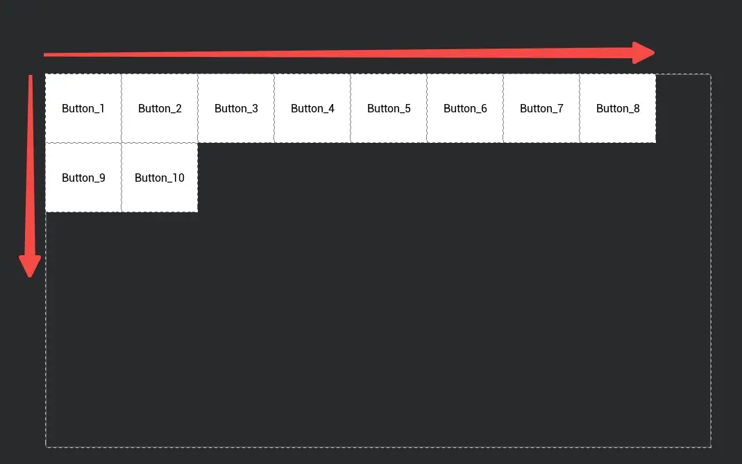
- Change the horizontal sort property to right to left and the vertical sort property to bottom to top.
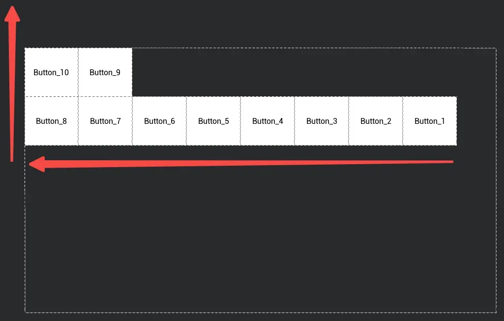
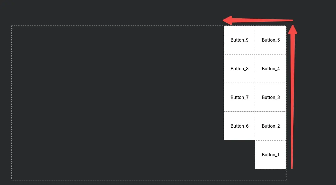
- Another description: When the mesh layout is turned on, by default, the Container type is set to vertical layout and the arrangement rule is set to top right align.
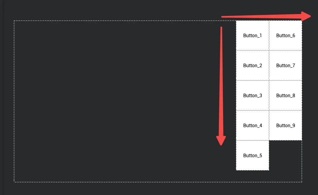
- Change the horizontal sort property to right to left and the vertical sort property to bottom to top.
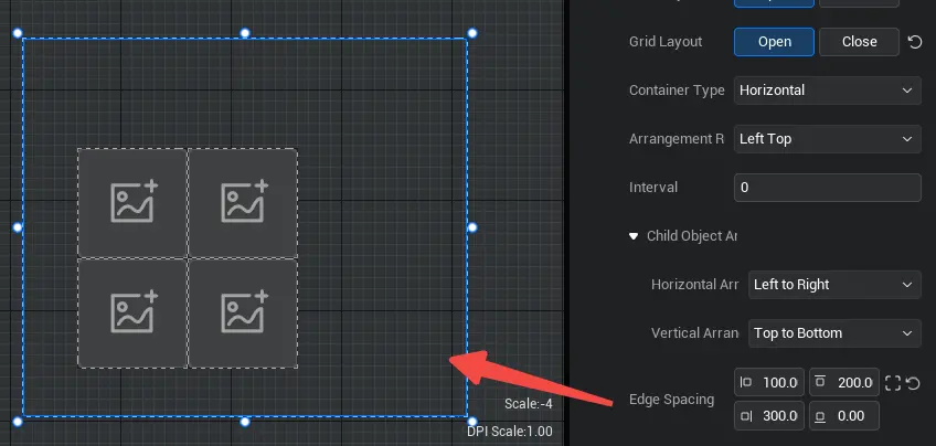
Edge spacing
Left Margin
- The distance between the child object content in the Container and the left border of the Container
Top Margin
- The distance between the child object content in the Container and the top border of the Container
Right Margin
- The distance between the child object content in the Container and the right border of the Container
Bottom margin
- The distance between the child object content in the Container and the bottom border of the Container
Schematic diagram:
How to use Container?
Example 1: Use automatic layout of Container to arrange UI widget in a regular sort
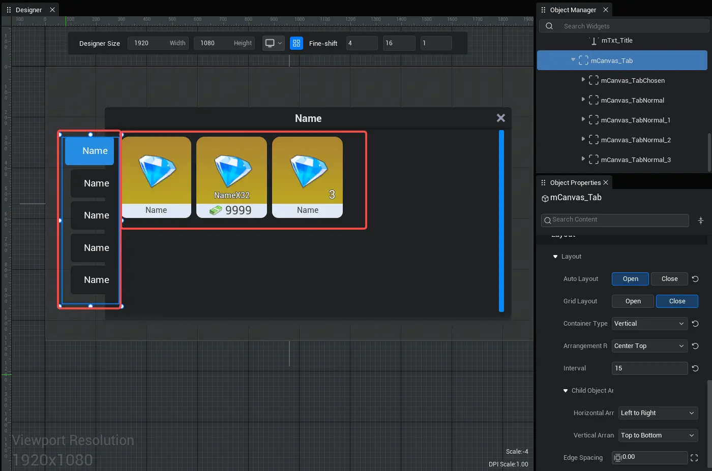
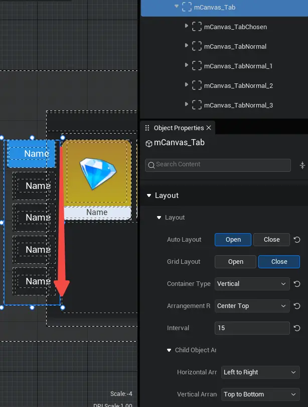
- For description, in many cases we need to create neat UI widget. The store interface tab button in the left picture below need to be arranged vertical, while the store content in the right picture below needs to be arranged horizontal.
- To achieve this effect, we can set the bottom Container to open the automatic layout, and hang the UI widget under this Container, so that we can achieve quick automatic layout.
- Schematic diagram:
Example 2: Create a panel for the store tab to organize UI widget and make them easier to manage
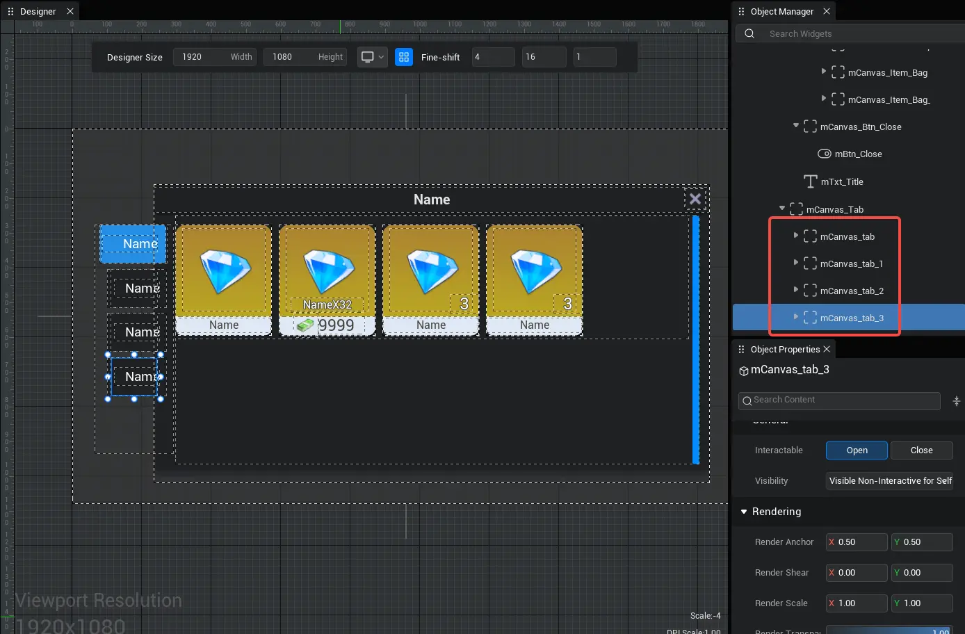
For description: Let's create a simple store panel with 4 store tabs. click the button of each store tab, the store details on the right will switch to different content;
For the convenience of control , we put all UI widget of the same store interface into the same Container, and when click the store interface tab button, set the Container to display and others to hide, and the effect can be achieve(for how to make the tab button selected, please refer to the idea of UI widget- button part)
- Sample script:
/** Tab selection enumeration */
export enum PropSelect {
    Prop1,
    Prop2,
    Prop3,
    Prop4,
}

@UIBind('')
export default class activity extends UIScript {

    PlayerPropSelect: PropSelect = PropSelect.Prop1;

	protected onStart() {
		const mBtn = this.uiWidgetBase.findChildByPath('mCanvas_Root/mCanvas_Tab_Left/mCanvas_tab/mBtn') as StaleButton
		const mBtn1 = this.uiWidgetBase.findChildByPath('mCanvas_Root/mCanvas_Tab_Left/mCanvas_tab_1/mBtn1') as StaleButton
		const mBtn2 = this.uiWidgetBase.findChildByPath('mCanvas_Root/mCanvas_Tab_Left/mCanvas_tab_2/mBtn2') as StaleButton
		const mBtn3 = this.uiWidgetBase.findChildByPath('mCanvas_Root/mCanvas_Tab_Left/mCanvas_tab_3/mBtn3') as StaleButton

		//When click tab button 1, the tab selection is tab 1, and the tab selection method is executed once
		mBtn.onPressed.add(() => {
			this.PlayerPropSelect = PropSelect.Prop1;
			this.Prop_Select(mBtn, mBtn1, mBtn2, mBtn3)
		});

		//When click tab button 2, the tab selection is tab 2, and the tab selection method is executed once
		mBtn1.onPressed.add(() => {
			this.PlayerPropSelect = PropSelect.Prop2;
			this.Prop_Select(mBtn, mBtn1, mBtn2, mBtn3)
		});
		//When click tab button 3, the tab selection is tab 3, and the tab selection method is executed once
		mBtn2.onPressed.add(() => {
			this.PlayerPropSelect = PropSelect.Prop3;
			this.Prop_Select(mBtn, mBtn1, mBtn2, mBtn3)
		});

		//When click tab button 4, the tab selection is tab 4, and the tab selection method is executed once
		mBtn3.onPressed.add(() => {
			this.PlayerPropSelect = PropSelect.Prop4;
			this.Prop_Select(mBtn, mBtn1, mBtn2, mBtn3)
		})
	}

	// create a method to select a tab: the judgment condition is which tab is selected
	Prop_Select(Btn1: StaleButton, Btn2: StaleButton, Btn3: StaleButton, Btn4: StaleButton) {
		const mButton_Select = this.uiWidgetBase.findChildByPath('mCanvas_Root/mCanvas_Tab_Left/mCanvas_tab/mButton_Select') as Image
		const mButton_Select1 = this.uiWidgetBase.findChildByPath('mCanvas_Root/mCanvas_Tab_Left/mCanvas_tab_1/mButton_Select1') as Image
		const mButton_Select2 = this.uiWidgetBase.findChildByPath('mCanvas_Root/mCanvas_Tab_Left/mCanvas_tab_2/mButton_Select2') as Image
		const mButton_Select3 = this.uiWidgetBase.findChildByPath('mCanvas_Root/mCanvas_Tab_Left/mCanvas_tab_3/mButton_Select3') as Image
		const mCanvas = this.uiWidgetBase.findChildByPath('mCanvas_Root/mCanvas') as Canvas
		const mCanvas_1 = this.uiWidgetBase.findChildByPath('mCanvas_Root/mCanvas_1') as Canvas
		const mCanvas_2 = this.uiWidgetBase.findChildByPath('mCanvas_Root/mCanvas_2') as Canvas
		const mCanvas_3 = this.uiWidgetBase.findChildByPath('mCanvas_Root/mCanvas_3') as Canvas
		switch (this.PlayerPropSelect) {
			//When the tab selection is tab 1, the button color effect
			case PropSelect.Prop1:
				{
					mButton_Select.visibility=0
					mButton_Select1.visibility=1
					mButton_Select2.visibility=1
					mButton_Select3.visibility=1
					// Make tab 1 visible and the rest hidden
					mCanvas.visibility=0
					mCanvas_1.visibility=1
					mCanvas_2.visibility=1
					mCanvas_3.visibility=1
				}
				break;
			//When the tab selection is tab 2, the button color effect
			case PropSelect.Prop2:
				{
					mButton_Select.visibility=1
					mButton_Select1.visibility=0
					mButton_Select2.visibility=1
					mButton_Select3.visibility=1
					// Make tab 2 visible and the rest hidden
					mCanvas.visibility=1
					mCanvas_1.visibility=0
					mCanvas_2.visibility=1
					mCanvas_3.visibility=1
				}
				break;
			//When the tab selection is tab 3, the button color effect
			case PropSelect.Prop3:
				{
					mButton_Select.visibility=1
					mButton_Select1.visibility=1
					mButton_Select2.visibility=0
					mButton_Select3.visibility=1
					// Make tab 3 visible and the rest hidden
					mCanvas.visibility=1
					mCanvas_1.visibility=1
					mCanvas_2.visibility=0
					mCanvas_3.visibility=1
				}
				break;
			//When the tab selection is tab 4, the button color effect
			case PropSelect.Prop4:
				{
					mButton_Select.visibility=1
					mButton_Select1.visibility=1
					mButton_Select2.visibility=1
					mButton_Select3.visibility=0
					// Make tab 4 visible and the rest hidden
					mCanvas.visibility=1
					mCanvas_1.visibility=1
					mCanvas_2.visibility=1
					mCanvas_3.visibility=0
				}
				break;
		}
	}
}
/** Tab selection enumeration */
export enum PropSelect {
Prop1,
Prop2,
Prop3,
Prop4,
}
@UIBind('')
export default class activity extends UIScript {
PlayerPropSelect: PropSelect = PropSelect.Prop1;
protected onStart() {
const mBtn = this.uiWidgetBase.findChildByPath('mCanvas_Root/mCanvas_Tab_Left/mCanvas_tab/mBtn') as StaleButton
const mBtn1 = this.uiWidgetBase.findChildByPath('mCanvas_Root/mCanvas_Tab_Left/mCanvas_tab_1/mBtn1') as StaleButton
const mBtn2 = this.uiWidgetBase.findChildByPath('mCanvas_Root/mCanvas_Tab_Left/mCanvas_tab_2/mBtn2') as StaleButton
const mBtn3 = this.uiWidgetBase.findChildByPath('mCanvas_Root/mCanvas_Tab_Left/mCanvas_tab_3/mBtn3') as StaleButton
//When click tab button 1, the tab selection is tab 1, and the tab selection method is executed once
mBtn.onPressed.add(() => {
this.PlayerPropSelect = PropSelect.Prop1;
this.Prop_Select(mBtn, mBtn1, mBtn2, mBtn3)
});
//When click tab button 2, the tab selection is tab 2, and the tab selection method is executed once
mBtn1.onPressed.add(() => {
this.PlayerPropSelect = PropSelect.Prop2;
this.Prop_Select(mBtn, mBtn1, mBtn2, mBtn3)
});
//When click tab button 3, the tab selection is tab 3, and the tab selection method is executed once
mBtn2.onPressed.add(() => {
this.PlayerPropSelect = PropSelect.Prop3;
this.Prop_Select(mBtn, mBtn1, mBtn2, mBtn3)
});
//When click tab button 4, the tab selection is tab 4, and the tab selection method is executed once
mBtn3.onPressed.add(() => {
this.PlayerPropSelect = PropSelect.Prop4;
this.Prop_Select(mBtn, mBtn1, mBtn2, mBtn3)
})
}
// create a method to select a tab: the judgment condition is which tab is selected
Prop_Select(Btn1: StaleButton, Btn2: StaleButton, Btn3: StaleButton, Btn4: StaleButton) {
const mButton_Select = this.uiWidgetBase.findChildByPath('mCanvas_Root/mCanvas_Tab_Left/mCanvas_tab/mButton_Select') as Image
const mButton_Select1 = this.uiWidgetBase.findChildByPath('mCanvas_Root/mCanvas_Tab_Left/mCanvas_tab_1/mButton_Select1') as Image
const mButton_Select2 = this.uiWidgetBase.findChildByPath('mCanvas_Root/mCanvas_Tab_Left/mCanvas_tab_2/mButton_Select2') as Image
const mButton_Select3 = this.uiWidgetBase.findChildByPath('mCanvas_Root/mCanvas_Tab_Left/mCanvas_tab_3/mButton_Select3') as Image
const mCanvas = this.uiWidgetBase.findChildByPath('mCanvas_Root/mCanvas') as Canvas
const mCanvas_1 = this.uiWidgetBase.findChildByPath('mCanvas_Root/mCanvas_1') as Canvas
const mCanvas_2 = this.uiWidgetBase.findChildByPath('mCanvas_Root/mCanvas_2') as Canvas
const mCanvas_3 = this.uiWidgetBase.findChildByPath('mCanvas_Root/mCanvas_3') as Canvas
switch (this.PlayerPropSelect) {
//When the tab selection is tab 1, the button color effect
case PropSelect.Prop1:
{
mButton_Select.visibility=0
mButton_Select1.visibility=1
mButton_Select2.visibility=1
mButton_Select3.visibility=1
// Make tab 1 visible and the rest hidden
mCanvas.visibility=0
mCanvas_1.visibility=1
mCanvas_2.visibility=1
mCanvas_3.visibility=1
}
break;
//When the tab selection is tab 2, the button color effect
case PropSelect.Prop2:
{
mButton_Select.visibility=1
mButton_Select1.visibility=0
mButton_Select2.visibility=1
mButton_Select3.visibility=1
// Make tab 2 visible and the rest hidden
mCanvas.visibility=1
mCanvas_1.visibility=0
mCanvas_2.visibility=1
mCanvas_3.visibility=1
}
break;
//When the tab selection is tab 3, the button color effect
case PropSelect.Prop3:
{
mButton_Select.visibility=1
mButton_Select1.visibility=1
mButton_Select2.visibility=0
mButton_Select3.visibility=1
// Make tab 3 visible and the rest hidden
mCanvas.visibility=1
mCanvas_1.visibility=1
mCanvas_2.visibility=0
mCanvas_3.visibility=1
}
break;
//When the tab selection is tab 4, the button color effect
case PropSelect.Prop4:
{
mButton_Select.visibility=1
mButton_Select1.visibility=1
mButton_Select2.visibility=1
mButton_Select3.visibility=0
// Make tab 4 visible and the rest hidden
mCanvas.visibility=1
mCanvas_1.visibility=1
mCanvas_2.visibility=1
mCanvas_3.visibility=0
}
break;
}
}
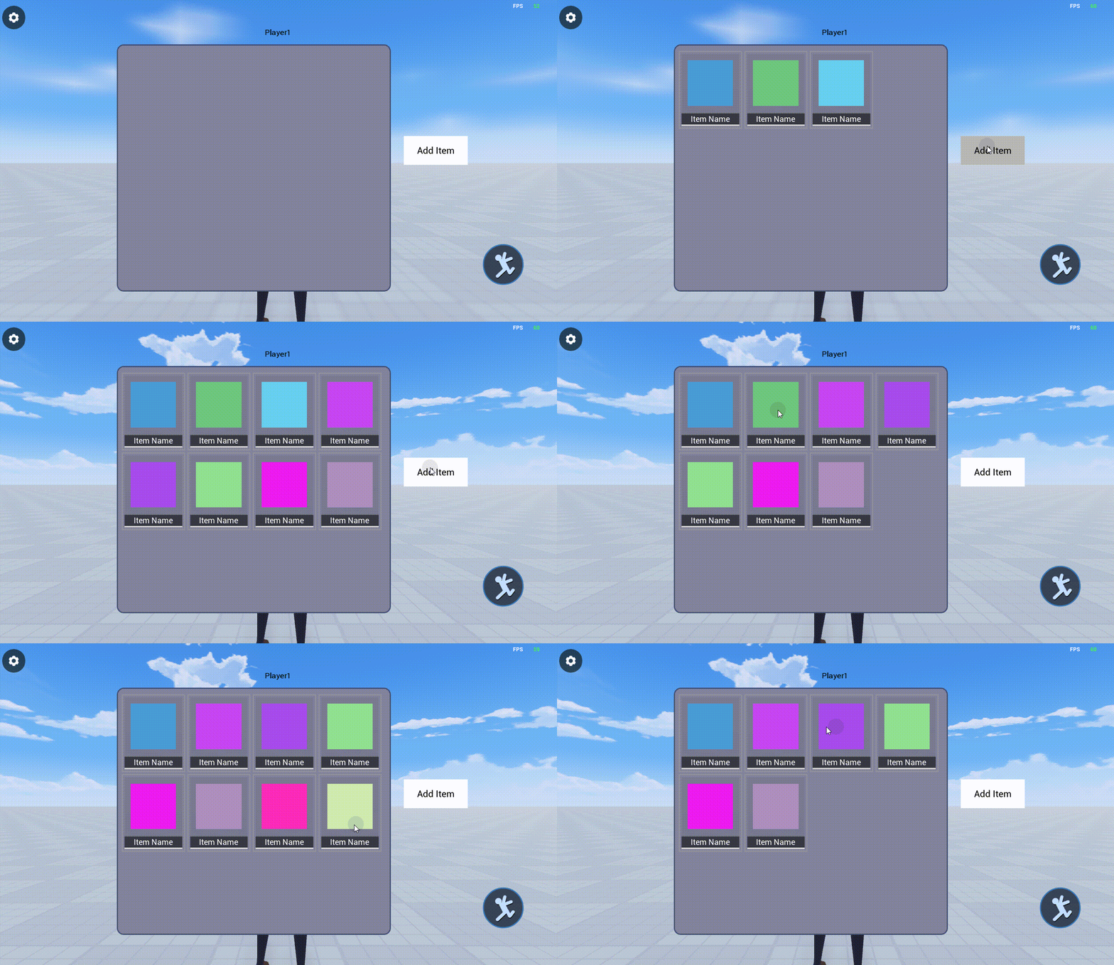
}Example 3: Creating an automatic layout panel that dynamically adds/removes customize UI widget
- When making experience, each grid in the bag/store menu is usually not a simple UI widget , but a composite of multiple UI widget such as image, text, button , etc. It is recommended to put a grid in a separate UI file.
- Note: Be sure to customize the root align of the custom UI file to left + align(if the root is align left + right + top + bottom or adaptive align , it will conflict with the automatic layout of the Container ), change the visibility to [Visible], and modify the design size to the required size.
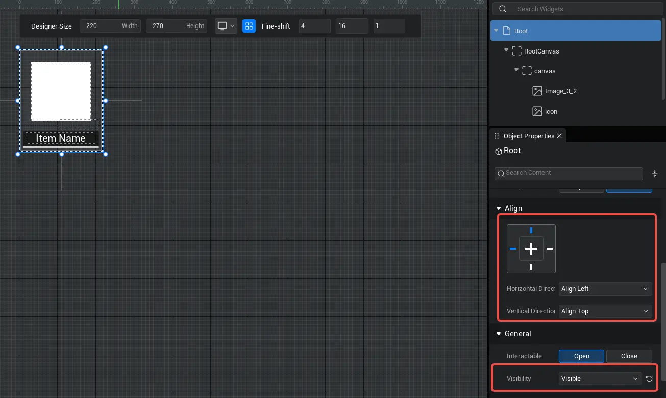
Then make a panel , place a Container with automatic layout turned on on the base map, and select [Adaptive height ] in [Adaptive Rules]-[ vertical Adaptation];
Finally, we write a script to dynamically generate and mount the customize UI widget as a grid into this Container ; each time the button is click , the UI file as a grid is instantiated once and a grid is generate.
- Sample script:
TypeScript@UIBind('') export default class UIDefault extends UIScript { /** Only call once during experience time for non- TEMPLATE instances */ protected onStart() { //Set whether onUpdate can be triggered every frame this.canUpdate = false; //Find the corresponding button and Container const newBtn = this.uiWidgetBase.findChildByPath('RootCanvas/StaleButton') as StaleButton const canvas = this.uiWidgetBase.findChildByPath('RootCanvas/Canvas') as Canvas canvas.autoLayoutHugContent.hugContentH=UIHugContentVertically.FixHeight // click the button to create UI newBtn.onPressed.add(()=>{ // create a customize UI component and mount it in the Container let item= createUIByName('BagItem.ui') as UserWidget canvas.addChild(item) }) } }@UIBind('') export default class UIDefault extends UIScript { /** Only call once during experience time for non- TEMPLATE instances */ protected onStart() { //Set whether onUpdate can be triggered every frame this.canUpdate = false; //Find the corresponding button and Container const newBtn = this.uiWidgetBase.findChildByPath('RootCanvas/StaleButton') as StaleButton const canvas = this.uiWidgetBase.findChildByPath('RootCanvas/Canvas') as Canvas canvas.autoLayoutHugContent.hugContentH=UIHugContentVertically.FixHeight // click the button to create UI newBtn.onPressed.add(()=>{ // create a customize UI component and mount it in the Container let item= createUIByName('BagItem.ui') as UserWidget canvas.addChild(item) }) } }In addition, we can also add a drag-and-drop removal function to each customize UI widget that serves as a grid:
- When the grid is dragged and release inside the panel , nothing happens
- When a grid is dragged and release outside the panel , the grid is destroyed, simulating the effect of dropping items from a bag. Since all grids are mounted under the automatic layout Container, when a grid is destroyed, the remaining grids will automatically modify the layout to fill the position of the destroyed grid.
- For more information about drag events, please refer to the product manual [UI Drag Events]
- Sample script:
TypeScript//Written in the grid UI script import BagItem_generate from "./ui-generate/BagItem_generate"; export default class BagItem extends BagItem_generate { // payLoad:TestDragDropPayLoad /** * After constructing the UI file successfully, initialize it once at the appropriate time */ protected onStart() { this.icon.imageColor= new LinearColor(Math.random(),Math.random(),Math.random(),1.0) } onTouchStarted(InGeometry :Geometry,InPointerEvent:PointerEvent) :EventReply{ console.log("onTouchStarted"+InPointerEvent.screenSpacePosition) return this.detectDragIfPressed(InPointerEvent, Keys.AnyKey) } onTouchEnded(InGemotry: Geometry, InPointerEvent: PointerEvent): EventReply { console.log("onTouchEnded"+InPointerEvent.screenSpacePosition) return EventReply.handled; } onDragDetected(InGeometry :Geometry,InPointerEvent:PointerEvent):DragDropOperation { console.log("OnDrag"+InPointerEvent.screenSpacePosition) //If you want to drag, the finger/ mouse keeps the relative position with the UI unchanged return this.newDragDrop(this.rootCanvas,"DragDropTag",null,DragPivot.TopLeft,(InPointerEvent.screenSpacePosition.clone().subtract(InGeometry.getAbsolutePosition().clone())).clone().divide(InGeometry.getAbsoluteSize().clone()).clone().multiply(-1)); //If you want to drag, move your finger/ mouse to the center of the UI // return this.newDragDrop(this.rootCanvas,"DragDropTag",null,DragPivot.CenterCenter,Vector2.zero); } //When the position of the release grid is outside the panel, the drag event will not end but be canceled, and the logic here will be executed to destroy the grid onDragCancelled(InGemotry :Geometry,InDragDropEvent:PointerEvent) { this.uiWidgetBase.destroyObject() console.log("onDragCancelled"+InDragDropEvent.screenSpacePosition) } }//Written in the grid UI script import BagItem_generate from "./ui-generate/BagItem_generate"; export default class BagItem extends BagItem_generate { // payLoad:TestDragDropPayLoad /** * After constructing the UI file successfully, initialize it once at the appropriate time */ protected onStart() { this.icon.imageColor= new LinearColor(Math.random(),Math.random(),Math.random(),1.0) } onTouchStarted(InGeometry :Geometry,InPointerEvent:PointerEvent) :EventReply{ console.log("onTouchStarted"+InPointerEvent.screenSpacePosition) return this.detectDragIfPressed(InPointerEvent, Keys.AnyKey) } onTouchEnded(InGemotry: Geometry, InPointerEvent: PointerEvent): EventReply { console.log("onTouchEnded"+InPointerEvent.screenSpacePosition) return EventReply.handled; } onDragDetected(InGeometry :Geometry,InPointerEvent:PointerEvent):DragDropOperation { console.log("OnDrag"+InPointerEvent.screenSpacePosition) //If you want to drag, the finger/ mouse keeps the relative position with the UI unchanged return this.newDragDrop(this.rootCanvas,"DragDropTag",null,DragPivot.TopLeft,(InPointerEvent.screenSpacePosition.clone().subtract(InGeometry.getAbsolutePosition().clone())).clone().divide(InGeometry.getAbsoluteSize().clone()).clone().multiply(-1)); //If you want to drag, move your finger/ mouse to the center of the UI // return this.newDragDrop(this.rootCanvas,"DragDropTag",null,DragPivot.CenterCenter,Vector2.zero); } //When the position of the release grid is outside the panel, the drag event will not end but be canceled, and the logic here will be executed to destroy the grid onDragCancelled(InGemotry :Geometry,InDragDropEvent:PointerEvent) { this.uiWidgetBase.destroyObject() console.log("onDragCancelled"+InDragDropEvent.screenSpacePosition) } }TypeScript//Written in the UI script of the panel , when the position of the release grid is within the panel, the end drag event is executed //In this example, onDrop does not execute any logic and is only used with onDragCancelled to distinguish whether the release point is inside or outside the panel. onDrop(InGemotry: Geometry, InDragDropEvent: PointerEvent, InOperation: DragDropOperation) { console.log("OnDrop"+InDragDropEvent.screenSpacePosition) return true }//Written in the UI script of the panel , when the position of the release grid is within the panel, the end drag event is executed //In this example, onDrop does not execute any logic and is only used with onDragCancelled to distinguish whether the release point is inside or outside the panel. onDrop(InGemotry: Geometry, InDragDropEvent: PointerEvent, InOperation: DragDropOperation) { console.log("OnDrop"+InDragDropEvent.screenSpacePosition) return true }Effect picture:
 Editor Doc