UI widget- Progress Bar
It takes about 10 minutes to read this article
This article outlines the various property and instructions of the UI widget- Progress Bar .
What is the Progress Bar?
The Progress Bar is a commonly used dynamic sliding type interactive widget; it can also be used as a non-interactive widget to display the progress effect of a percentage.
- For transformation/ align/general/rendering property , please see the basic property of UI widget.
Progress Bar property-slide settings
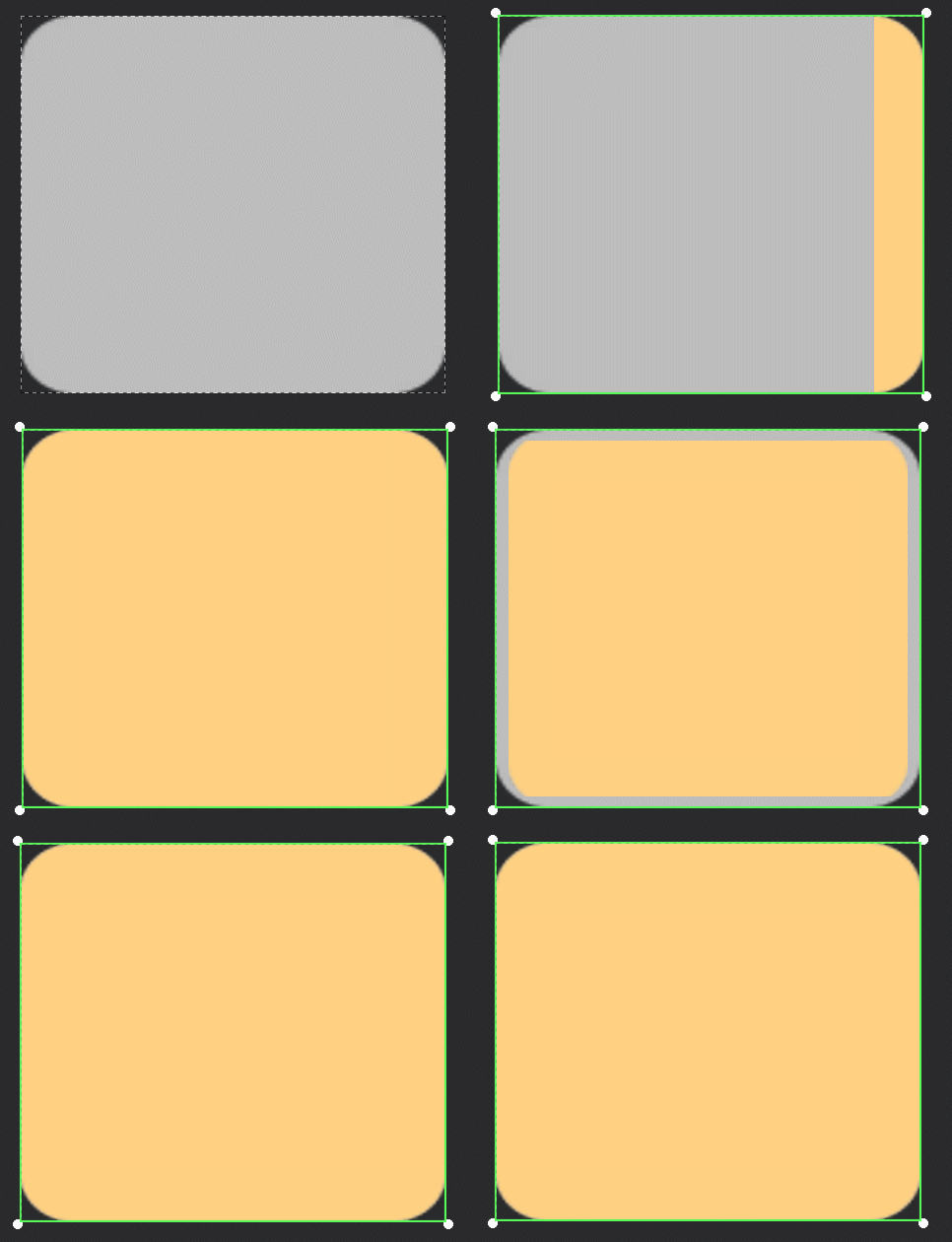
Fill Type
Left To Right
- The effect of filling the image from left to right.
Right To Left
- The effect of filling the image from right to left.
Fill From Center
- The effect of filling the image from the center outwards.
Top To Bottom
- The effect of filling the image from top to bottom.
Bottom To Top
- The effect of filling the image from bottom to top.
- Schematic diagram:
Sliding minimum
- Sets the minimum to which the slider can slide
- For description: the download Progress Bar goes from 0 to 100%, 0 is the minimum sliding value
Slide maximum
- Set the maximum that the slider can slide to
- For description: the download Progress Bar goes from 0 to 100%, 100% is the maximum sliding value
Current Value
- A value that specifies the initial position of the slider button .
- For description: the download Progress Bar starts from 0, so the current value is 0. On the contrary, assuming that the character full physical strength is 100, then the character physical strength should be 100 when running the experience, that is, the current value is 100.
Current Percentage
- Specifies the percentage of the initial position of the slide button . The percentage is converted from the current value, which means that the two values modify the same parameter.
- For description: Taking the download Progress Bar above as an example, if the current value is 0, the current percentage should be 0%. If the current value is 50, the current percentage should be 50%.
rounding
- Limits whether the slide value is an integer or a decimal.
- For description: The slider for purchasing item quantities in a store needs to be rounding because there are no decimals in item quantities.
- Schematic diagram:

Strip thickness
The Progress Bar widget allows you to set the rendering graphics size and the operable range to different sizes:
- 1. The Progress Bar 's [bar thickness] is used to modify the width of the Progress Bar sliding fill image and sliding background image rendering graphics
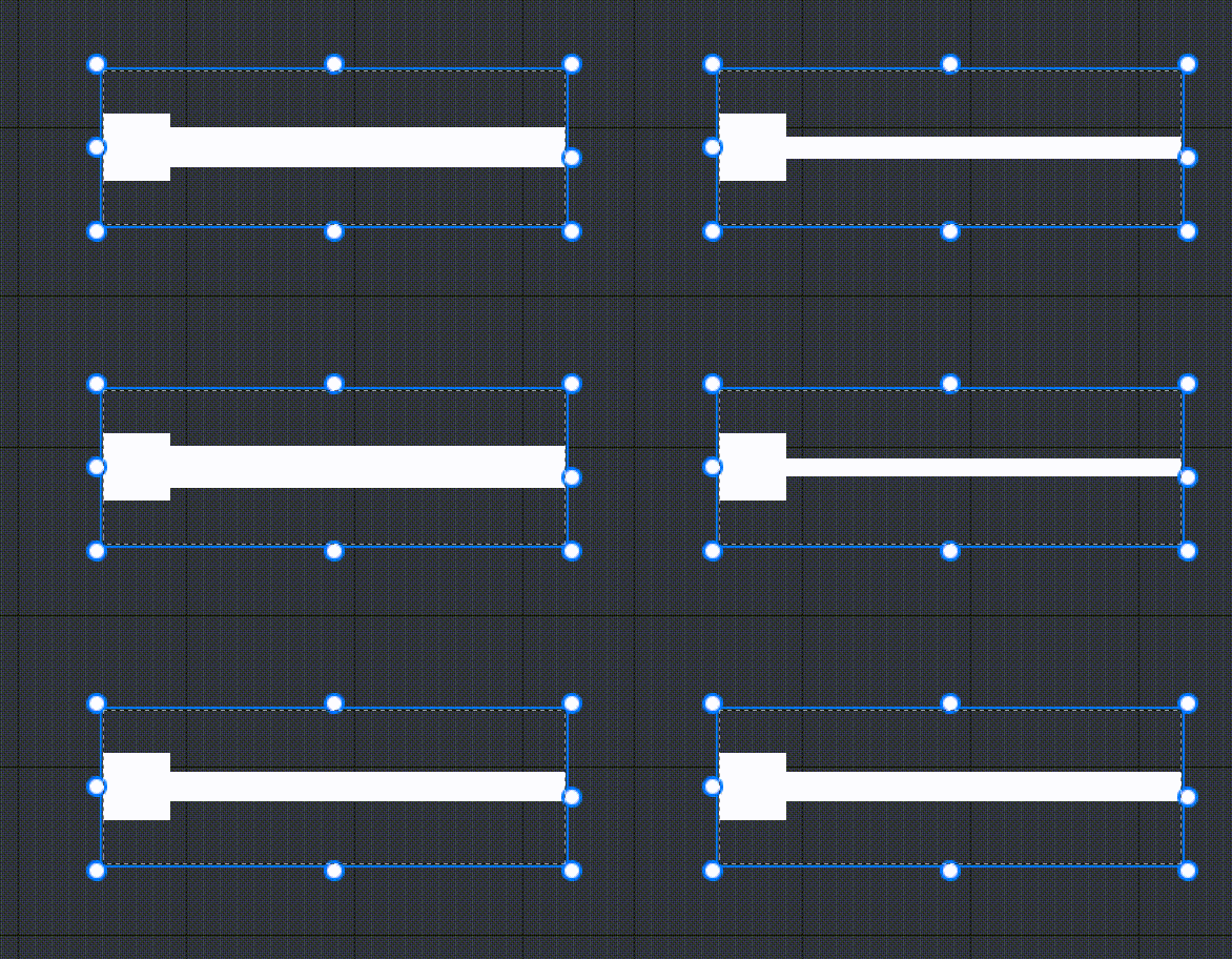
- 2. The [Transform] - [Size] of the Progress Bar is the size of the actual operating range of the widget, which is the blue box in the animation below. Player are allowed to click and drag within this range, and the sliding value is the value of the vertical line from the click/drag point to the Progress Bar;
When modifying [Transform] - [Size], only the length of the Progress Bar sliding fill image and sliding background image rendering graphics will be change , and their width will not be change .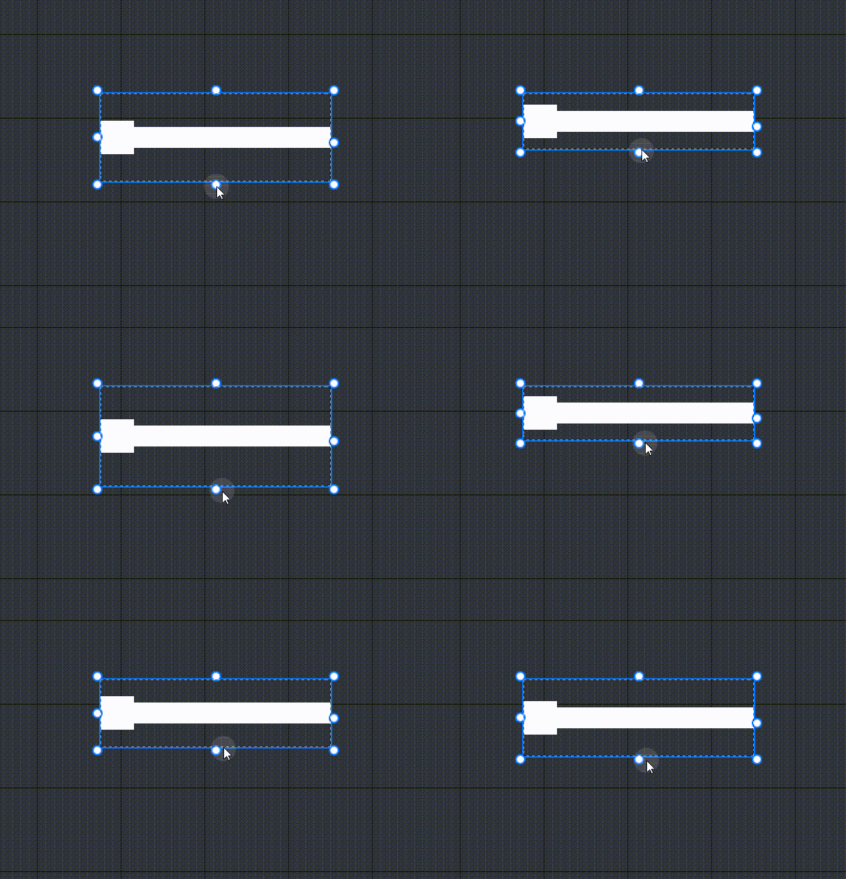
- 3. To modify the size of the slide button image, use [Slide button image] - [image Size]
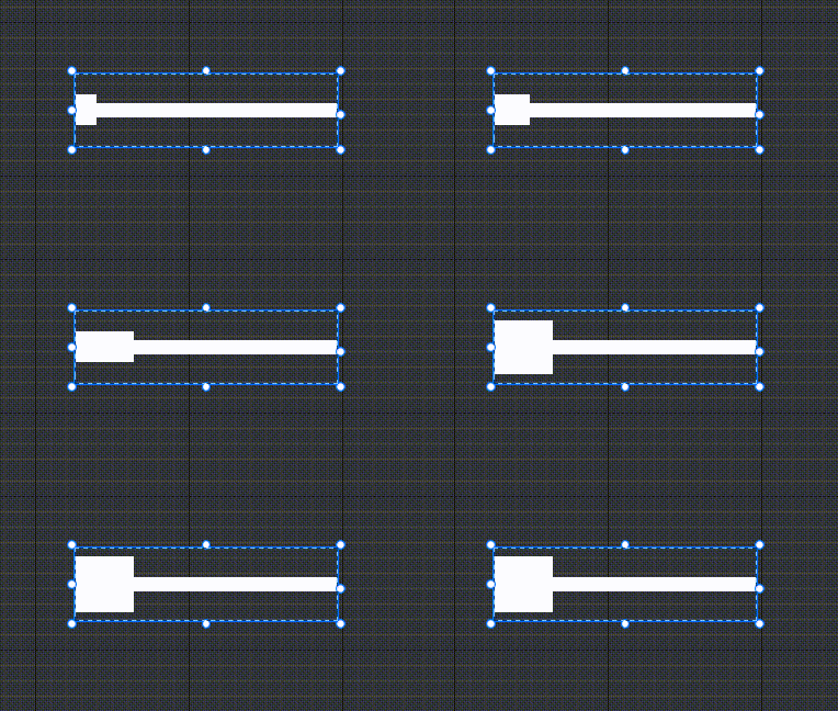
- 1. The Progress Bar 's [bar thickness] is used to modify the width of the Progress Bar sliding fill image and sliding background image rendering graphics
description: Create a slider that looks thin but has a larger trigger area.
- Schematic diagram:

Progress Bar property- style
Slide fill image
- What is modified is the filling effect of the Progress Bar when it is filling. For image property, please see [UI widget- image]
Slide button image
What is modified is the button effect at the Progress Bar filling position . For image property, please see [UI widget- image]
anchor type: You can choose the center or both sides to modify the specific position of the anchor in the button image.
- The center anchor is in the center of the button image
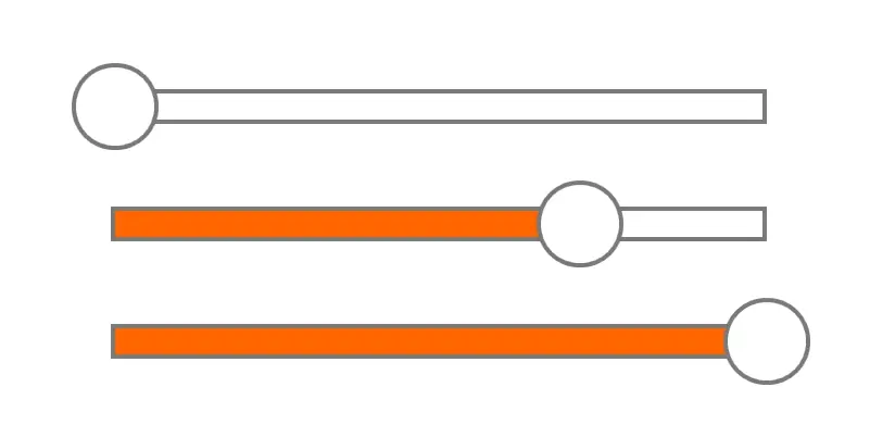
- The two anchor anchor are on both sides of the image, and the image will not exceed the range of the Progress Bar.
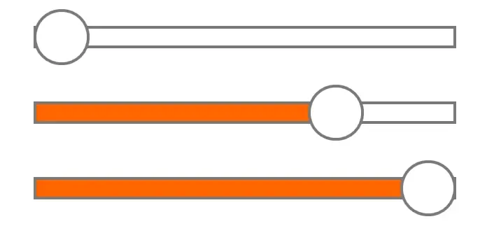
- The center anchor is in the center of the button image
offset value: used to modify the position of the button relative to the anchor
- When the anchor type is center, the offset value is X pixels, which means that the button image is offset to the right by X pixels. The offset value is -X pixels, which means that the button image is offset to the left by X pixels.
- When the anchor type is both sides, the offset value is X pixels, which means that the position and rightmost position of the button image can slide as a whole pixel. The offset value is -X pixels, which means that the position and rightmost position of the button image are offset inward by X pixels.
Sliding background image
- What is modified is the effect of the Progress Bar on the unfilled background. For image property, see UI widget- Image
How to use Progress Bar?
- For description: create a slider to control the volume, a Progress Bar on the loading interface , or an energy bar for the character.
Example 1: Creating a Progress Bar for modify the volume
- First we need to use the UI editor to create a panel , and then place UI widget such as the Progress Bar on the panel, as shown in the figure
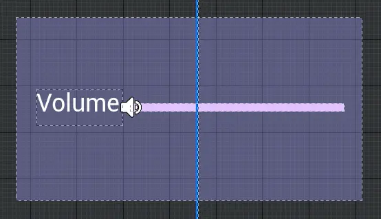
Then drag the corresponding sound effect file into the priority loading , and drag the UI file bound to the script into the object list
script example:
@UIBind('')
export default class DefaultUI extends UIScript {
	private character: Character;
	private anim1 = null;

	/** Only call once during experience time for non- TEMPLATE instances */
    protected  onStart() {
		 //Find the Progress Bar
		 const progressbar = this.uiWidgetBase.findChildByPath('Canvas/ProgressBar') as ProgressBar

		 AssetUtil.asyncDownloadAsset("4165").then((res : boolean) => {
			if (res) {
				// generate a sound effect and play it
				let sound1 = GameObject.spawn("4165") as Sound
				sound1.isLoop = true
				sound1.play()
				//Get the volume of the current sound effect and set it as the current value of the Progress Bar
				let volume1=sound1.volume
				progressbar.currentValue=volume1
				//Set the volume after the Progress Bar moves
				progressbar.onSliderValueChanged.add(() => {
					let volume1=progressbar.currentValue
					sound1.volume=volume1
				});
			}
		})
    }
}@UIBind('')
export default class DefaultUI extends UIScript {
private character: Character;
private anim1 = null;
/** Only call once during experience time for non- TEMPLATE instances */
protected onStart() {
//Find the Progress Bar
const progressbar = this.uiWidgetBase.findChildByPath('Canvas/ProgressBar') as ProgressBar
AssetUtil.asyncDownloadAsset("4165").then((res : boolean) => {
if (res) {
// generate a sound effect and play it
let sound1 = GameObject.spawn("4165") as Sound
sound1.isLoop = true
sound1.play()
//Get the volume of the current sound effect and set it as the current value of the Progress Bar
let volume1=sound1.volume
progressbar.currentValue=volume1
//Set the volume after the Progress Bar moves
progressbar.onSliderValueChanged.add(() => {
let volume1=progressbar.currentValue
sound1.volume=volume1
});
}
})
}
} Editor Doc