UI widget - Mask button
It takes about 15 minutes to read this article
This article provides an overview of the UI widget—mask button properties and instructions.
What is the Mask Button?
The Mask Button is a UI widget that occludes, masks part of, and displays image content for a specific area; can be used to achieve masking effects for skill cooldown buttons, specially shaped buttons; or can be used not as a button, but for excessive scenes, image cutting, etc.
- Diagram:

For transform/align/generic/render properties see UI widget base properties
- Note: When not used as a button, modify visibility to SelfHitTestInvisible
Mask Button Properties
Mask type
- Can choose circular sector mask, circle mask, rounded rectangle mask three types
In this paper, in order to clearly describe the changing effects of mask image and ordinary image (bottom image) when modifying various properties, different images were selected for mask image and ordinary image (bottom image) in legend.
In practice, if you only want to achieve the masking effect of button skill cooldown, it is recommended to mask images with the same image resources as normal images (bottom image) and use different image colors and transparency
2.1 Circular sector masks
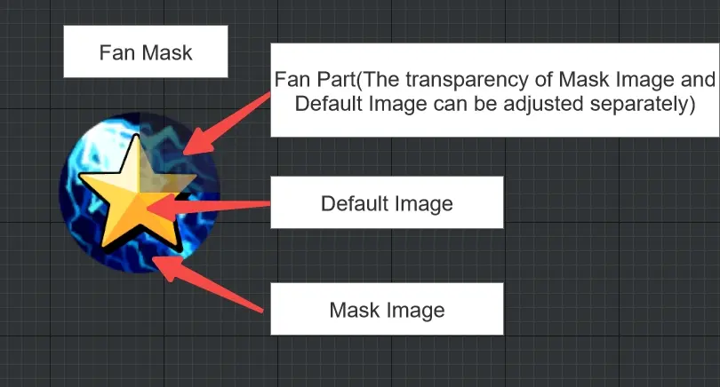
Normal image / masking image
- i. e. base image and mask image of mask button control, you can modify material, color, transparency of both images
- Normal image drawing types are currently for the entire mask widget and also affect the effect of masking images
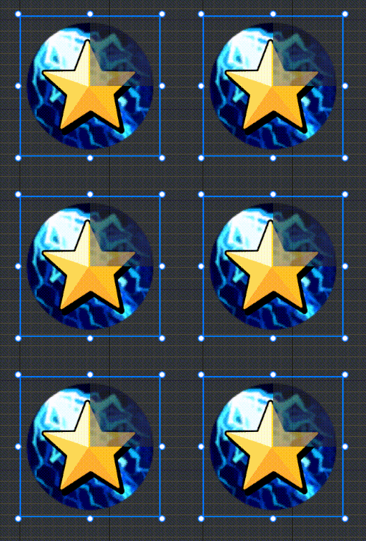
Whether to turn on transition mode
- When checked, you can configure the style of the baseimage in the pressed/disabled state with the exact same logic as the button

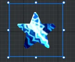
Mask Chart Outline Cull Base Image
i.e. with the contour cull base of the mask chart, the transparency outside the contour of the mask chart becomes 0 and the transparency inside the contour of the mask chart uniformly becomes the mask chart transparency
- This option only completes culling the baseimage, with the maskimage still overlaid above the baseimage

If you want to achieve undercuts along the outline of the mask chart and do not display the mask chart, refer to the following parameters for a specially shaped mask button:
- Mask chart outline cull base image: check
- Circular sector percentage value: 1
- Circular sector bottom image transparency: 1
- Circular Sector Mask Chart Transparency: 0
Center of rotation
- i. e. modify the circular sector region's center position
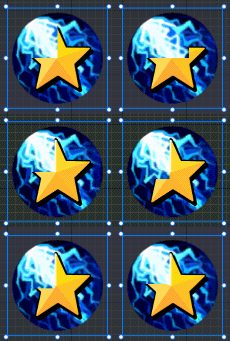
Circular sector percentage value
- i.e. circular sector angle divided by 360° as a percentage
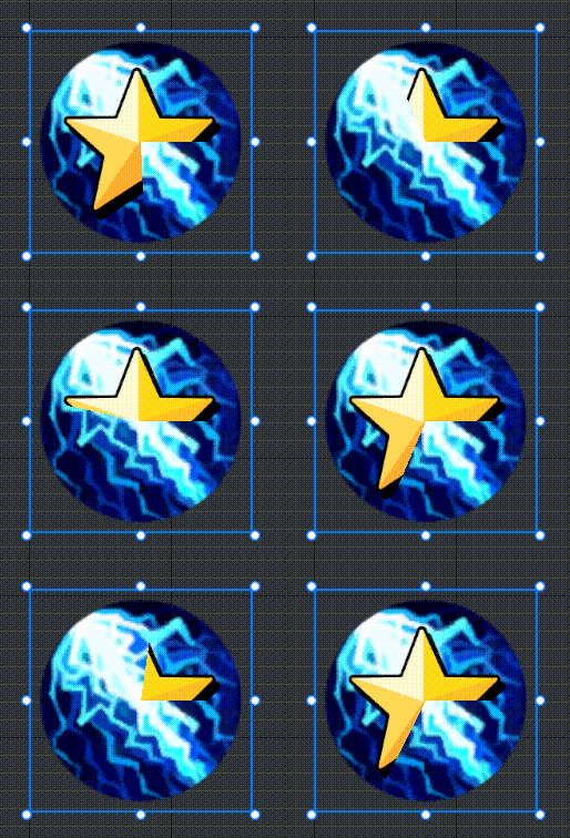
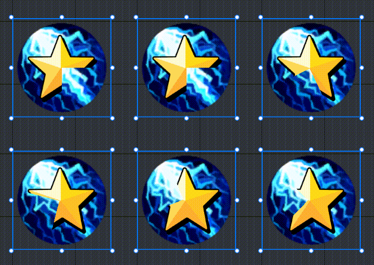
Rotation angle
- i.e. the circular sector position; at 0.25 this property calculates the angle of the circular sector from 12 o'clock
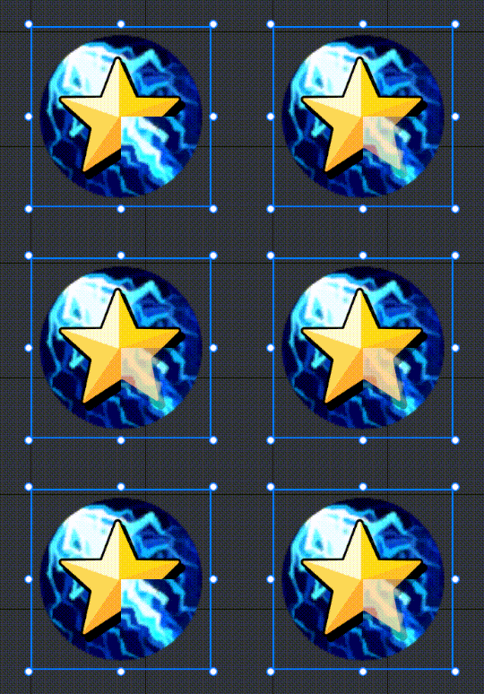
Circular sector bottom image transparency
- i. e. transparency of that portion of the base image within circular sector area
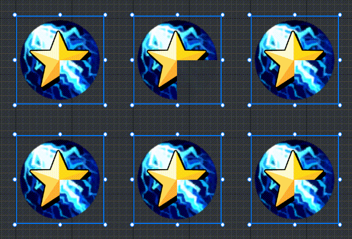
Circular sector partial mask chart transparency
- i. e. that transparency of this part of the mask image within the circular sector area
2.2 Circle mask
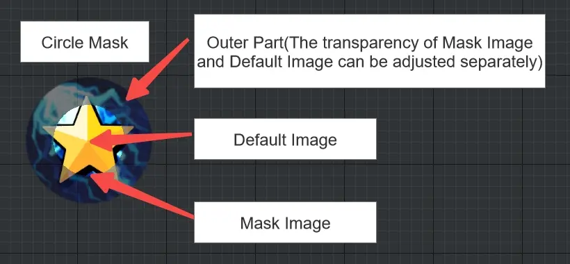
Normal image / masking image
- i. e. mask button control base image and mask image, you can modify the material, color, transparency of both images

Whether to turn on transition mode
- When checked, you can configure the style of the baseimage in the pressed/disabled state with the exact same logic as the button

Mask Chart Outline Cull Base Image
i.e. with the contour cull base of the mask chart, the transparency outside the contour of the mask chart becomes 0 and the transparency inside the contour of the mask chart uniformly becomes the mask chart transparency
- This option only completes culling the baseimage, with the maskimage still overlaid above the baseimage
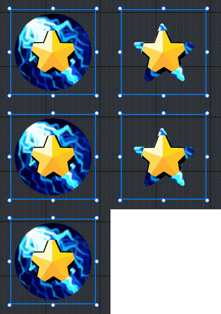
Similarly, if you want to achieve undercuts along the outline of the mask chart and do not display the mask chart, you can get a specially shaped mask button by referring to the following parameters:
- Mask chart outline cull base image: check
- Circle Percent Value: 1
- Circle part bottom image transparency: 1
- Circle partial masking chart transparency: 0

Circle center position
- i. e. that centroid position of the circle part
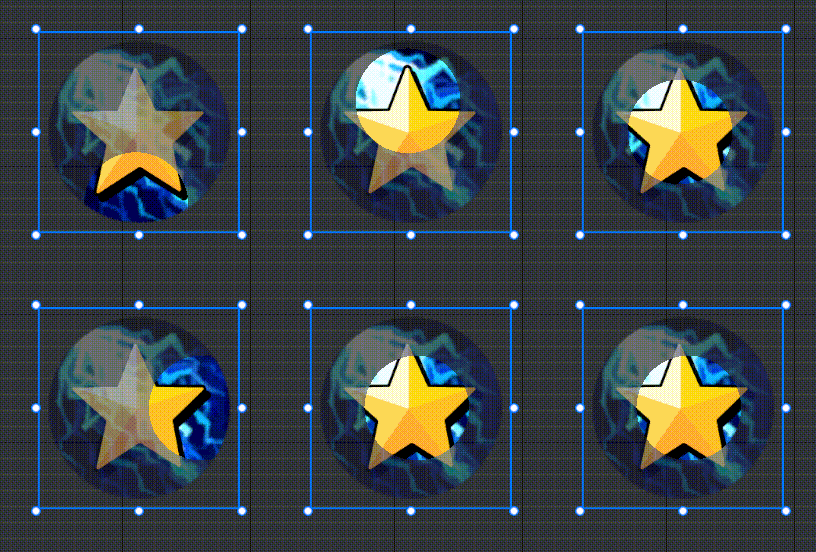
Percent value of outer ring
- Used to modify the outer bezel size, i.e. the distance from the outer bezel to the center on the widget's diagonal/percentage of the widget's diagonal length; at this value of 1-√2/2 (about 0.293), the portion that is not occluded by the outer bezel just becomes a circle cut inside the widget boundary
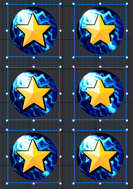
Transparency of bottom image of outer ring section
- i. e. transparency of that portion of the base image within the out ring region

Transparency of outer bezel partial masking diagram
- i. e. that transparency of this part of the mask image within the out ring region

2.3 Rounded rectangle mask
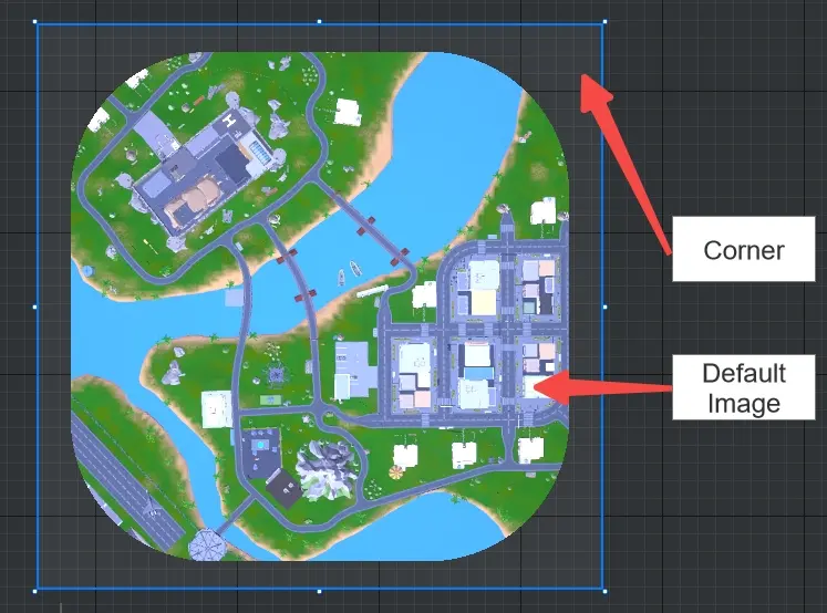
Normal image / masking image
- You can modify the material, color and transparency of the baseimage, and the color and transparency of the rounded mask

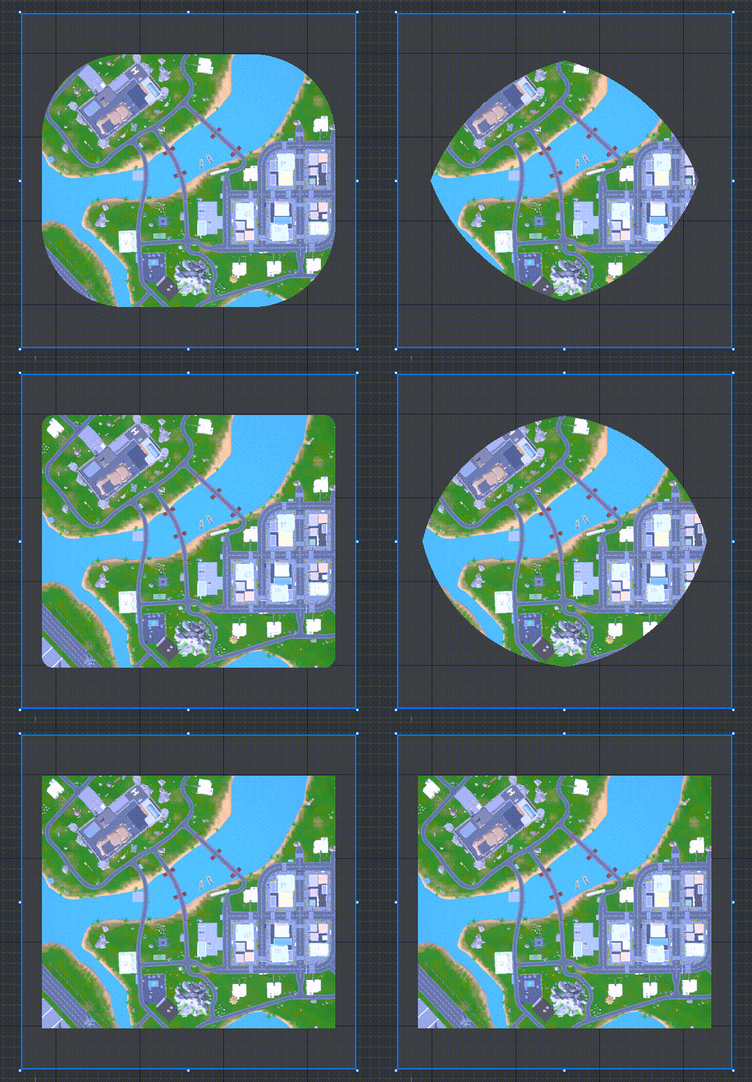
Rectangle Margins X/Y
- culls a normal image in both the X and Y axes, this property adjusts the ratio of the culled part to the widget size in both the X and Y axes, the larger the property, the larger the ratio of culls

Angle radius
- i.e. the radius of the rounded corner; when this property is 0, it becomes a right rectangle
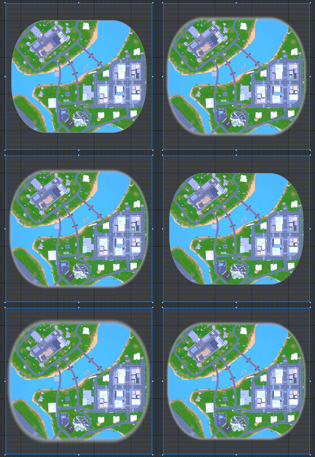
Sharpness
- i. e. sharpness of edges of rounded rectangles
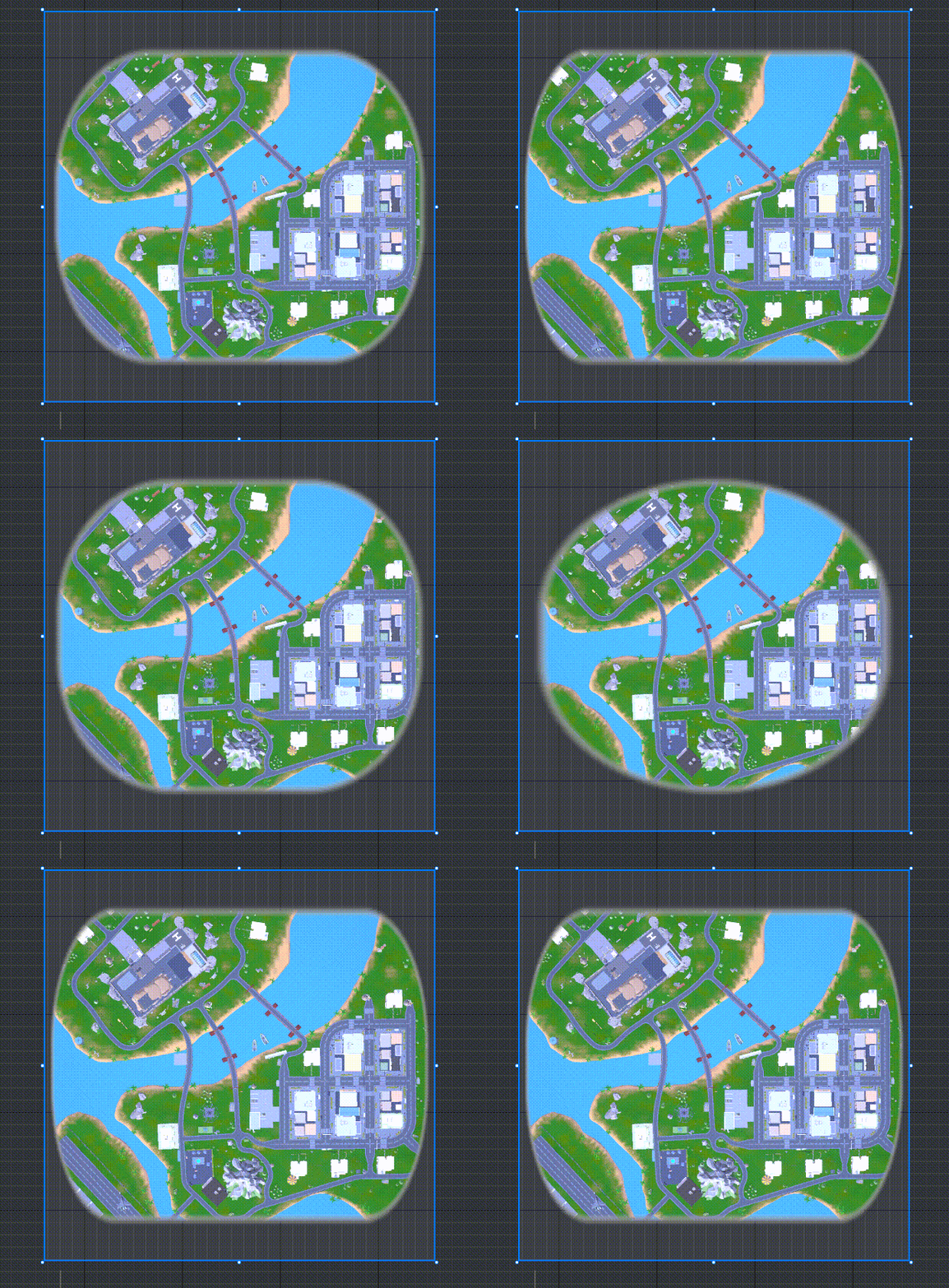
Round adjustment
- This property modifies the center position of the corners with a fixed radius; used to modify the desired corner orientation
How do I use the mask button?
Example1: Making Skill Buttons that Clock Display CDs
Set up mask button controls and text controls in the UI editor and set up skill images (normal images/press images/disable images/mask images are all set up)
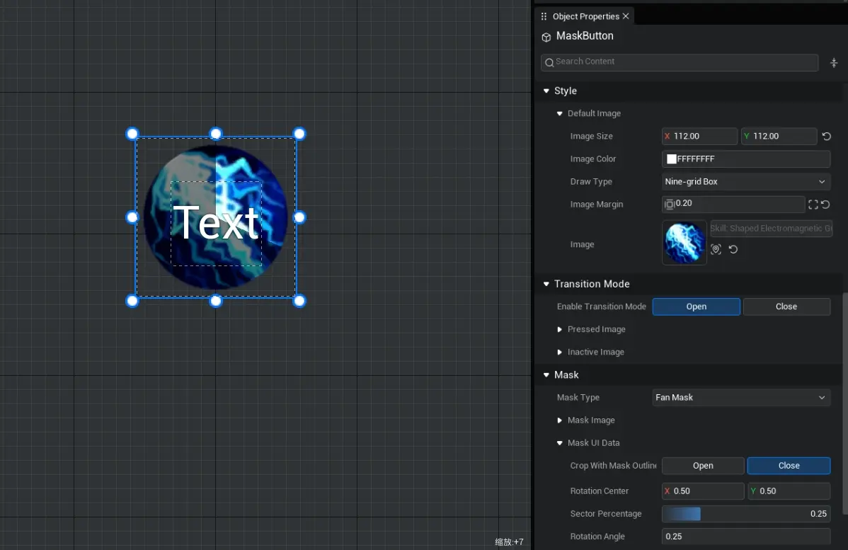
- Logic for achieving masking in scripts using UI.MaskButton class
export default class UIDefault extends UIScript {
    character: Character;

	/** call non-TEMPLATE instances only once during experience time */
    protected onStart() {

		 // Set whether onUpdate can be triggered per frame
		 this.canUpdate = false;
		 // Set the cooldown time for this mask button
		 let cd_value = 5000;

		 // Find the corresponding mask button and text
		 const fanShape_0 = this.uiWidgetBase.findChildByPath('Canvas/MaskButton') as MaskButton
		 const text_0 = this.uiWidgetBase.findChildByPath('Canvas/TextBlock_1') as TextBlock
		 // need to make text invisible first
		 text_0.visibility=1
		 // Create variable record remaining time
		 let timeleft=cd_value
		 // Zero circular sector values
		 fanShape_0.fanShapedValue=0
		 // Mask image set to fully transparent
		 fanShape_0.maskImageColor=new LinearColor(0, 0, 0, 0)
		 // Set the baseimage to disable darker colors when unavailable, or set it in the editor
		 fanShape_0.disableImageColor=new LinearColor(0.5, 0.5, 0.5, 1)

		 // Press mask button to enter cooldown timer
		 fanShape_0.pressedDelegate.add(() => {

			 console.warn("----> GameUI construct");
			 // Mask image set to translucent black to show masking effect
			 fanShape_0.maskImageColor=new LinearColor(0, 0, 0, 0.8)
			 // Remember to make the mask button unavailable
			 fanShape_0.enable=false
			 // Show total cooldown time
			 text_0.text=(""+timeleft/1000)
			 // Set text to visible
			 text_0.visibility=3

			// Start timing, circular sector values get larger over time
			let _time=setInterval(() => {
				timeleft-=50
				fanShape_0.fanShapedValue=(fanShape_0.fanShapedValue+50/cd_value)
				// Show cooldown time remaining
				if (Math.ceil(timeleft/1000)>1) {
					text_0.text=(""+(Math.ceil(timeleft/1000)))

				}else{
					text_0.text=(""+(Math.ceil(timeleft/100)/10))
				}
				console.error(timeleft/1000)
			}, 50);

			 // After cooldown, button returns to normal state
			 setTimeout(() => {
				 // Stop timing
				 clearInterval(_time)
				 // Zero circular sector values
				 fanShape_0.fanShapedValue=0
				 // Mask image set to fully transparent
				 fanShape_0.maskImageColor=new LinearColor(0, 0, 0, 0)
				 // Remember to make the mask button available
				 fanShape_0.enable=true
				 // Set text invisible
				 text_0.visibility=1
				 // Time remaining to reset
				 timeleft=cd_value
			 }, cd_value);
        });
    }
}
export default class UIDefault extends UIScript {
character: Character;
/** call non-TEMPLATE instances only once during experience time */
protected onStart() {
// Set whether onUpdate can be triggered per frame
this.canUpdate = false;
// Set the cooldown time for this mask button
let cd_value = 5000;
// Find the corresponding mask button and text
const fanShape_0 = this.uiWidgetBase.findChildByPath('Canvas/MaskButton') as MaskButton
const text_0 = this.uiWidgetBase.findChildByPath('Canvas/TextBlock_1') as TextBlock
// need to make text invisible first
text_0.visibility=1
// Create variable record remaining time
let timeleft=cd_value
// Zero circular sector values
fanShape_0.fanShapedValue=0
// Mask image set to fully transparent
fanShape_0.maskImageColor=new LinearColor(0, 0, 0, 0)
// Set the baseimage to disable darker colors when unavailable, or set it in the editor
fanShape_0.disableImageColor=new LinearColor(0.5, 0.5, 0.5, 1)
// Press mask button to enter cooldown timer
fanShape_0.pressedDelegate.add(() => {
console.warn("----> GameUI construct");
// Mask image set to translucent black to show masking effect
fanShape_0.maskImageColor=new LinearColor(0, 0, 0, 0.8)
// Remember to make the mask button unavailable
fanShape_0.enable=false
// Show total cooldown time
text_0.text=(""+timeleft/1000)
// Set text to visible
text_0.visibility=3
// Start timing, circular sector values get larger over time
let _time=setInterval(() => {
timeleft-=50
fanShape_0.fanShapedValue=(fanShape_0.fanShapedValue+50/cd_value)
// Show cooldown time remaining
if (Math.ceil(timeleft/1000)>1) {
text_0.text=(""+(Math.ceil(timeleft/1000)))
}else{
text_0.text=(""+(Math.ceil(timeleft/100)/10))
}
console.error(timeleft/1000)
}, 50);
// After cooldown, button returns to normal state
setTimeout(() => {
// Stop timing
clearInterval(_time)
// Zero circular sector values
fanShape_0.fanShapedValue=0
// Mask image set to fully transparent
fanShape_0.maskImageColor=new LinearColor(0, 0, 0, 0)
// Remember to make the mask button available
fanShape_0.enable=true
// Set text invisible
text_0.visibility=1
// Time remaining to reset
timeleft=cd_value
}, cd_value);
});
}
}- End result:

 Editor Doc