UI widget- Scroll Box
It takes about 10 minutes to read this article
This article outlines the various property and instructions of the UI widget- Scroll Box .
What is a Scroll Box ?
The Scroll Box is a commonly used sliding Container widget. It is often used when the interface is not large enough to accommodate all the content, and all the content can be displayed by sliding.
- Schematic diagram:
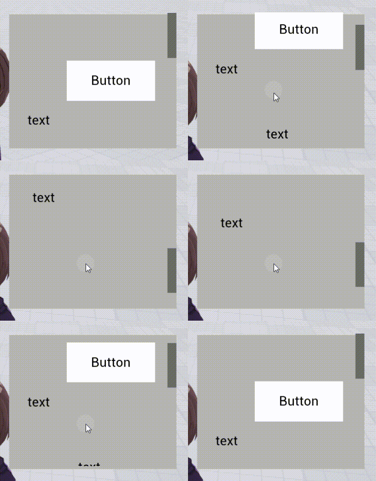
- For transformation/ align/general/rendering property , please see the basic property of UI widget.
Scroll Box property- scroll panel settings
scroll direction
horizontal scroll
- The Scroll Box can scroll the content horizontal .
vertical scroll
- The Scroll Box can scroll the content vertical .
Schematic diagram:
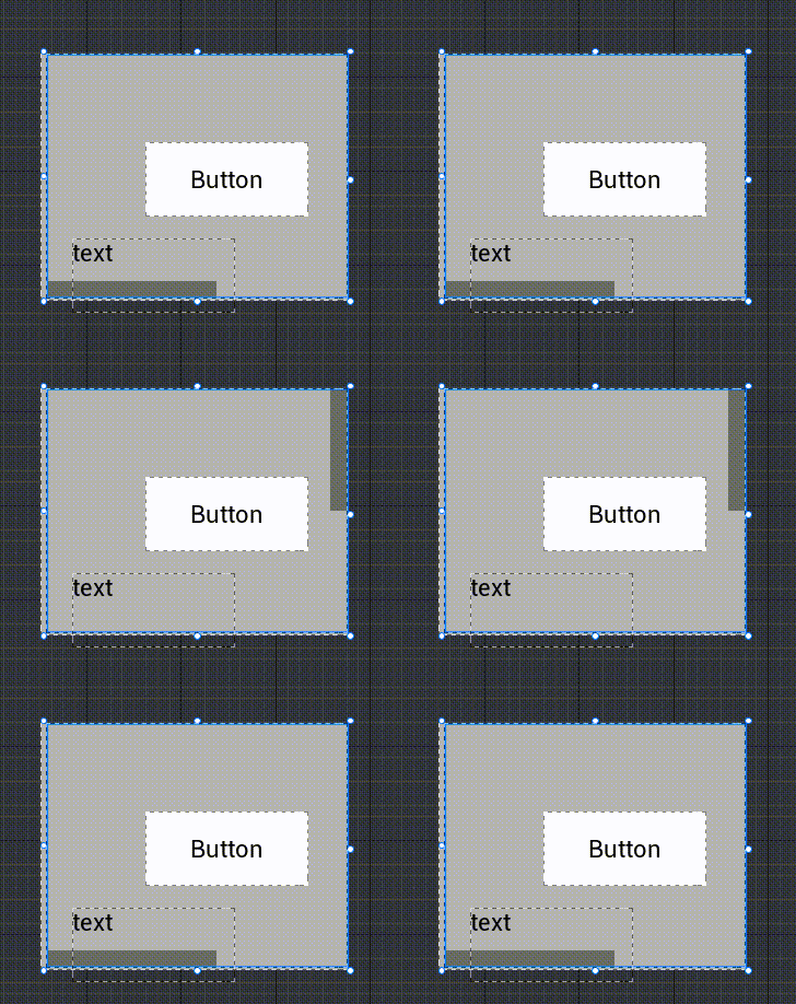
movement type
Elastic
- When the Scroll Box is pulled to the top or bottom edge, it can be pulled a short distance further and has a rebound effect.
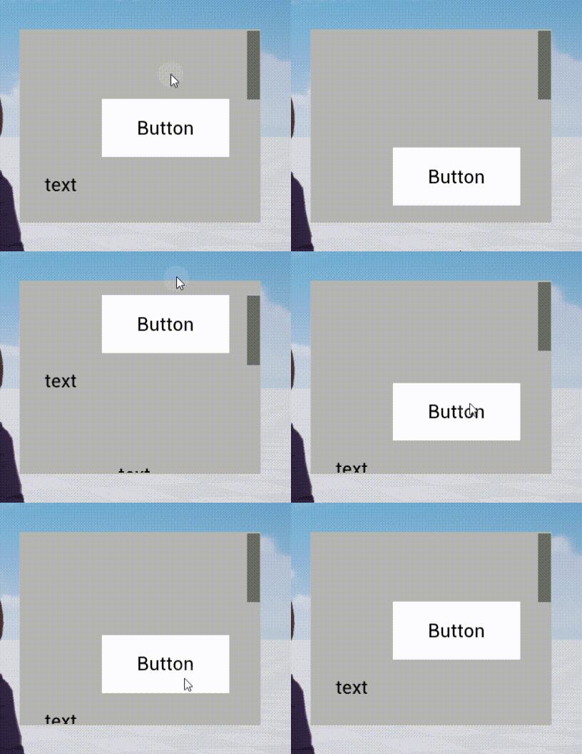
Limited
- Once the Scroll Box is pulled to the top or bottom edge, it cannot be pulled down further.
scroll bar default position
- The default position of the scroll bar when the Player does not operate the scroll bar; each time the slider is re-rendered, the slider returns to this default position
| horizontal scroll | vertical scroll | |
|---|---|---|
| Top or Left | 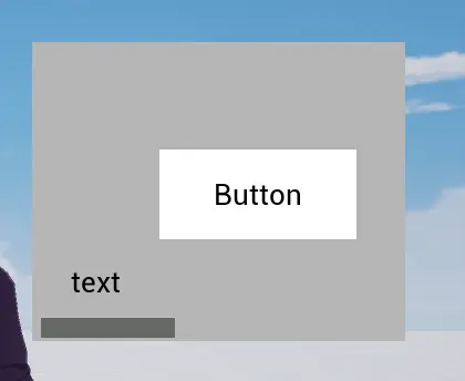 | 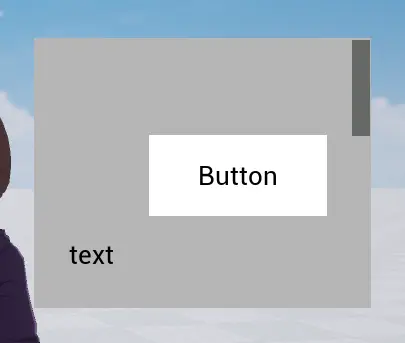 |
| Center | 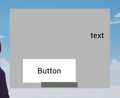 | 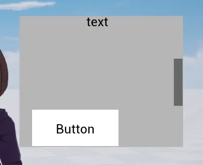 |
| Bottom or right | 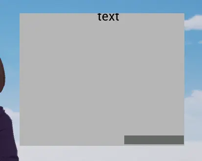 | 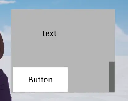 |
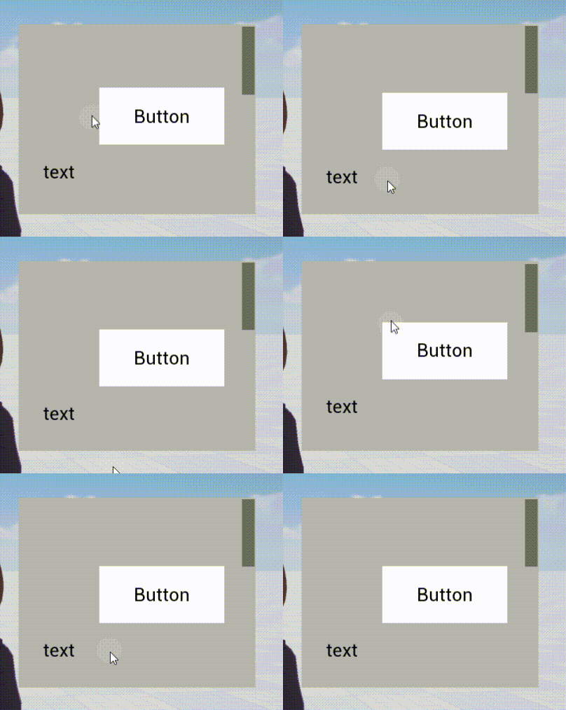
Elastic coefficient
- When the movement type is elastic motion, the Scroll Box can be pulled to the top or bottom edge and can be pulled a short distance further. This coefficient determine the distance that can exceed the normal range of the Scroll Box.
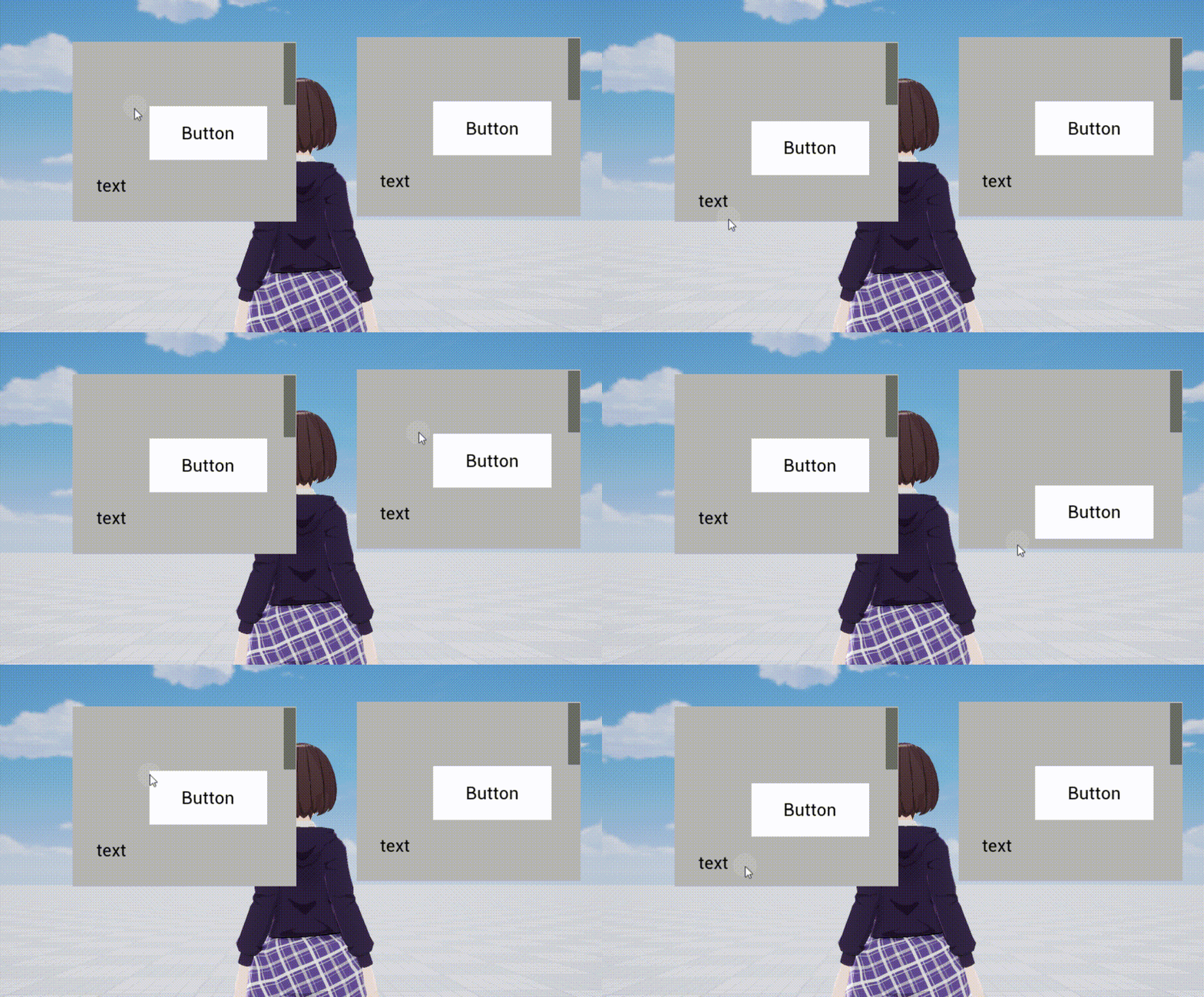
Elastic coefficient on the left = 0.2, elastic coefficient on the right = 2
Is there inertia
- After using the Scroll Box to scroll the content, will it slide a certain distance due to inertia? If checked, there will be inertia and you can slide a certain distance. If not checked, there will be no inertia.
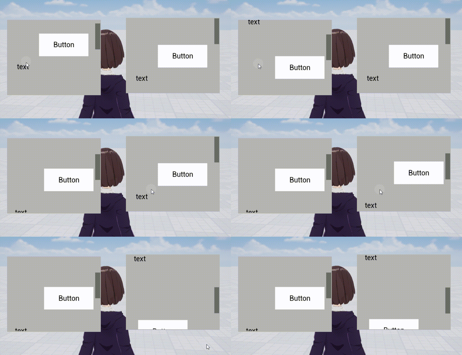
No inertia on the left, inertia on the right
Show scroll bars
- Whether to display scroll bars. Check it to display it, uncheck it to not display it.
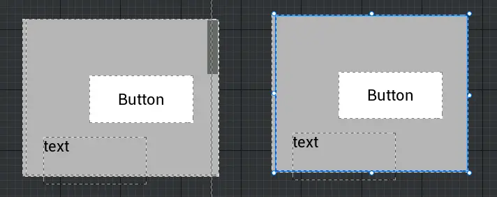
The scroll bar is displayed on the left side, but not on the right side
Edge Shadow
- Whether to show the shadow part of the scroll edge. Check it to display it, uncheck it to not display it.
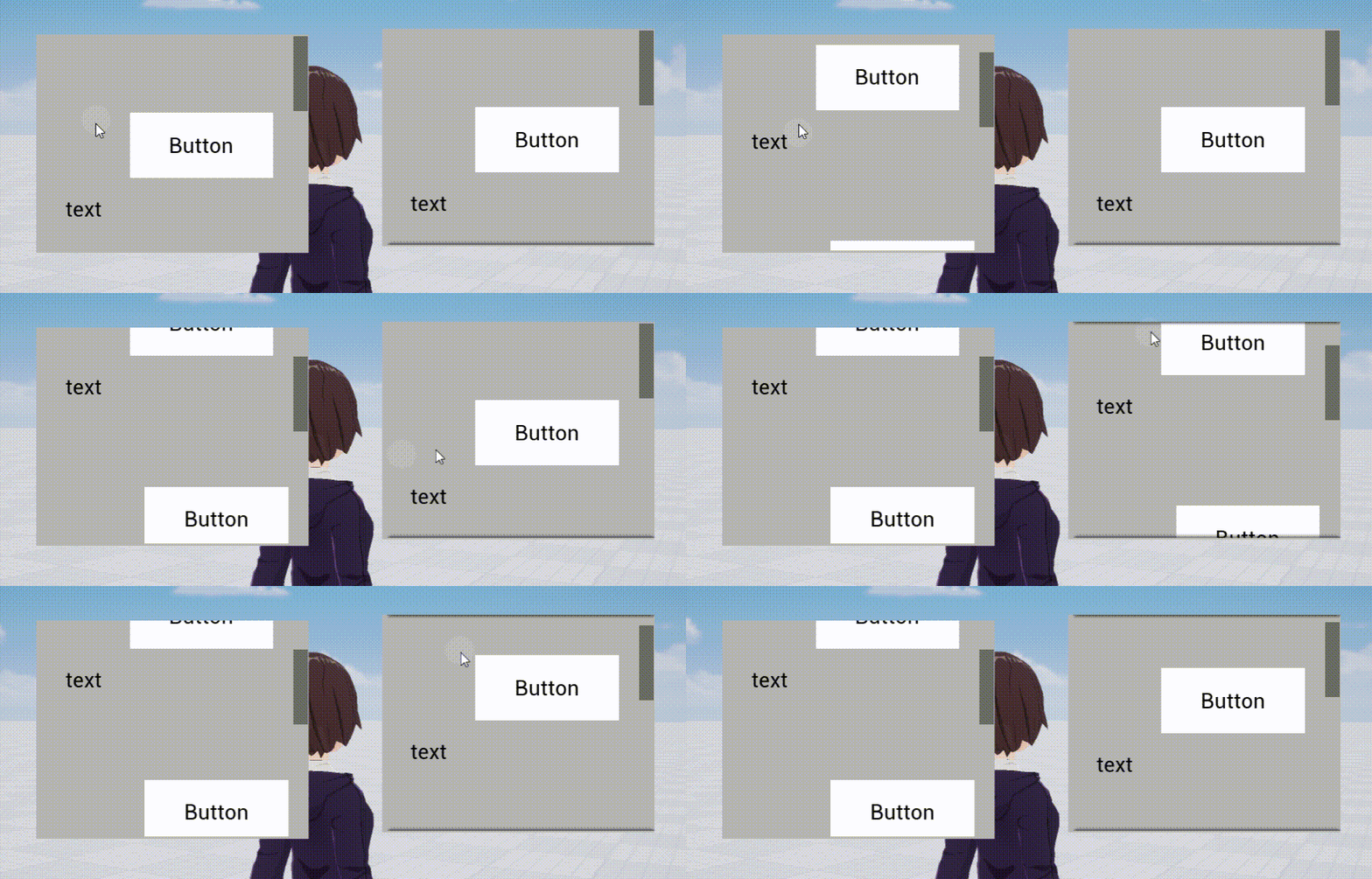
Left side without edge shadow, right side with edge shadow
scroll bar width
- That is, the width of the scroll bar. The X and Y values are the width when scroll vertical and horizontal , respectively.
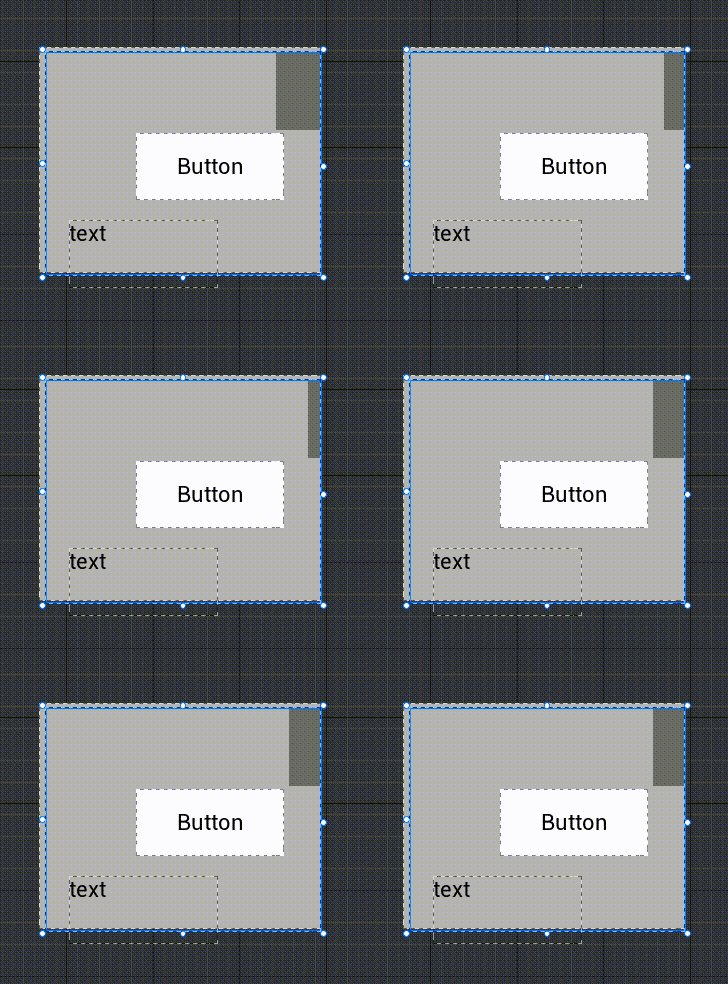
scroll bar color
- The color and transparency of the scroll bar can be modified
Scroll Box property- style settings
- What is modified here is the image and style of the scroll bar. For image property, see UI widget - Image
How to use Scroll Box?
Example 1: Creating an infinite scroll list with dynamically added content
- First, place an empty Scroll Box and place a Container with automatic layout and vertical automatic size turned on inside it.
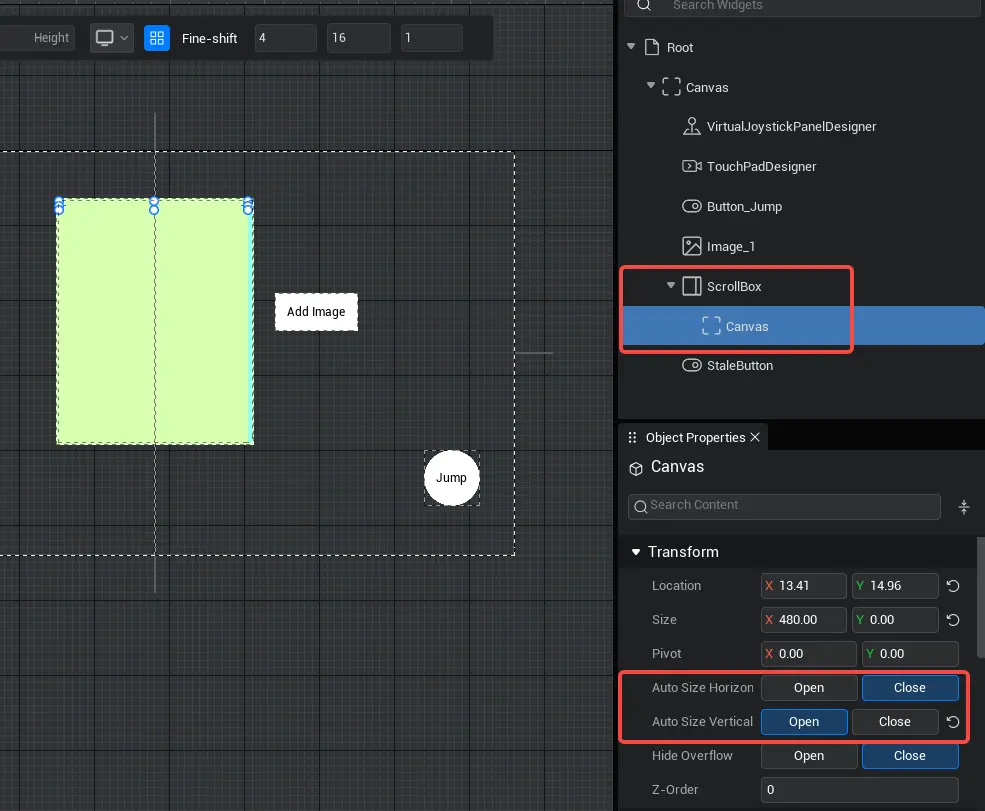
- Then write a script to dynamically generate other UI widget and add them as children of the container in the scroll Scroll Box. Here, generate an image widget as an example. After running the experience, click the button to see the dynamically generate UI widget appear inside the Scroll Box.
@UIBind('')
export default class DefaultUI extends UIScript {
	/** Only call once during experience time for non- TEMPLATE instances */
    protected  onStart() {
		//Find the corresponding button and Container
		const newBtn = this.uiWidgetBase.findChildByPath('Canvas/StaleButton') as StaleButton
		const canvas = this.uiWidgetBase.findChildByPath('Canvas/ScrollBox/Canvas') as Canvas
		// click the button to create a image
		newBtn.onPressed.add(()=>{
			// create image component
			let image= Image.newObject()
			//Mount the image component under the Scroll Box
			canvas.addChild(image)
			image.size=new Vector2(225,225)
			image.imageGuid="76721"
		})
    }
}@UIBind('')
export default class DefaultUI extends UIScript {
/** Only call once during experience time for non- TEMPLATE instances */
protected onStart() {
//Find the corresponding button and Container
const newBtn = this.uiWidgetBase.findChildByPath('Canvas/StaleButton') as StaleButton
const canvas = this.uiWidgetBase.findChildByPath('Canvas/ScrollBox/Canvas') as Canvas
// click the button to create a image
newBtn.onPressed.add(()=>{
// create image component
let image= Image.newObject()
//Mount the image component under the Scroll Box
canvas.addChild(image)
image.size=new Vector2(225,225)
image.imageGuid="76721"
})
}
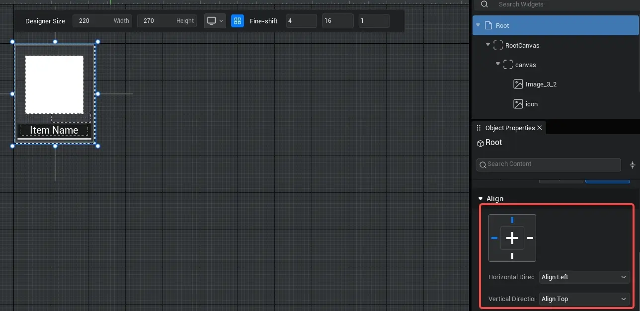
}- When making experience, each grid in the bag/store menu is usually not a simple UI widget , but a customize UI widget containing multiple UI widget . It is recommended to put the elements of a grid in a separate UI file , and then dynamically instantiate this UI file as a customize UI widget in the script and hang it under the Container.
TIP
Please note: Please set the root align of the customize UI file to left + top, and modify the design size to the required size. This is equivalent to the align of the instantiated customize UI widget . If you choose fully-justified+ top-bottom align, or customize align , the size and position of the customize UI widget will change adaptively with the parent. For details, see the [Overall property of UI file(customize UI) - Root property ] section in the [Basic property of UI widget ] section of the product manual.
Example 2: Create a button for the Scroll Box that support click and sliding the Scroll Box when dragged
- When the Scroll Box contains many button , we will find that the Scroll Box cannot be slid when pressing the button and dragging
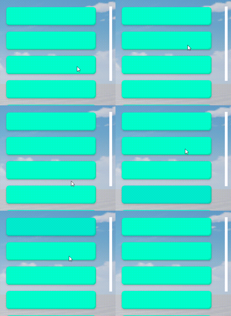
- If the touchMethod (touch mode ) of the button in the sliding box is changed to UI.ButtonTouchMethod.PreciseTap (precise click mode ), when the button is press and dragged, the button's pressed state will be immediately canceled and the Scroll Box will be operated instead.
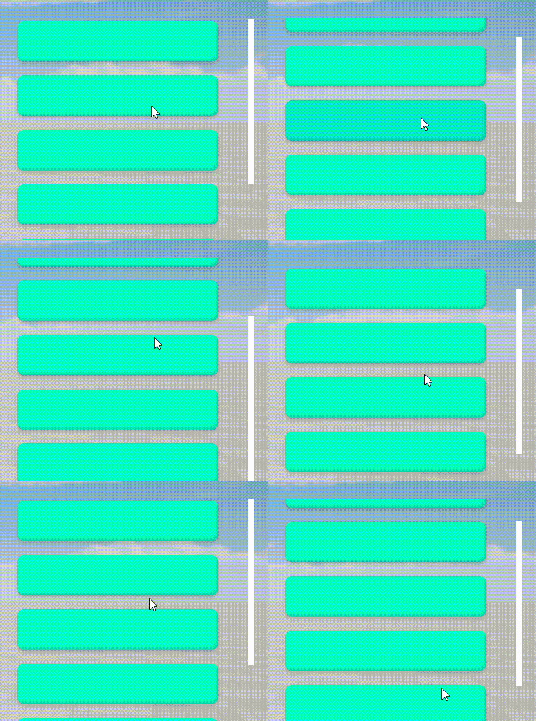 - script example:
//Modify button touch mode
    changeBtnMethod(): void {
        for(let i = 1; i < 7; i++) {
            (this["btn"+i] as Button).touchMethod = ButtonTouchMethod.PreciseTap;
        }
    }
//Modify button touch mode
changeBtnMethod(): void {
for(let i = 1; i < 7; i++) {
(this["btn"+i] as Button).touchMethod = ButtonTouchMethod.PreciseTap;
}
} Editor Doc